
About
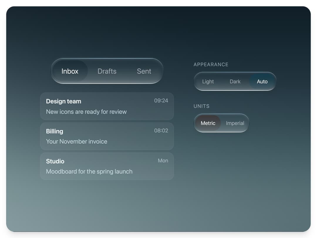
A liquid glass segmented control with a thick specular rim and a recessed pill that stretches, flows and squashes into place when you switch.
Built with React and Tailwind. Copy the prompt and paste it into Claude Code, Cursor or Lovable: your agent adds Glass Tabs to your project and fits it to your theme.
Code
How Glass Tabs is used: the demo's code. The component's own source comes with a free account.
Usage.tsx
"use client"

import * as React from "react"
import { GlassTabs, glassTabsBackdrop } from "@/components/ui/glass-tabs"

type Mail = { from: string; subject: string; time: string }

const MAIL: Record<string, Mail[]> = {
  Inbox: [
    { from: "Design team", subject: "New icons are ready for review", time: "09:24" },
    { from: "Billing", subject: "Your November invoice", time: "08:02" },
    { from: "Studio", subject: "Moodboard for the spring launch", time: "Mon" },
  ],
  Drafts: [
    { from: "To: Design team", subject: "Feedback on the icon set", time: "10:11" },
    { from: "To: Support", subject: "Question about my plan", time: "Sun" },
  ],
  Sent: [
    { from: "To: Studio", subject: "Photos from the shoot", time: "Fri" },
    { from: "To: Billing", subject: "Updated company address", time: "Thu" },
    { from: "To: Design team", subject: "Kickoff notes", time: "Wed" },
  ],
}

// The layout is drawn for a fixed box and every size is multiplied by one scale, so the controls
// keep their proportions and nothing spills past the frame.
const WIDE = { w: 640, h: 370 }
const TALL = { w: 330, h: 620 }

function measure() {
  if (typeof window === "undefined") return { scale: 1, tall: false }
  const tall = window.innerHeight > window.innerWidth * 1.2
  const box = tall ? TALL : WIDE
  return { tall, scale: Math.max(0.55, Math.min(window.innerWidth / box.w, window.innerHeight / box.h, 1.8)) }
}

function useFit() {
  const [fit, setFit] = React.useState(measure)
  React.useEffect(() => {
    const update = () => setFit(measure())
    window.addEventListener("resize", update)
    return () => window.removeEventListener("resize", update)
  }, [])
  return fit
}

const row: React.CSSProperties = { display: "flex", flexDirection: "column", alignItems: "flex-start", gap: "0.6em" }
const caption: React.CSSProperties = { margin: 0, fontSize: "0.8em", letterSpacing: "0.08em", textTransform: "uppercase", color: "rgba(225, 240, 245, 0.55)" }

/**
 * Three controls, one component: a controlled tab bar that switches the mail list under it, and
 * two smaller radio groups with their own tint. Labels, size, tint and semantics are all props.
 */
export default function GlassTabsDemo() {
  const { scale, tall } = useFit()
  const s = (n: number) => Math.round(n * scale)
  const [box, setBox] = React.useState("Inbox")
  const [theme, setTheme] = React.useState("Auto")
  const [units, setUnits] = React.useState("Metric")

  return (
    <main className="relative min-h-screen w-full bg-background">
      <section
        className="absolute flex items-center justify-center overflow-hidden shadow-xl"
        style={{
          inset: "clamp(10px, 2.6vmin, 26px)",
          borderRadius: "clamp(18px, 4.5vmin, 34px)",
          border: "1px solid rgba(190, 220, 225, 0.12)",
          background: glassTabsBackdrop,
        }}
      >
        <div
          style={{
            display: "flex",
            flexDirection: tall ? "column" : "row",
            alignItems: tall ? "center" : "flex-start",
            gap: s(tall ? 30 : 44),
            fontSize: s(14),
            color: "#f2f8fa",
          }}
        >
          <div style={{ display: "flex", flexDirection: "column", alignItems: "center", width: s(300) }}>
            <GlassTabs options={["Inbox", "Drafts", "Sent"]} value={box} onChange={setBox} size={s(58)} panelIdPrefix="mail" />
            <ul
              id={`mail-${["Inbox", "Drafts", "Sent"].indexOf(box)}`}
              role="tabpanel"
              style={{ listStyle: "none", margin: `${s(14)}px 0 0`, padding: 0, width: "100%", minHeight: "14.4em" }}
            >
              {MAIL[box].map((m) => (
                <li
                  key={m.subject}
                  style={{
                    display: "grid",
                    gridTemplateColumns: "1fr auto",
                    columnGap: "0.8em",
                    padding: "0.6em 0.9em",
                    marginTop: "0.4em",
                    borderRadius: "0.9em",
                    background: "rgba(255, 255, 255, 0.06)",
                    border: "1px solid rgba(255, 255, 255, 0.07)",
                  }}
                >
                  <span style={{ fontWeight: 600, whiteSpace: "nowrap", overflow: "hidden", textOverflow: "ellipsis" }}>{m.from}</span>
                  <span style={{ fontSize: "0.86em", color: "rgba(225, 240, 245, 0.55)" }}>{m.time}</span>
                  <span style={{ gridColumn: "1 / -1", marginTop: "0.15em", color: "rgba(225, 240, 245, 0.75)", whiteSpace: "nowrap", overflow: "hidden", textOverflow: "ellipsis" }}>
                    {m.subject}
                  </span>
                </li>
              ))}
            </ul>
          </div>

          <div style={{ display: "flex", flexDirection: "column", gap: s(26), paddingTop: tall ? 0 : s(6) }}>
            <div style={row}>
              <p style={caption}>Appearance</p>
              <GlassTabs options={["Light", "Dark", "Auto"]} value={theme} onChange={setTheme} size={s(42)} semantics="radiogroup" tint="rgb(0, 70, 95)" aria-label="Appearance" />
            </div>
            <div style={row}>
              <p style={caption}>Units</p>
              <GlassTabs options={["Metric", "Imperial"]} value={units} onChange={setUnits} size={s(42)} semantics="radiogroup" tint="rgb(70, 30, 20)" aria-label="Units" />
            </div>
          </div>
        </div>
      </section>
    </main>
  )
}
More by Louis Studios
View all

Warp Carousel
1.1K
Peak Chart
873
Dot Tiles
168
Glow Rocker
156
Cover Flow
126
Chapter Player
124
Chrome Arcs
124
Market Card
106
More in Navigation
View all

Liquid Glass Expandable Sidebar
76

Footer with Big Wordmark
40

Sidebar
392

Oversized 404 Numeral
78
Navbar with Theme Toggle
67

NavBar
2

Pagination
109
Tabs like bookmark
82
