
About
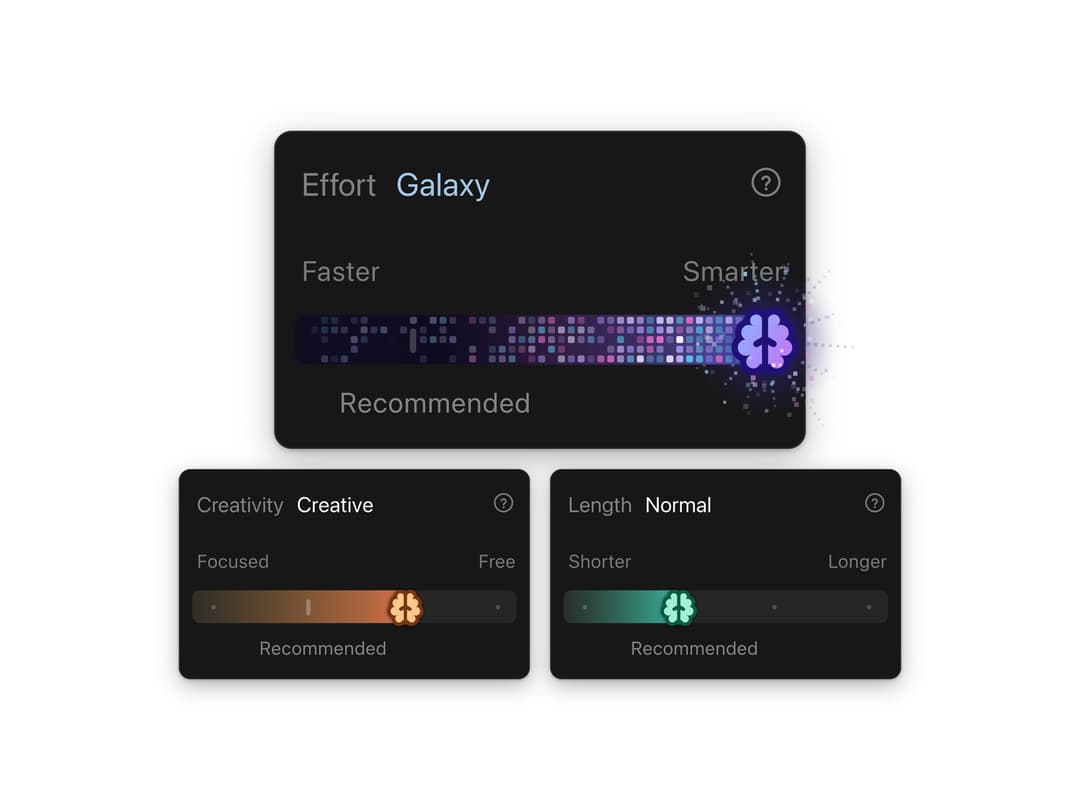
A stepped effort slider whose brain thumb glides along a pink to violet track, then ignites a twinkling pixel galaxy with a starburst at max. Levels, labels, colours and the galaxy state are all props.
Built with React and Tailwind. Copy the prompt and paste it into Claude Code, Cursor or Lovable: your agent adds Effort Slider to your project and fits it to your theme.
Code
How Effort Slider is used: the demo's code. The component's own source comes with a free account.
Usage.tsx
"use client"

import * as React from "react"
import { EffortSlider } from "@/components/ui/effort-slider"

// The layout is drawn for a fixed box (wide: one large card over two small ones, tall: three in a
// column) and scaled as one piece to fit the frame, so the starburst at the top level always has
// room and nothing spills past the edge.
const WIDE = { w: 600, h: 430 }
const TALL = { w: 440, h: 690 }

function useFit() {
  const [fit, setFit] = React.useState({ scale: 1, tall: false })
  React.useEffect(() => {
    const measure = () => {
      const tall = window.innerHeight > window.innerWidth * 1.2
      const box = tall ? TALL : WIDE
      setFit({ tall, scale: Math.max(0.5, Math.min(window.innerWidth / box.w, window.innerHeight / box.h, 1.7)) })
    }
    measure()
    window.addEventListener("resize", measure)
    return () => window.removeEventListener("resize", measure)
  }, [])
  return fit
}

/**
 * Three settings of an assistant, all the same component: the default Effort control with its
 * Galaxy level, and warm Creativity and mint Length controls with four stops of their own and the
 * Galaxy state off. Every difference is a prop.
 */
export default function EffortSliderDemo() {
  const { scale, tall } = useFit()
  const small = tall ? 1 : 0.74

  return (
    <div className="flex min-h-screen w-full flex-col items-center justify-center overflow-hidden bg-background">
      <div style={{ display: "flex", flexDirection: "column", alignItems: "center", gap: 14 * scale }}>
        <EffortSlider scale={(tall ? 1 : 1.12) * scale} />
        <div style={{ display: "flex", flexDirection: tall ? "column" : "row", gap: 14 * scale }}>
          <EffortSlider
            scale={small * scale}
            title="Creativity"
            levels={["Precise", "Balanced", "Creative", "Wild"]}
            defaultValue={2}
            recommended={1}
            autoplay={false}
            galaxy={false}
            minLabel="Focused"
            maxLabel="Free"
            accent="#fdc98a"
            accentDeep="#7a3410"
            fillFrom="#f9b24a"
            fillTo="#ef5f4e"
          />
          <EffortSlider
            scale={small * scale}
            title="Length"
            levels={["Brief", "Normal", "Detailed", "Essay"]}
            defaultValue={1}
            recommended={1}
            autoplay={false}
            galaxy={false}
            minLabel="Shorter"
            maxLabel="Longer"
            accent="#a5f0d2"
            accentDeep="#0c5a45"
            fillFrom="#48d9a4"
            fillTo="#2bb7d8"
          />
        </div>
      </div>
    </div>
  )
}
More by Louis Studios
View all

Warp Carousel
1.1K
Peak Chart
873
Dot Tiles
168
Glow Rocker
156
Cover Flow
126
Chapter Player
124
Chrome Arcs
124
Market Card
106
More in AI chats
View all

AI Actions
351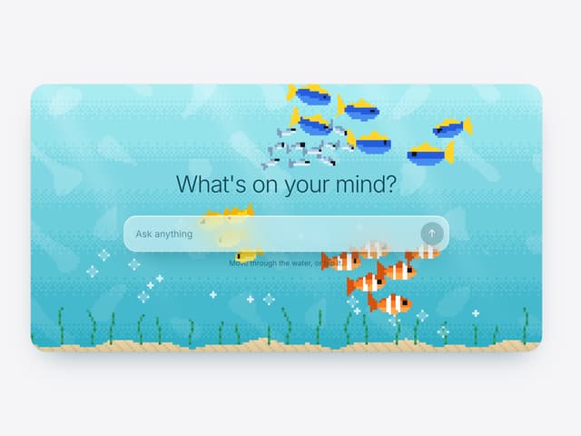

Aquarium Prompt
113
Agent Chat
21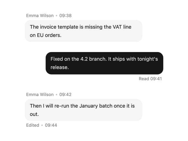

Message With Header And Delivery Status
60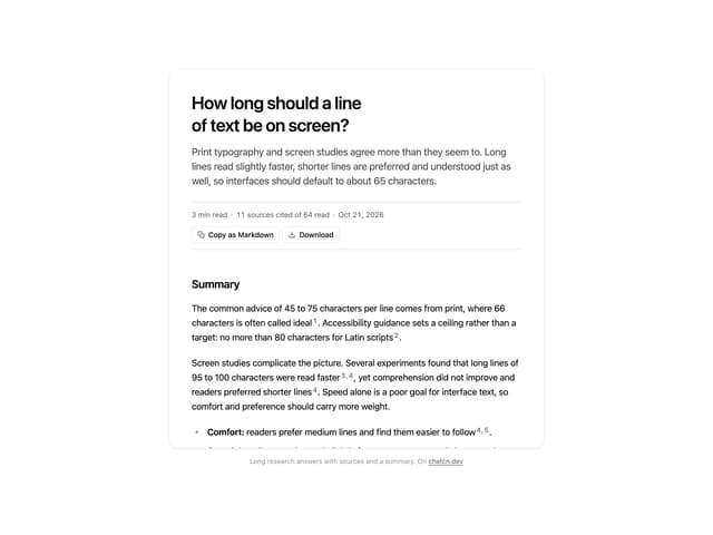
Research Report
7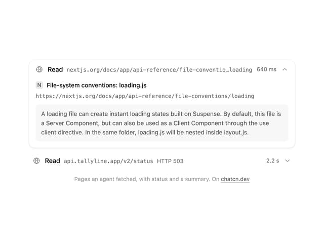
Tool Web Fetch
4
Color Picker
201
Suggestions
40


