
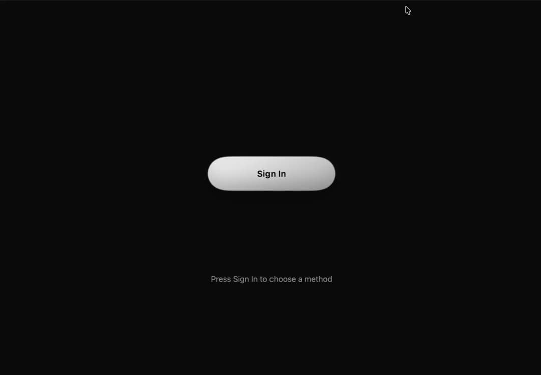
About
Button Sig In option access with effect
Built with React and Tailwind. Copy the prompt and paste it into Claude Code, Cursor or Lovable: your agent adds Button Sign In to your project and fits it to your theme.
Code
How Button Sign In is used: the demo's code. The component's own source comes with a free account.
Usage.tsx
import { useEffect, useRef, useState } from "react";
import type { CSSProperties, ReactElement } from "react";

type Provider = { id: string; label: string; cls: string; y: number; icon: ReactElement };

const iconProps = { className: "wsi-i", viewBox: "0 0 24 24" } as const;

// Vertical offsets (px) of each option once the button has split.
const PROVIDERS: Provider[] = [
  {
    id: "google", label: "Google", cls: "a", y: -138,
    icon: <svg {...iconProps}><path d="M21.35 11.1H12v2.9h5.35c-.5 2.4-2.5 3.9-5.35 3.9a6 6 0 1 1 0-12c1.5 0 2.8.55 3.85 1.45l2.1-2.1A9 9 0 1 0 12 21c5.2 0 8.6-3.65 8.6-8.8 0-.4-.05-.8-.1-1.1z" /></svg>,
  },
  {
    id: "github", label: "GitHub", cls: "b", y: -46,
    icon: <svg {...iconProps}><path d="M12 .297c-6.63 0-12 5.373-12 12 0 5.303 3.438 9.8 8.205 11.385.6.113.82-.258.82-.577 0-.285-.01-1.04-.015-2.04-3.338.724-4.042-1.61-4.042-1.61C4.422 18.07 3.633 17.7 3.633 17.7c-1.087-.744.084-.729.084-.729 1.205.084 1.838 1.236 1.838 1.236 1.07 1.835 2.809 1.305 3.495.998.108-.776.417-1.305.76-1.605-2.665-.3-5.466-1.332-5.466-5.93 0-1.31.465-2.38 1.235-3.22-.135-.303-.54-1.523.105-3.176 0 0 1.005-.322 3.3 1.23.96-.267 1.98-.399 3-.405 1.02.006 2.04.138 3 .405 2.28-1.552 3.285-1.23 3.285-1.23.645 1.653.24 2.873.12 3.176.765.84 1.23 1.91 1.23 3.22 0 4.61-2.805 5.625-5.475 5.92.42.36.81 1.096.81 2.22 0 1.606-.015 2.896-.015 3.286 0 .315.21.69.825.57C20.565 22.092 24 17.592 24 12.297c0-6.627-5.373-12-12-12" /></svg>,
  },
  {
    id: "x", label: "X", cls: "c", y: 46,
    icon: <svg {...iconProps}><path d="M18.244 2.25h3.308l-7.227 8.26 8.502 11.24H16.17l-5.214-6.817L4.99 21.75H1.68l7.73-8.835L1.254 2.25H8.08l4.713 6.231zm-1.161 17.52h1.833L7.084 4.126H5.117z" /></svg>,
  },
  {
    id: "email", label: "Email", cls: "d", y: 138,
    icon: <svg {...iconProps}><path d="M20 4H4a2 2 0 0 0-2 2v12a2 2 0 0 0 2 2h16a2 2 0 0 0 2-2V6a2 2 0 0 0-2-2zm0 4-8 5-8-5V6l8 5 8-5z" /></svg>,
  },
];

export default function WaterSignIn() {
  const [split, setSplit] = useState(false);
  const [picked, setPicked] = useState<number | null>(null);
  const [loading, setLoading] = useState(false);
  const timer = useRef<ReturnType<typeof setTimeout> | undefined>(undefined);

  useEffect(() => () => clearTimeout(timer.current), []);

  const toggle = (on: boolean) => {
    clearTimeout(timer.current);
    setPicked(null);
    setLoading(false);
    setSplit(on);
  };

  const pick = (i: number) => {
    if (picked !== null) return;
    setPicked(i);
    // Unpicked bars shrink into droplets, flow into the chosen bar, then it becomes the spinner.
    // Let the droplets merge first, then morph into the spinner.
    timer.current = setTimeout(() => setLoading(true), 1900);
  };

  const stageClass = ["wsi-stage", split && "split", picked !== null && "picked", loading && "loading"]
    .filter(Boolean)
    .join(" ");
  const stageStyle = picked !== null ? ({ "--py": `${PROVIDERS[picked].y}px` } as CSSProperties) : undefined;

  return (
    <div className="wsi">
      <style>{CSS}</style>

      <svg width="0" height="0" style={{ position: "absolute" }} aria-hidden="true">
        <defs>
          <filter id="wsi-goo" x="-20%" y="-20%" width="140%" height="140%">
            <feGaussianBlur in="SourceGraphic" stdDeviation="12" result="b" />
            <feColorMatrix in="b" mode="matrix" values="1 0 0 0 0  0 1 0 0 0  0 0 1 0 0  0 0 0 18 -7" />
          </filter>
        </defs>
      </svg>

      <main className={split ? "splitted" : undefined}>
        <div className={stageClass} style={stageStyle}>
          <div className="goo">
            {PROVIDERS.map((p, i) => (
              <div key={p.id} className={`blob ${p.cls}${picked === i ? " is-picked" : ""}`} />
            ))}
            <div className="drip" />
          </div>
          <div className="spin" aria-hidden="true" />

          <button className="main" type="button" onClick={() => toggle(true)}>
            Sign In
          </button>

          {PROVIDERS.map((p, i) => (
            <button
              key={p.id}
              className={`opt ${p.cls}`}
              type="button"
              aria-pressed={picked === i}
              onClick={() => pick(i)}
            >
              {p.icon}
              {p.label}
            </button>
          ))}
        </div>

        <div className="status" aria-live="polite">
          {picked !== null ? (
            <>Connecting to <b>{PROVIDERS[picked].label}</b>…</>
          ) : split ? (
            "Choose how to sign in"
          ) : (
            "Press Sign In to choose a method"
          )}
        </div>
        <button className="reset" type="button" onClick={() => toggle(false)}>
          Merge back
        </button>
      </main>
    </div>
  );
}

const CSS = `
.wsi{--bg:#f1f1f1;--ink:#111;--muted:#6a6a6a;--a:#2b2b2b;--b:#0a0a0a;--hi:#5c5c5c;--on:#fff;--on2:rgba(255,255,255,.3);--ease:cubic-bezier(.34,1.25,.64,1);
 box-sizing:border-box;position:fixed;inset:0;width:100%;height:100vh;height:100dvh;overflow:hidden;display:grid;place-items:center;
 padding:max(16px,env(safe-area-inset-top)) max(16px,env(safe-area-inset-right)) max(16px,env(safe-area-inset-bottom)) max(16px,env(safe-area-inset-left));
 background:var(--bg);color:var(--ink);
 font-family:"Sora","Segoe UI",system-ui,sans-serif}
@media (prefers-color-scheme:dark){.wsi{--bg:#0a0a0a;--ink:#f1f1f1;--muted:#8f8f8f;--a:#e4e4e4;--b:#a6a6a6;--hi:#fff;--on:#0a0a0a;--on2:rgba(0,0,0,.25)}}
.wsi *{box-sizing:border-box}
html,body,#root{margin:0;height:100%;overflow:hidden}
.wsi main{text-align:center;width:100%;display:flex;flex-direction:column;align-items:center}
.wsi-stage{position:relative;flex:none;width:min(300px,100%);height:340px;margin:0 auto;transform-origin:center top}
.wsi .goo{position:absolute;inset:0;filter:url(#wsi-goo) drop-shadow(0 10px 14px rgba(0,0,0,.18))}
.wsi .a{--y:-138px;--d:.08s}.wsi .b{--y:-46px;--d:0s}.wsi .c{--y:46px;--d:0s}.wsi .d{--y:138px;--d:.08s}

/* Water blobs. Base state = merging back (smooth, no overshoot). */
.wsi .blob{position:absolute;top:50%;left:50%;width:240px;height:60px;margin:-30px 0 0 -120px;border-radius:30px;will-change:transform;
 background:linear-gradient(160deg,var(--hi) -40%,var(--a) 30%,var(--b) 110%);
 box-shadow:inset 0 7px 10px rgba(255,255,255,.16),inset 0 -9px 14px rgba(0,0,0,.28);
 transition:transform 1.1s cubic-bezier(.65,0,.35,1),width .9s ease,margin-left .9s ease;transition-delay:calc(.08s - var(--d))}
.wsi-stage.split .blob{transform:translateY(var(--y));transition:transform .9s var(--ease),width .6s ease,margin-left .6s ease;transition-delay:var(--d)}
.wsi .drip{position:absolute;top:50%;left:50%;width:30px;height:30px;margin:-15px 0 0 -15px;border-radius:50%;background:var(--a);transform:scale(0)}
.wsi-stage.split .drip{animation:wsi-drip 1s ease-in-out}
@keyframes wsi-drip{0%{transform:scale(.2)}40%{transform:scale(1.7,1.2)}100%{transform:scale(0)}}

.wsi button{font:inherit;cursor:pointer;border:0;color:var(--on);background:transparent;position:absolute;top:50%;left:50%;width:240px;height:60px;margin:-30px 0 0 -120px;border-radius:30px;font-weight:600;font-size:16px;letter-spacing:.02em;display:flex;align-items:center;justify-content:center;gap:10px;-webkit-tap-highlight-color:transparent}
.wsi button:focus-visible{outline:3px solid var(--ink);outline-offset:4px}
.wsi-i{width:20px;height:20px;fill:currentColor;flex:none}

.wsi .main{transition:opacity .5s .6s,transform .15s}
.wsi .main:active{transform:scale(.95)}
.wsi-stage.split .main{opacity:0;pointer-events:none;transition:opacity .25s,transform .15s}

.wsi .opt{opacity:0;pointer-events:none;will-change:transform;transition:transform 1.1s cubic-bezier(.65,0,.35,1),opacity .25s;transition-delay:calc(.08s - var(--d)),0s}
.wsi-stage.split .opt{opacity:1;pointer-events:auto;transform:translateY(var(--y));transition:transform .9s var(--ease),opacity .2s;transition-delay:var(--d),.4s}
.wsi .opt:active{filter:brightness(1.12)}
.wsi .opt[aria-pressed="true"],.wsi .opt[aria-pressed="true"]:focus-visible{outline:none;box-shadow:none}

/* Picked: the other droplets flow into the chosen one, then it becomes a spinner. */
.wsi-stage.split.picked .blob:not(.is-picked){width:60px;margin-left:-30px;transform:translateY(var(--py));
 transition:width .45s cubic-bezier(.45,0,.2,1),margin-left .45s cubic-bezier(.45,0,.2,1);transition-delay:0s;
 animation:wsi-fall .95s cubic-bezier(.45,0,.25,1) calc(.3s + var(--d)) both}
@keyframes wsi-fall{
 0%{transform:translateY(var(--y)) scale(1,1)}
 18%{transform:translateY(var(--y)) scale(1.08,.9)}
 55%{transform:translateY(calc(var(--y) + (var(--py) - var(--y)) * .6)) scale(.82,1.28)}
 85%{transform:translateY(var(--py)) scale(.95,1.1)}
 100%{transform:translateY(var(--py)) scale(1,1)}}
.wsi-stage.split.picked .blob.is-picked{animation:wsi-absorb .7s ease-out 1s}
@keyframes wsi-absorb{0%{scale:1}30%{scale:1.05 1.25}60%{scale:.98 .94}100%{scale:1}}
.wsi-stage.split.picked .opt{pointer-events:none;transition-delay:0s,0s}
.wsi-stage.split.picked .opt:not([aria-pressed="true"]){opacity:0;transition:opacity .15s}
.wsi-stage.split.loading .opt{opacity:0}
.wsi-stage.loading .blob{width:60px;margin-left:-30px}
.wsi .spin{position:absolute;left:50%;top:calc(50% + var(--py,0px));width:28px;height:28px;margin:-14px 0 0 -14px;border:3px solid var(--on2);border-top-color:var(--on);border-radius:50%;opacity:0;pointer-events:none;transition:opacity .25s}
.wsi-stage.loading .spin{opacity:1;transition:opacity .4s .25s;animation:wsi-spin .8s linear infinite}
@keyframes wsi-spin{to{transform:rotate(360deg)}}

.wsi .status{margin-top:18px;min-height:24px;color:var(--muted);font-size:15px}
.wsi .status b{color:var(--ink)}
.wsi .reset{position:static;width:auto;height:auto;margin:6px 0 0;color:var(--muted);text-decoration:underline;font-size:14px;font-weight:400;display:inline-block;opacity:0;pointer-events:none;transition:opacity .3s;border-radius:6px}
.wsi .splitted .reset{opacity:1;pointer-events:auto}

/* Short screens (landscape phones): scale the stage down and shrink its layout box too. */
@media (max-height:520px){.wsi-stage{transform:scale(.75);margin-bottom:-85px}}
@media (max-height:420px){.wsi-stage{transform:scale(.6);margin-bottom:-136px}}

@media (prefers-reduced-motion:reduce){.wsi *{transition-duration:.01s!important;animation-duration:.01s!important}.wsi-stage.loading .spin{animation-duration:1.6s!important}}
`;More by pstzx
View all
Button Payment
114
Contour Land Map
29
Sign In Water Effect Glass
27
Card Dashboard Analytic
23
Contour line Mountain
22
Contour Line Light
16
Loading Screen Glass
15
Contour Line Chart
14
More in Cards
View all

Course Design Cards
1.3K

Statistics Card 7
327
Statistics Card 2
305

Interactive Tech Stack Bento Grid with Hover Effects
625

Card Studio
5
The Item one
4

Weather Card
65

Card
9