
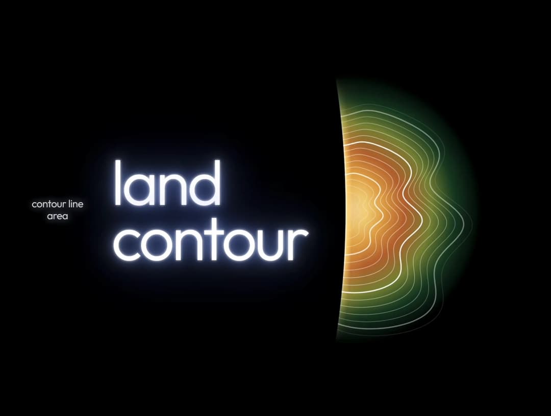
About
Elevation lines of the land, rippling outward from the peak.
Built with React and Tailwind. Copy the prompt and paste it into Claude Code, Cursor or Lovable: your agent adds Contour Line Light to your project and fits it to your theme.
Code
How Contour Line Light is used: the demo's code. The component's own source comes with a free account.
Usage.tsx
import { useEffect, useMemo, useRef } from "react";

// Contour lines: full organic rings around the left edge of the art area;
// the concave mask trims them, so every line ends exactly on the concave edge.
// Rings drift outward (to the right) while waving, and fade away.
const RINGS = 16;
const STEPS = 260;
const CX = 60;
const CY = 400;

type Ring = { d: string; opacity: number };

function ringGeometry(i: number, time: number): Ring {
  const u = (i + time * 0.7) % RINGS; // ring position, drifting outward over time
  const base = 18 + u * 11;
  let d = "";
  for (let s = 0; s <= STEPS; s++) {
    const t = -Math.PI + (s / STEPS) * 2 * Math.PI; // full ring: the concave mask trims it exactly on the curve
    const wob =
      1 +
      0.15 * Math.sin(2 * t + u * 0.05 - time * 0.6) +
      0.11 * Math.sin(3 * t + u * 0.05 + 1.3 - time * 0.45) +
      0.06 * Math.sin(5 * t + u * 0.05 - time * 0.8);
    const r = base * wob;
    const x =
      CX +
      r * Math.cos(t) * 1.35 +
      base * 0.1 * Math.sin(7 * t + u * 0.05 - time * 1.1);
    const y = CY + r * Math.sin(t);
    d += (s === 0 ? "M" : "L") + x.toFixed(1) + " " + y.toFixed(1);
  }
  const opacity = Math.pow(Math.sin((Math.PI * u) / RINGS), 0.7);
  return { d, opacity };
}

const css = `
@import url("https://fonts.googleapis.com/css2?family=Outfit:wght@300;400&display=swap");

.cs-root {
  --bg: #000000;
  --ink: #ffffff;
  --soft: rgba(255, 255, 255, 0.82);
  --line: rgba(255, 255, 255, 0.5);
  --line-strong: rgba(255, 255, 255, 0.95);
  box-sizing: border-box;
  position: relative;
  height: 100vh;
  height: 100dvh;
  padding-top: env(safe-area-inset-top, 0px);
  padding-bottom: env(safe-area-inset-bottom, 0px);
  background: var(--bg);
  color: var(--ink);
  color-scheme: dark;
  font-family: "Outfit", "Avenir Next", "Segoe UI", system-ui, sans-serif;
  font-weight: 300;
  overflow: hidden;
  display: grid;
  grid-template-rows: minmax(0, 1fr);
  grid-template-columns: minmax(0, 1.15fr) minmax(0, 1fr);
  align-items: center;
}
.cs-root *, .cs-root *::before, .cs-root *::after { box-sizing: inherit; }

.cs-copy {
  display: flex;
  align-items: center;
  gap: clamp(20px, 4vw, 64px);
  padding: 0 0 0 clamp(24px, 6vw, 96px);
  position: relative;
  z-index: 2;
}
.cs-meta {
  margin: 0;
  font-size: clamp(0.95rem, 1.5vw, 1.2rem);
  line-height: 1.15;
  letter-spacing: -0.02em;
  color: var(--soft);
  text-shadow: 0 0 10px rgba(180, 200, 255, 0.7);
  text-align: center;
  flex: none;
}
.cs-title {
  margin: 0;
  font-weight: 300;
  font-size: clamp(3rem, 9vw, 8rem);
  line-height: 0.88;
  letter-spacing: -0.045em;
  color: #fff;
  text-shadow:
    0 0 4px rgba(255, 255, 255, 0.95),
    0 0 16px rgba(170, 195, 255, 0.9),
    0 0 40px rgba(100, 140, 255, 0.85),
    0 0 90px rgba(80, 110, 255, 0.7);
}
.cs-title span { display: block; }

.cs-art {
  position: relative;
  align-self: stretch;
  min-height: 0;
}

/* half disc of light: straight side on the left, fading out to the right */
.cs-glow {
  --r: 34vh;
  position: absolute;
  left: 0;
  top: 50%;
  width: 100%;
  height: min(100%, 110vw);
  transform: translateY(-50%);
  background: radial-gradient(
    circle var(--r) at 14% 50%,
    #fff1c9 0%,
    #f2d27a 14%,
    #e0a444 26%,
    #b9692f 40%,
    #7f8a35 58%,
    rgba(47, 138, 74, 0.45) 74%,
    rgba(0, 0, 0, 0) 92%
  );
  -webkit-mask-image:
    linear-gradient(to bottom, transparent 0, #000 28%, #000 72%, transparent 100%),
    radial-gradient(ellipse 40% 72% at -26% 50%, transparent 99.6%, #000 100%);
  -webkit-mask-composite: source-in;
  mask-image:
    linear-gradient(to bottom, transparent 0, #000 28%, #000 72%, transparent 100%),
    radial-gradient(ellipse 40% 72% at -26% 50%, transparent 99.6%, #000 100%);
  mask-composite: intersect;
}

/* light edge curving inward, with a glowing rim */
.cs-rim {
  position: absolute;
  inset: 0;
  background: radial-gradient(
    ellipse 40% 72% at -26% 50%,
    transparent 99.6%,
    #fff6cc 100.3%,
    rgba(255, 216, 112, 0.8) 101.5%,
    rgba(224, 164, 68, 0.35) 106%,
    transparent 118%
  );
  -webkit-mask-image: linear-gradient(to bottom, transparent 20%, #000 38%, #000 62%, transparent 80%);
  mask-image: linear-gradient(to bottom, transparent 20%, #000 38%, #000 62%, transparent 80%);
}

.cs-art svg {
  position: absolute;
  inset: 0;
  width: 100%;
  height: 100%;
  display: block;
  -webkit-mask-image:
    linear-gradient(to right, #000 0, #000 55%, transparent 98%),
    radial-gradient(ellipse 40% 72% at -26% 50%, transparent 99.6%, #000 100%);
  -webkit-mask-composite: source-in;
  mask-image:
    linear-gradient(to right, #000 0, #000 55%, transparent 98%),
    radial-gradient(ellipse 40% 72% at -26% 50%, transparent 99.6%, #000 100%);
  mask-composite: intersect;
}

.cs-ring { fill: none; stroke: var(--line); stroke-width: 1; vector-effect: non-scaling-stroke; }
.cs-ring.cs-index { stroke: var(--line-strong); stroke-width: 1.8; }
.cs-draw { stroke-dasharray: 1; stroke-dashoffset: 1; animation: cs-draw 2.6s ease-out forwards; }
@keyframes cs-draw { to { stroke-dashoffset: 0; } }

@media (prefers-reduced-motion: reduce) {
  .cs-draw { animation: none; stroke-dashoffset: 0; }
}

@media (max-width: 720px) {
  .cs-root { grid-template-columns: 1fr; grid-template-rows: auto minmax(0, 1fr); align-items: start; }
  .cs-copy { padding: 56px 24px 8px; flex-direction: column; align-items: flex-start; gap: 16px; }
  .cs-meta { order: 2; text-align: left; }
  .cs-title { font-size: clamp(3.2rem, 20vw, 6rem); }
  .cs-art { min-height: 0; }
  .cs-glow { --r: 22vh; height: 100%; }
}
`;

export default function ContourStage() {
  const pathRefs = useRef<(SVGPathElement | null)[]>([]);

  // Initial frame (time = 0) so the first paint already shows the rings.
  const initial = useMemo(
    () => Array.from({ length: RINGS }, (_, i) => ringGeometry(i, 0)),
    []
  );

  useEffect(() => {
    if (window.matchMedia("(prefers-reduced-motion: reduce)").matches) return;

    let raf = 0;
    let start: number | null = null;

    const tick = (now: number) => {
      if (start === null) start = now;
      const time = (now - start) / 1000;
      for (let i = 0; i < RINGS; i++) {
        const el = pathRefs.current[i];
        if (!el) continue;
        const { d, opacity } = ringGeometry(i, time);
        el.setAttribute("d", d);
        el.style.opacity = opacity.toFixed(3);
      }
      raf = requestAnimationFrame(tick);
    };

    raf = requestAnimationFrame(tick);
    return () => cancelAnimationFrame(raf);
  }, []);

  return (
    <main className="cs-root">
      <style>{css}</style>

      <section className="cs-copy">
        <p className="cs-meta">
          contour line
          <br />
          area
        </p>
        <h1 className="cs-title">
          <span>land</span>
          <span>contour</span>
        </h1>
      </section>

      <div className="cs-art" aria-hidden="true">
        <div className="cs-glow" />
        <div className="cs-rim" />
        <svg viewBox="0 0 600 800" preserveAspectRatio="xMinYMid slice">
          {initial.map((ring, i) => (
            <path
              key={i}
              ref={(el) => {
                pathRefs.current[i] = el;
              }}
              d={ring.d}
              pathLength={1}
              className={"cs-ring cs-draw" + (i % 5 === 4 ? " cs-index" : "")}
              style={{ animationDelay: `${i * 0.07}s`, opacity: ring.opacity }}
            />
          ))}
        </svg>
      </div>
    </main>
  );
}More by pstzx
View all
Button Payment
114
Contour Land Map
29
Sign In Water Effect Glass
27
Card Dashboard Analytic
23
Contour line Mountain
22
Loading Screen Glass
15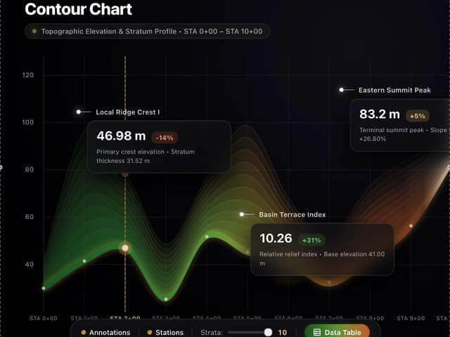
Contour Line Chart
14
21 st Contour Line
13
More in Shaders
View all
Glass Fold
499

Shader Animation
3.9K
Parallel Waves
13

Radial Shader
149
Phosphor 30
314

Stream Search
22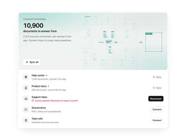

Illos Knowledge Sources
55

Paper design shader Background
700

