About
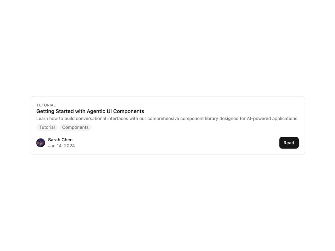
A compound blog post card that shows a cover image, category, title, excerpt, tags, author and a read-more button, with default, compact, horizontal and covered layout variants.
Built with React and Tailwind. Copy the prompt and paste it into Claude Code, Cursor or Lovable: your agent adds Post Card to your project and fits it to your theme.
Code
How Post Card is used: the demo's code. The component's own source comes with a free account.
Usage.tsx
"use client";

import { PostCard, PostCardContent } from "@/components/ui/post-card";

export default function PostCardWithoutImageDemo() {
  return (
    <PostCard appearance={{ showImage: false }}>
      <PostCardContent />
    </PostCard>
  );
}
More by shadcn-labs
View all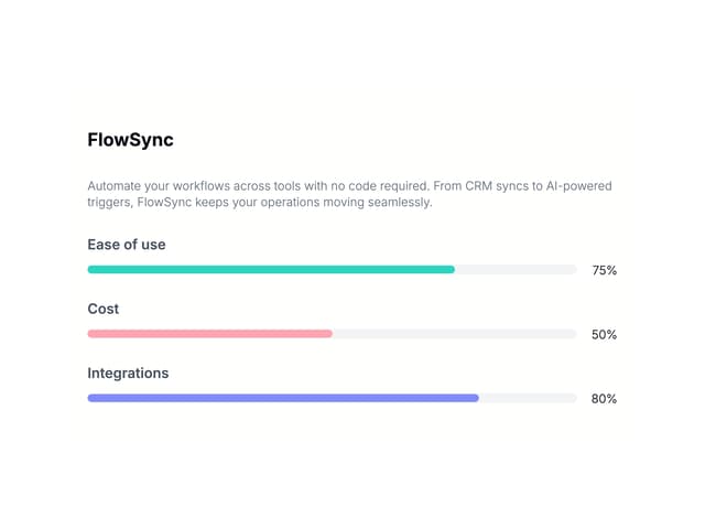

Email Progress Bar
4
PDF Stack
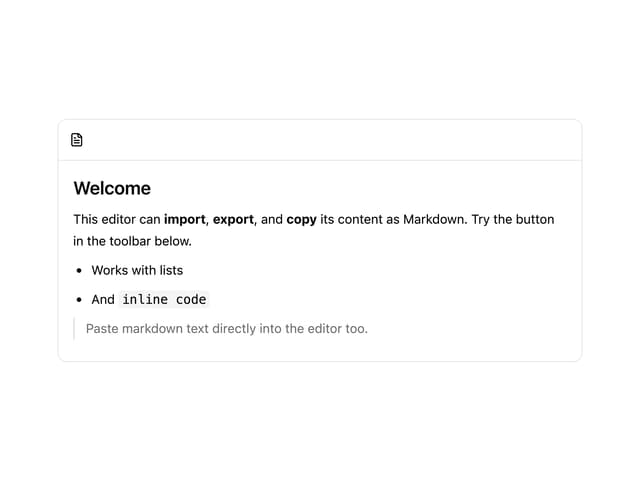
Markdown Toolbar
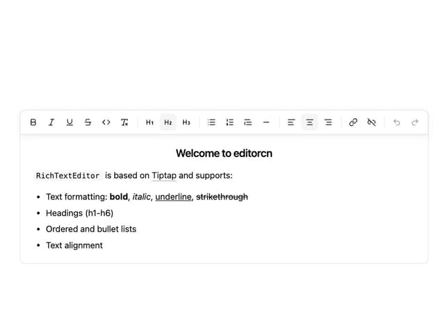
Rich Text Editor
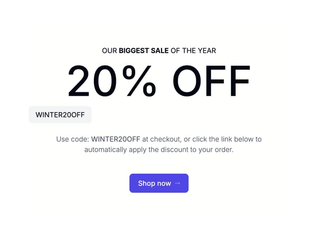
Coupons With Centered Text
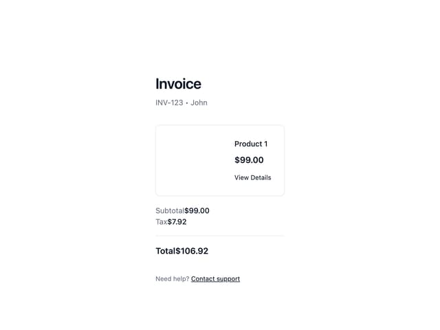
Stripe Receipt Email
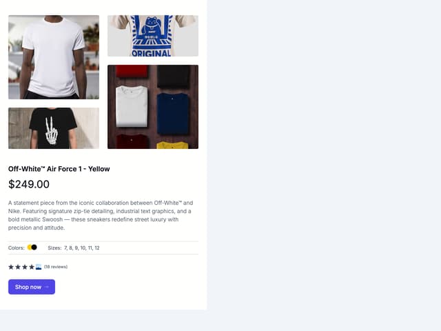
Masonry Product Detail

Post List
More in Cards
View all

Course Design Cards
1.3K

Statistics Card 7
327
Statistics Card 2
305

Interactive Tech Stack Bento Grid with Hover Effects
625

Card Studio
5
The Item one
4

Weather Card
65

Card
9