About
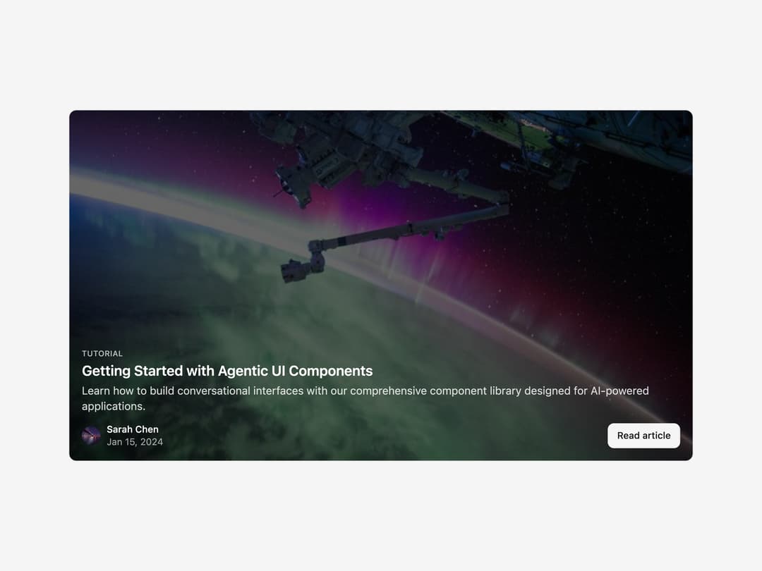
A compound blog post card that shows a cover image, category, title, excerpt, tags, author and a read-more button, with default, compact, horizontal and covered layout variants.
Built with React and Tailwind. Copy the prompt and paste it into Claude Code, Cursor or Lovable: your agent adds Post Card to your project and fits it to your theme.
Code
How Post Card is used: the demo's code. The component's own source comes with a free account.
Usage.tsx
"use client";

import { PostCard, PostCardContent } from "@/components/ui/post-card";

export default function PostCardCoveredDemo() {
  return (
    <PostCard appearance={{ variant: "covered" }}>
      <PostCardContent />
    </PostCard>
  );
}
More by shadcn-labs
View all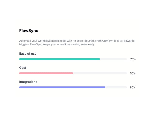

Email Progress Bar
4
PDF Stack
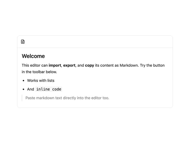
Markdown Toolbar
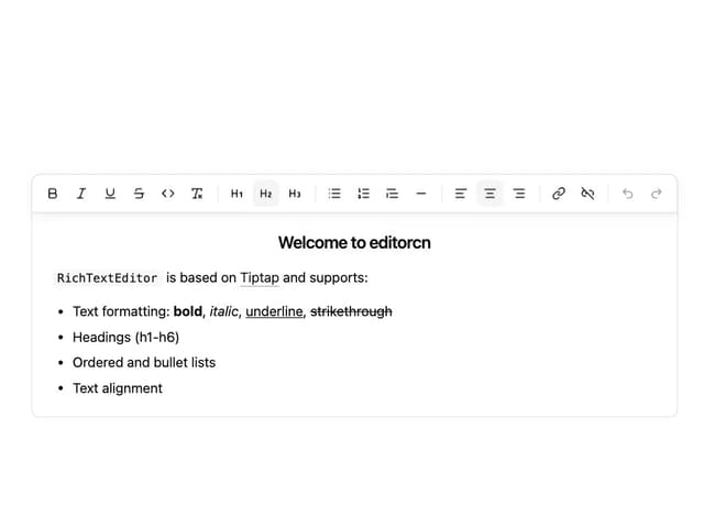
Rich Text Editor
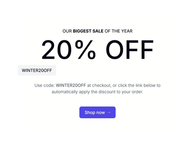
Coupons With Centered Text
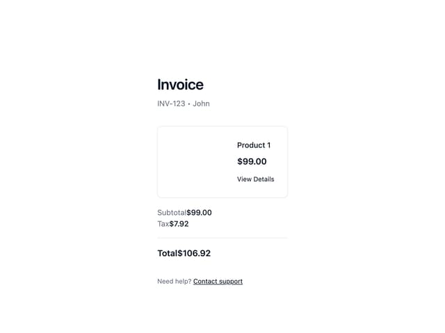
Stripe Receipt Email
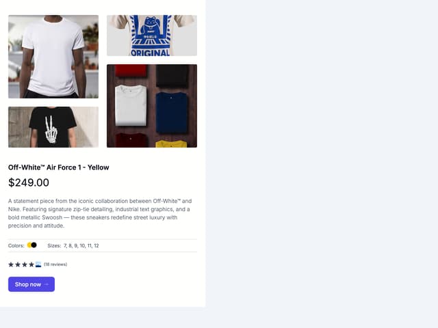
Masonry Product Detail

Post List
More in Heroes
View all

Responsive Hero Banner
2.2K

SaaS Template
2.7K

Hero
1.3K
Centered Hero with Image Fan
1.1K
Editorial Collage Hero
507

Hero Section
445

Aero Hero-3
618
Hero with group of images, text and two buttons
442
