
About
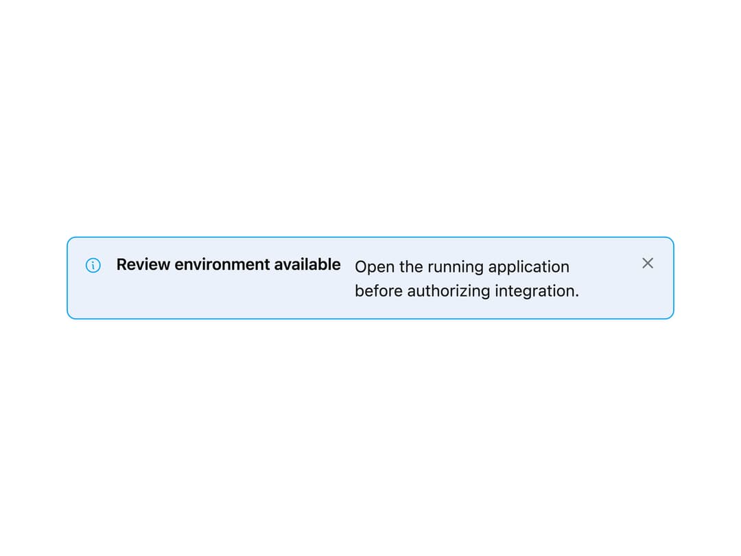
A dismissible page/content banner with info, warning, danger and success variants for surfacing status messages above content.
Built with React and Tailwind. Copy the prompt and paste it into Claude Code, Cursor or Lovable: your agent adds Banner to your project and fits it to your theme.
Code
How Banner is used: the demo's code. The component's own source comes with a free account.
Usage.tsx
import {
  Banner,
  BannerIcon,
  BannerTitle,
  BannerDescription,
  BannerDismiss,
} from "@/components/ui/banner";
import { Info } from "@phosphor-icons/react";

export default function BannerDemo() {
  return (
    <div className="w-full max-w-xl p-6">
      <Banner variant="info" dismissible>
        <BannerIcon>
          <Info size={16} />
        </BannerIcon>
        <BannerTitle>Review environment available</BannerTitle>
        <BannerDescription>
          Open the running application before authorizing integration.
        </BannerDescription>
        <BannerDismiss aria-label="Dismiss review banner" />
      </Banner>
    </div>
  );
}
Dependencies
More by russellbloxwich
View all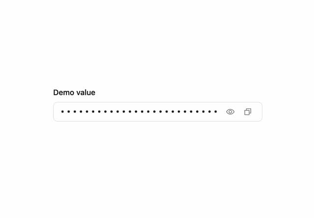
Sensitive Input
5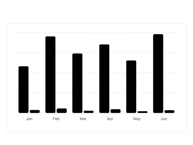
Chart
4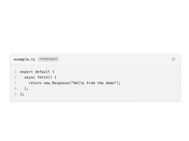
Code Block
4
Layer Card
3
Meter
1
Field
1
Direction Provider
1
Toast Notifications
1
More in Dashboards
View all
Dashboard with Collapsible Sidebar
2.6K
Stat Card
46

Sidebar
392

Chart Component
11

SaaS Template
2.7K

Fitness Bento Grid
42

Financial Bento Grid
129

Course Design Cards
1.3K

