About
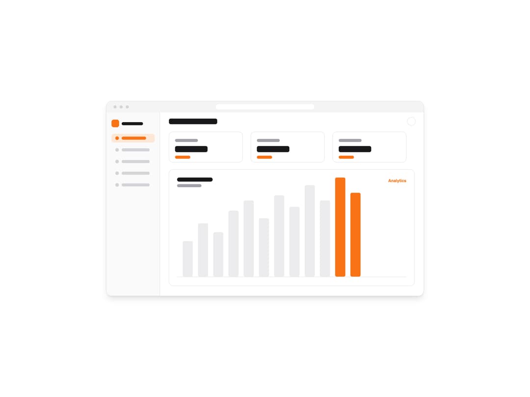
A theme-aware image component that automatically swaps between light and dark screenshots based on the active color scheme.
Built with React and Tailwind. Copy the prompt and paste it into Claude Code, Cursor or Lovable: your agent adds Screenshot to your project and fits it to your theme.
Code
How Screenshot is used: the demo's code. The component's own source comes with a free account.
Usage.tsx
import Screenshot from "@/components/ui/screenshot";

type Palette = {
  bg: string;
  chrome: string;
  sidebar: string;
  card: string;
  cardBorder: string;
  heading: string;
  muted: string;
  track: string;
  accent: string;
  accentSoft: string;
  dot: string;
  label: string;
};

const light: Palette = {
  bg: "#ffffff",
  chrome: "#f4f4f5",
  sidebar: "#fafafa",
  card: "#ffffff",
  cardBorder: "#e4e4e7",
  heading: "#18181b",
  muted: "#a1a1aa",
  track: "#ececee",
  accent: "#f97316",
  accentSoft: "#fdE7d6",
  dot: "#d4d4d8",
  label: "Analytics",
};

const dark: Palette = {
  bg: "#09090b",
  chrome: "#18181b",
  sidebar: "#0f0f11",
  card: "#141416",
  cardBorder: "#27272a",
  heading: "#fafafa",
  muted: "#71717a",
  track: "#27272a",
  accent: "#fb923c",
  accentSoft: "#3a2410",
  dot: "#3f3f46",
  label: "Analytics",
};

const dashboard = (p: Palette) => {
  const bars = [140, 210, 175, 260, 300, 230, 320, 275, 360, 300, 390, 330];
  const baseY = 690;
  const barW = 40;
  const gap = 20;
  const startX = 300;

  const barSvg = bars
    .map((h, i) => {
      const x = startX + i * (barW + gap);
      const isPeak = i >= bars.length - 2;
      return `<rect x='${x}' y='${baseY - h}' width='${barW}' height='${h}' rx='6' fill='${
        isPeak ? p.accent : p.track
      }'/>`;
    })
    .join("");

  const nav = [0, 1, 2, 3, 4]
    .map((i) => {
      const y = 128 + i * 46;
      const active = i === 0;
      return (
        `<rect x='20' y='${y}' width='170' height='34' rx='9' fill='${
          active ? p.accentSoft : "transparent"
        }'/>` +
        `<circle cx='42' cy='${y + 17}' r='7' fill='${active ? p.accent : p.dot}'/>` +
        `<rect x='60' y='${y + 11}' width='${active ? 96 : 110}' height='12' rx='6' fill='${
          active ? p.accent : p.dot
        }'/>`
      );
    })
    .join("");

  const cards = [0, 1, 2]
    .map((i) => {
      const x = 246 + i * 322;
      return (
        `<rect x='${x}' y='120' width='290' height='120' rx='16' fill='${p.card}' stroke='${p.cardBorder}' stroke-width='1.5'/>` +
        `<rect x='${x + 24}' y='148' width='90' height='12' rx='6' fill='${p.muted}'/>` +
        `<rect x='${x + 24}' y='176' width='128' height='24' rx='7' fill='${p.heading}'/>` +
        `<rect x='${x + 24}' y='214' width='60' height='12' rx='6' fill='${p.accent}'/>`
      );
    })
    .join("");

  return (
    "data:image/svg+xml," +
    encodeURIComponent(
      `<svg xmlns='http://www.w3.org/2000/svg' width='1248' height='765' viewBox='0 0 1248 765'>` +
        `<rect width='1248' height='765' fill='${p.bg}'/>` +
        // browser chrome
        `<rect width='1248' height='44' fill='${p.chrome}'/>` +
        `<circle cx='34' cy='22' r='6' fill='${p.dot}'/><circle cx='58' cy='22' r='6' fill='${p.dot}'/><circle cx='82' cy='22' r='6' fill='${p.dot}'/>` +
        `<rect x='430' y='12' width='388' height='20' rx='10' fill='${p.bg}'/>` +
        // sidebar
        `<rect x='0' y='44' width='210' height='721' fill='${p.sidebar}'/>` +
        `<line x1='210' y1='44' x2='210' y2='765' stroke='${p.cardBorder}' stroke-width='1.5'/>` +
        `<rect x='20' y='72' width='30' height='30' rx='9' fill='${p.accent}'/>` +
        `<rect x='60' y='82' width='84' height='12' rx='6' fill='${p.heading}'/>` +
        nav +
        // header
        `<rect x='246' y='68' width='190' height='22' rx='7' fill='${p.heading}'/>` +
        `<circle cx='1200' cy='79' r='16' fill='${p.card}' stroke='${p.cardBorder}' stroke-width='1.5'/>` +
        // stat cards
        cards +
        // chart panel
        `<rect x='246' y='268' width='966' height='458' rx='16' fill='${p.card}' stroke='${p.cardBorder}' stroke-width='1.5'/>` +
        `<rect x='278' y='300' width='140' height='16' rx='8' fill='${p.heading}'/>` +
        `<rect x='278' y='326' width='96' height='12' rx='6' fill='${p.muted}'/>` +
        `<text x='1180' y='318' font-family='sans-serif' font-size='16' font-weight='600' fill='${p.accent}' text-anchor='end'>${p.label}</text>` +
        barSvg +
        `<line x1='278' y1='691' x2='1180' y2='691' stroke='${p.cardBorder}' stroke-width='1.5'/>` +
        `</svg>`,
    )
  );
};

export default function ScreenshotDemo() {
  return (
    <div className="flex w-full items-center justify-center bg-background p-8">
      <div className="w-full max-w-3xl overflow-hidden rounded-xl border border-border shadow-lg">
        <Screenshot
          srcLight={dashboard(light)}
          srcDark={dashboard(dark)}
          alt="Theme-aware analytics dashboard screenshot"
          width={1248}
          height={765}
          loading="eager"
          className="w-full"
        />
      </div>
    </div>
  );
}
Dependencies
More by Mikolaj Dobrucki
View all

Hero Section
1.4K
CTA with Rectangle
287
Pricing Section
201
CTA with Glow
156
Mockup
45
More in Dashboards
View all
Dashboard with Collapsible Sidebar
2.6K
Stat Card
46

Sidebar
392

Chart Component
11

SaaS Template
2.7K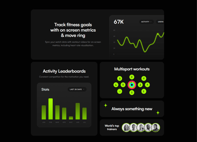

Fitness Bento Grid
42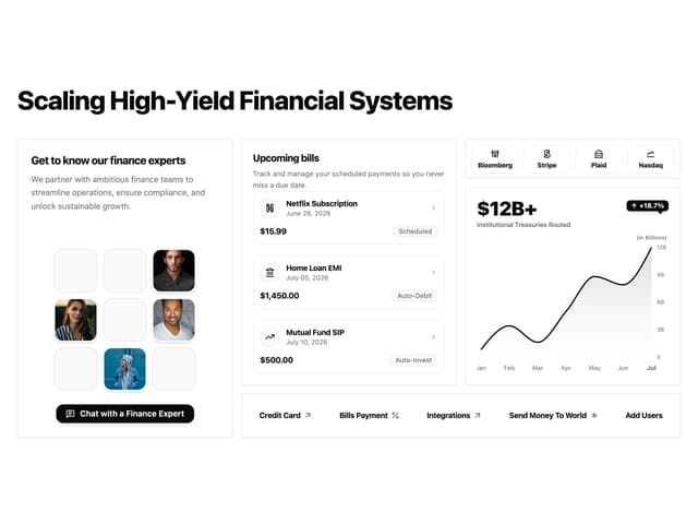

Financial Bento Grid
129

Course Design Cards
1.3K

