
About
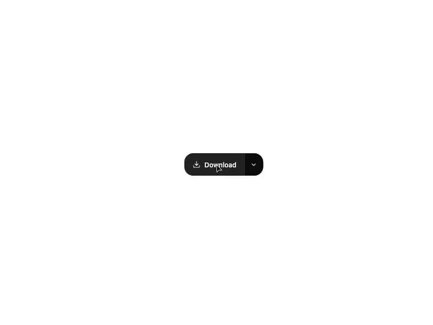
A primary action button paired with a dropdown trigger that reveals a menu of related alternative actions.
Built with React and Tailwind. Copy the prompt and paste it into Claude Code, Cursor or Lovable: your agent adds Split Button to your project and fits it to your theme.
Code
How Split Button is used: the demo's code. The component's own source comes with a free account.
Usage.tsx
"use client";

import SplitButton from "@/components/ui/split-button";
import { Download, Copy, Trash2 } from "lucide-react";

export default function SplitButtonDemo() {
  return (
    <div className="flex min-h-[200px] w-full items-center justify-center bg-background p-10">
      <SplitButton
        label="Download"
        icon={<Download size={16} strokeWidth={1.8} />}
        actions={[
          { label: "Copy link", icon: <Copy size={15} strokeWidth={1.8} /> },
          { label: "Duplicate" },
          {
            label: "Delete",
            destructive: true,
            icon: <Trash2 size={15} strokeWidth={1.8} />,
          },
        ]}
      />
    </div>
  );
}
Dependencies
More by kuratlielia
View all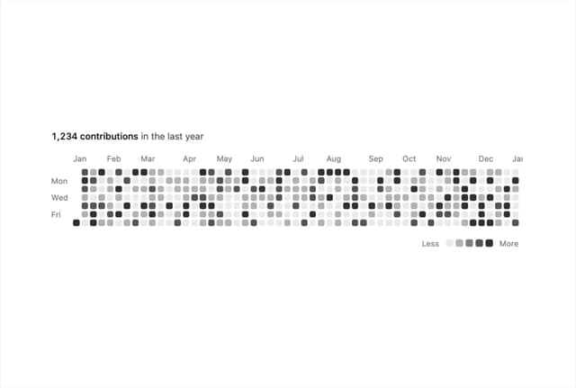
Activity Heatmap
511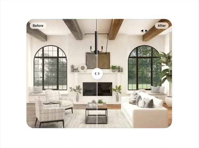
Image Compare
182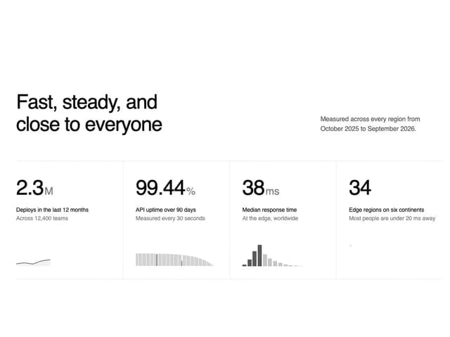
Stats Band
128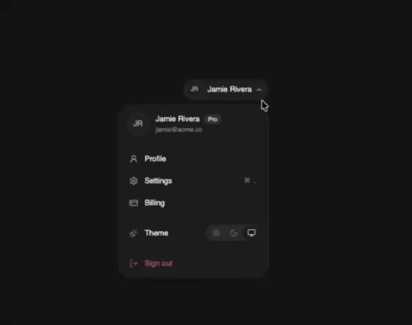
User Menu
112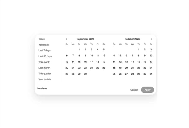
Date Range Picker
91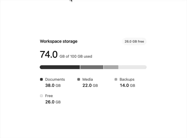
Usage Meter
72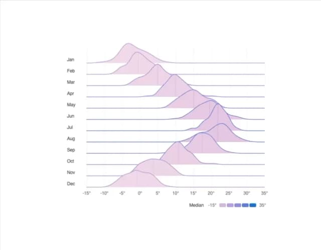
Ridgeline Chart
55
Timeline
55
More in Buttons
View all
Texture Button
108
Button
14

Notification Button
117

HeroUI Button Group
2

Eclipse Button
44
Button Save
50

App Store Button
484

Base Button
1


