
About
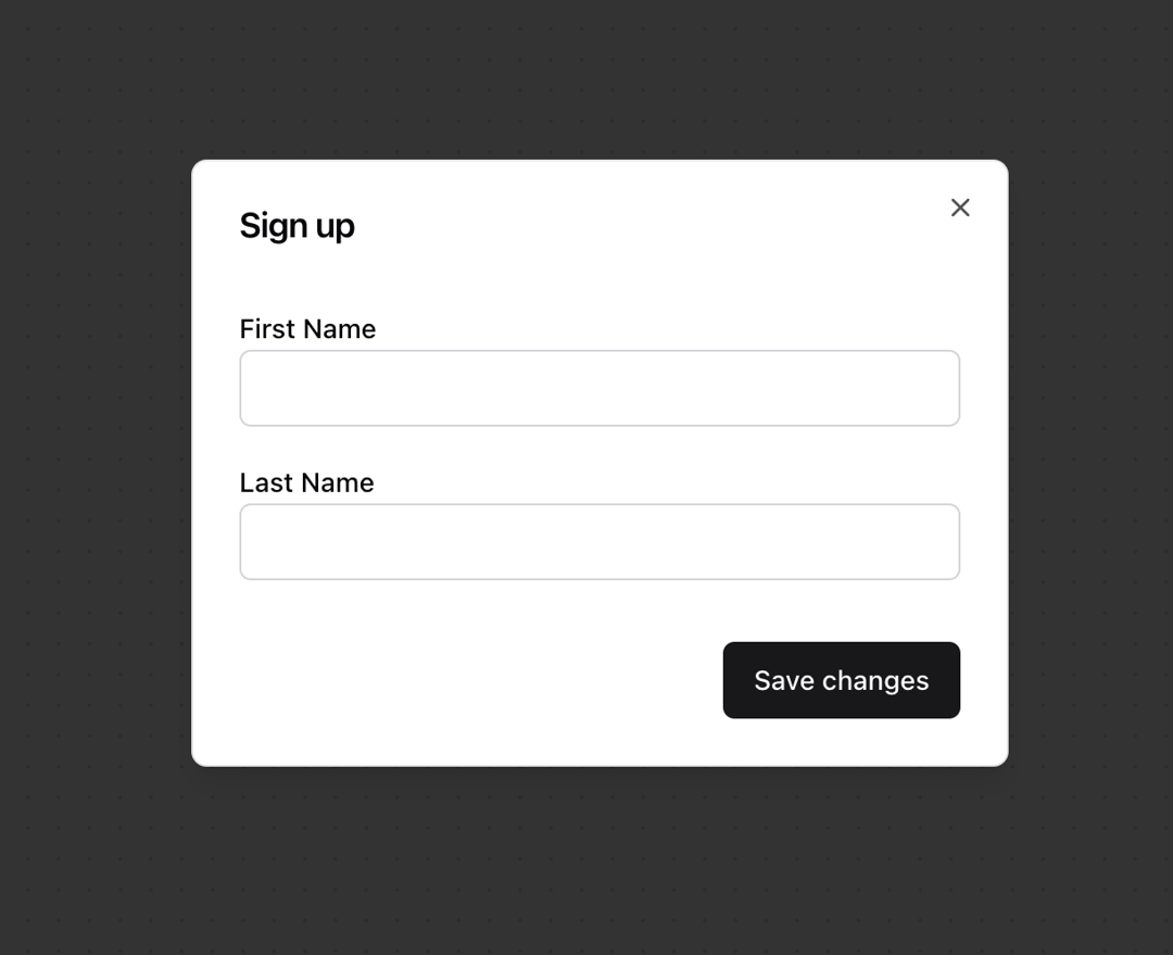
A dialog is an overlay shown above other content in an application. The HTML <dialog> element can be used to build dialogs. However, it is not yet widely supported across browsers, and building fully accessible custom dialogs from scratch is very difficult and error prone. Dialog helps achieve accessible dialogs that can be styled as needed.
Built with React and Tailwind. Copy the prompt and paste it into Claude Code, Cursor or Lovable: your agent adds Dialog [react-aria-components] to your project and fits it to your theme.
Code
How Dialog [react-aria-components] is used: the demo's code. The component's own source comes with a free account.
Usage.tsx
import { Button } from "@/components/ui/button"
import {
  DialogContent,
  DialogFooter,
  DialogHeader,
  DialogOverlay,
  DialogTitle,
  DialogTrigger,
} from "@/components/ui/dialog"
import { Label } from "@/components/ui/field"
import { Input, TextField } from "@/components/ui/textfield"

export function DialogDemo() {
  return (
    <DialogTrigger>
      <Button variant="outline">Sign up...</Button>
      <DialogOverlay>
        <DialogContent className="sm:max-w-[425px]">
          {({ close }) => (
            <>
              <DialogHeader>
                <DialogTitle>Sign up</DialogTitle>
              </DialogHeader>
              <div className="grid gap-4 py-4">
                <TextField autoFocus>
                  <Label>First Name</Label>
                  <Input />
                </TextField>
                <TextField>
                  <Label>Last Name</Label>
                  <Input />
                </TextField>
              </div>
              <DialogFooter>
                <Button onPress={close} type="submit">
                  Save changes
                </Button>
              </DialogFooter>
            </>
          )}
        </DialogContent>
      </DialogOverlay>
    </DialogTrigger>
  )
}
Dependencies
More by James Shopland
View all
Tag Group [react-aria-components]
99
Date Range Picker [react-aria-components]
90
Grid List [react-aria-components]
75
Switch [react-aria-components]
71
Select [react-aria-components]
48
Range Calendar [react-aria-components]
40
Menu
37
Popover
36
More in Buttons
View all
Texture Button
108
Button
14

Notification Button
117

HeroUI Button Group
2

Eclipse Button
44
Button Save
50

App Store Button
484

Base Button
1


