
About
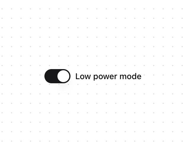
A switch allows a user to turn a setting on or off. There is no native HTML element with switch styling. <input type="checkbox"> is the closest semantically, but isn't styled or exposed to assistive technology as a switch. Switch helps achieve accessible switches that can be styled as needed.
Built with React and Tailwind. Copy the prompt and paste it into Claude Code, Cursor or Lovable: your agent adds Switch [react-aria-components] to your project and fits it to your theme.
Code
How Switch [react-aria-components] is used: the demo's code. The component's own source comes with a free account.
Usage.tsx
import { Switch } from "@/components/ui/switch"

export function SwitchDemo() {
  return <Switch>Low power mode</Switch>
}
Dependencies
More by James Shopland
View all
Tag Group [react-aria-components]
99
Date Range Picker [react-aria-components]
90
Grid List [react-aria-components]
75
Select [react-aria-components]
48
Range Calendar [react-aria-components]
40
Menu
37
Popover
36
Slider [react-aria-components]
34
More in Forms
View all

Login 1
63

Premium Auth
570

Contact Card
1.1K

Form
18

Book A Demo 1
91
Authentication Card
52

Card Studio
47

Login Card
35
