
About
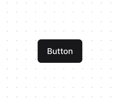
A button allows a user to perform an action, with mouse, touch, and keyboard interactions. On the surface, building a custom styled button seems simple. However, there are many cross browser inconsistencies in interactions and accessibility features to consider. Button handles all of these interactions for you, so you can focus on the styling.
Built with React and Tailwind. Copy the prompt and paste it into Claude Code, Cursor or Lovable: your agent adds Button [react-aria-components] to your project and fits it to your theme.
Code
How Button [react-aria-components] is used: the demo's code. The component's own source comes with a free account.
Usage.tsx
import { Button } from "@/components/ui/button"

export function ButtonDemo() {
  return <Button>Button</Button>
}
Dependencies
More by James Shopland
View all
Tag Group [react-aria-components]
99
Date Range Picker [react-aria-components]
90
Grid List [react-aria-components]
75
Switch [react-aria-components]
71
Select [react-aria-components]
48
Range Calendar [react-aria-components]
40
Menu
37
Popover
36
More in Buttons
View all
Texture Button
108
Button
14

Notification Button
117

HeroUI Button Group
2

Eclipse Button
44
Button Save
50

App Store Button
484

Base Button
1


