
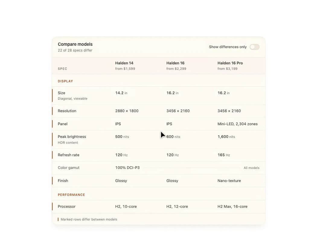
About
A comparison table for showing product specs side by side across up to three variants, with a toggle to show only the differing rows and a stacked layout on narrow screens.
Built with React and Tailwind. Copy the prompt and paste it into Claude Code, Cursor or Lovable: your agent adds Spec Sheet to your project and fits it to your theme.
Code
How Spec Sheet is used: the demo's code. The component's own source comes with a free account.
Usage.tsx
import { SpecSheet } from "@/components/ui/spec-sheet";

export default function SpecSheetDemo() {
  return (
    <div className="w-full max-w-3xl p-4">
      <SpecSheet />
    </div>
  );
}
Dependencies
More by Isaiah
View all
Agent Plan
2.2K
Voice Powered Orb
1.5K
Video Scroll Hero
1.4K
Reveal Text
1.1K
Portfolio Gallery
981
Leads Data Table
970
Message Dock
860
Ruler Carousel
664
More in Pricing
View all
Pricing Section
691
Colorful-Pricing
93

Pricing Section
201

Pricing Card
391
pricing section
175

RuixenPricing05
117
Single Pricing Card
818

Pricing Cards
33


