
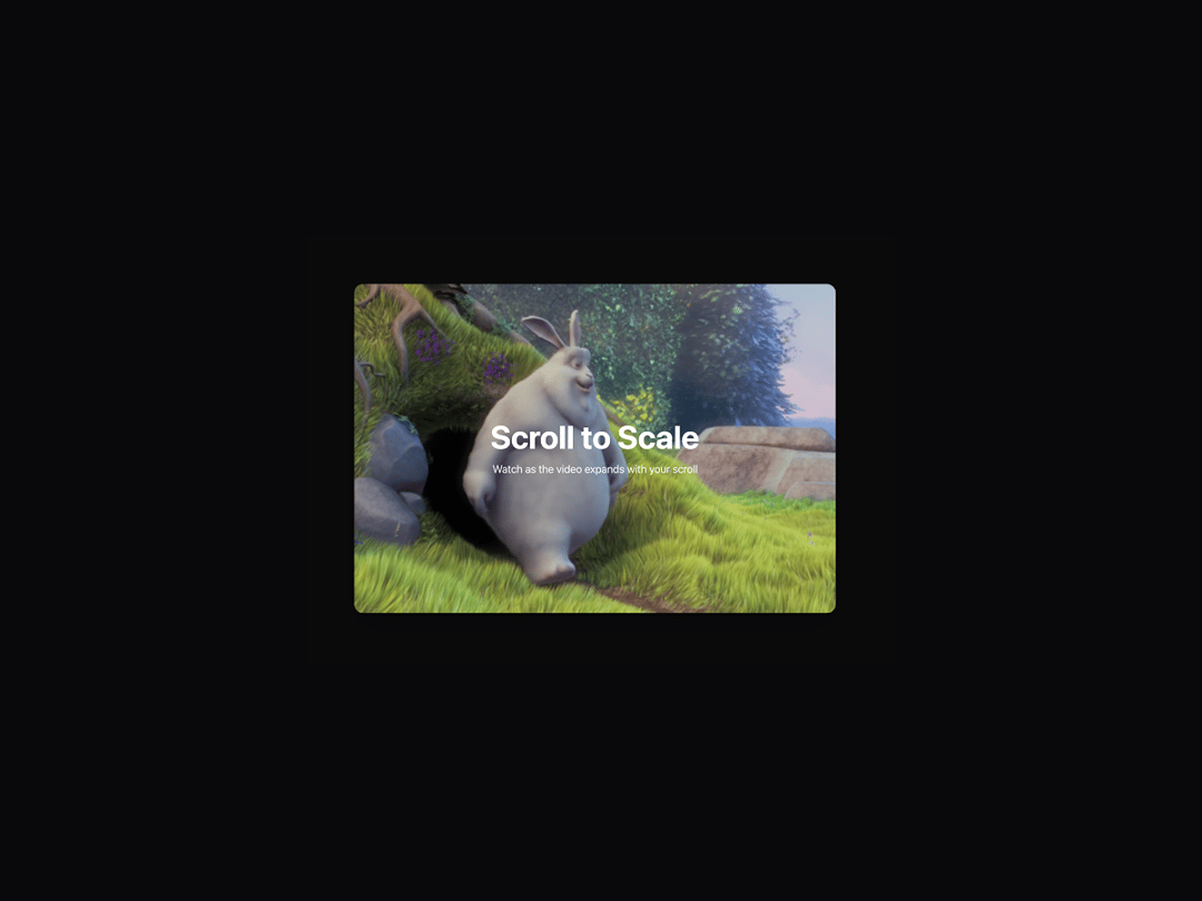
The Video Scroll Hero component creates an engaging scroll-triggered video scaling effect where a video starts at a very small size (25% scale) and smoothly expands to full size as users scroll down the page. The video remains fixed in the center of the screen during scaling, providing a cinematic experience that draws attention to the content while maintaining smooth performance through direct CSS transforms. This component is perfect for hero sections, product showcases, or any landing page where you want to create an immersive first impression that encourages users to explore further content below.
Built with React and Tailwind. Copy the prompt and paste it into Claude Code, Cursor or Lovable: your agent adds Video Scroll Hero to your project and fits it to your theme.
Code
How Video Scroll Hero is used: the demo's code. The component's own source comes with a free account.
Usage.tsx
import { VideoScrollHero } from "@/components/ui/video-scroll-hero";
import { motion } from "framer-motion";

export default function VideoScrollHeroPage() {
  return (
    <div className="min-h-screen">
      <VideoScrollHero />

      {/* Next Section */}
      <motion.section
        className="relative bg-muted -mt-8 rounded-t-3xl min-h-screen"
        initial={{ opacity: 0, y: 50 }}
        whileInView={{ opacity: 1, y: 0 }}
        viewport={{ once: true, margin: "-100px" }}
        transition={{
          duration: 0.8,
          type: "spring",
          stiffness: 200,
          damping: 25,
        }}
      >
        <div className="container mx-auto px-8 py-24">
          <div className="max-w-4xl mx-auto text-center">
            <motion.h2
              className="text-3xl md:text-5xl font-bold mb-8 text-foreground"
              initial={{ opacity: 0, y: 30 }}
              whileInView={{ opacity: 1, y: 0 }}
              viewport={{ once: true }}
              transition={{
                delay: 0.2,
                duration: 0.8,
                type: "spring",
                stiffness: 200,
                damping: 25,
              }}
            >
              Next Section
            </motion.h2>
            <motion.p
              className="text-lg md:text-xl text-muted-foreground mb-12"
              initial={{ opacity: 0, y: 20 }}
              whileInView={{ opacity: 1, y: 0 }}
              viewport={{ once: true }}
              transition={{
                delay: 0.4,
                duration: 0.8,
                type: "spring",
                stiffness: 200,
                damping: 25,
              }}
            >
              The video has reached full size and now you can continue scrolling through the rest of the content.
            </motion.p>

            {/* Demo Content Cards */}
            <div className="grid grid-cols-1 md:grid-cols-3 gap-8">
              {[1, 2, 3].map((item, index) => (
                <motion.div
                  key={item}
                  className="bg-card p-6 rounded-xl border border-border/50 shadow-sm"
                  initial={{ opacity: 0, y: 30, scale: 0.95 }}
                  whileInView={{ opacity: 1, y: 0, scale: 1 }}
                  viewport={{ once: true }}
                  transition={{
                    delay: 0.6 + index * 0.1,
                    duration: 0.8,
                    type: "spring",
                    stiffness: 300,
                    damping: 25,
                  }}
                  whileHover={{
                    scale: 1.05,
                    y: -5,
                    transition: { type: "spring", stiffness: 400, damping: 25 }
                  }}
                >
                  <div className="w-12 h-12 bg-primary/10 rounded-lg flex items-center justify-center mb-4">
                    <div className="w-6 h-6 bg-primary rounded" />
                  </div>
                  <h3 className="text-xl font-semibold mb-2 text-foreground">
                    Feature {item}
                  </h3>
                  <p className="text-muted-foreground">
                    Lorem ipsum dolor sit amet, consectetur adipiscing elit.
                    Sed do eiusmod tempor incididunt ut labore.
                  </p>
                </motion.div>
              ))}
            </div>
          </div>
        </div>
      </motion.section>
    </div>
  );
}
Dependencies
More by Isaiah
View all
Agent Plan
2.2K
Voice Powered Orb
1.5K
Reveal Text
1.1K
Portfolio Gallery
981
Leads Data Table
970
Message Dock
860
Ruler Carousel
664
Coach Scheduling Card
546
More in Heroes
View all

Responsive Hero Banner
2.2K

SaaS Template
2.7K

Hero
1.3K
Centered Hero with Image Fan
1.1K
Editorial Collage Hero
504

Aero Hero-3
617

Hero Section
445
Hero with group of images, text and two buttons
442
