
About
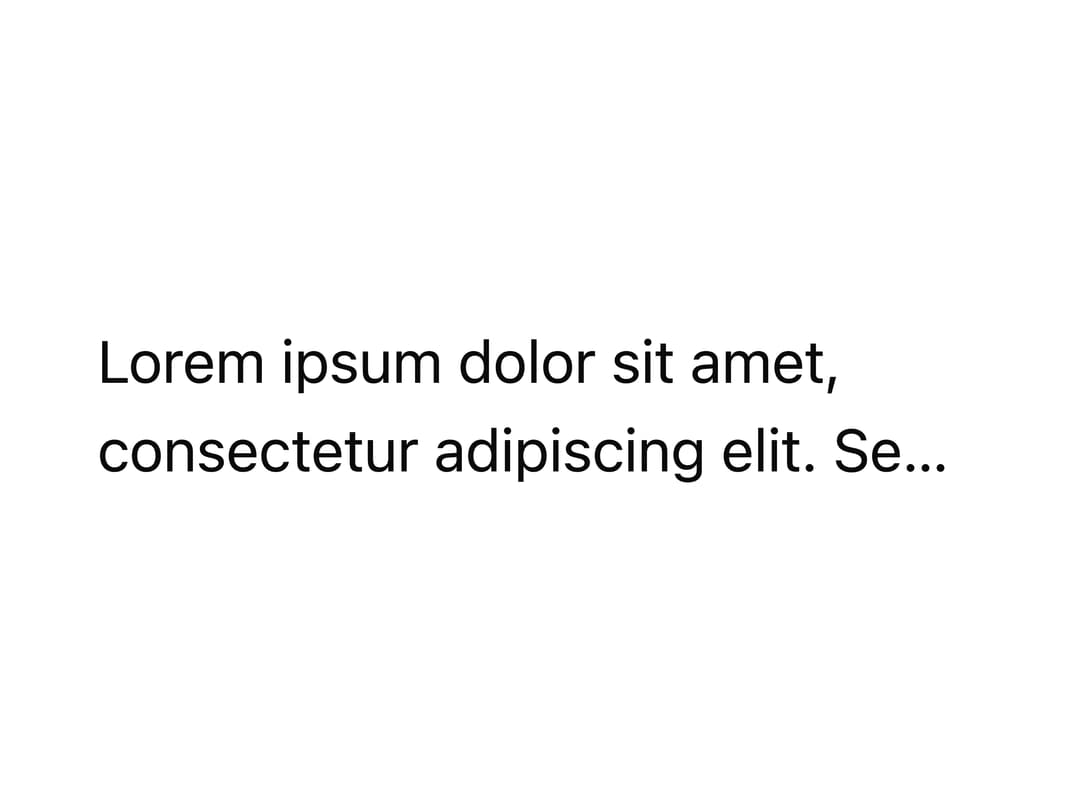
A polymorphic text component with semantic heading/body/caption variants, weight, alignment, truncation and line-clamp options for consistent typographic styles.
Built with React and Tailwind. Copy the prompt and paste it into Claude Code, Cursor or Lovable: your agent adds Typography to your project and fits it to your theme.
Code
How Typography is used: the demo's code. The component's own source comes with a free account.
Usage.tsx
import { Typography } from "@/components/ui/typography";

export default function TypographyMaxLinesDemo() {
  return (
    <Typography maxLines={2} style={{ maxWidth: 240 }}>
      Lorem ipsum dolor sit amet, consectetur adipiscing elit. Sed do eiusmod
      tempor incididunt ut labore.
    </Typography>
  );
}
More by dixant
View all
Tooltip
1
Select
Avatar
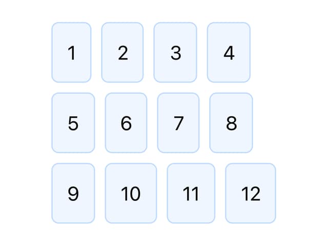
Stack
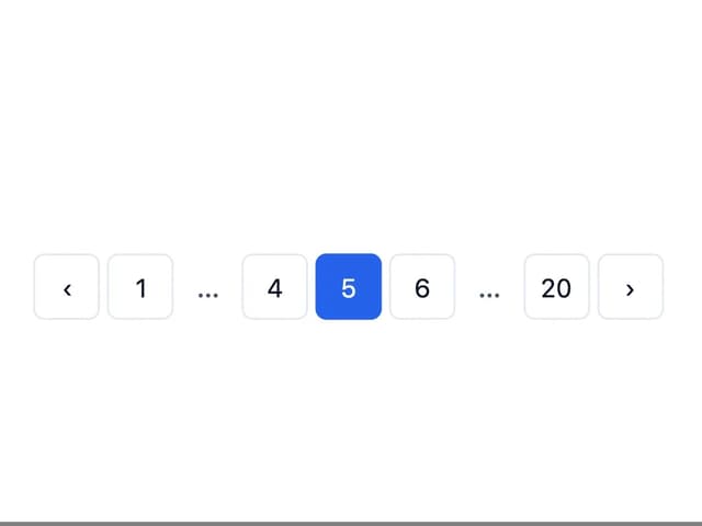
Pagination
Skeleton
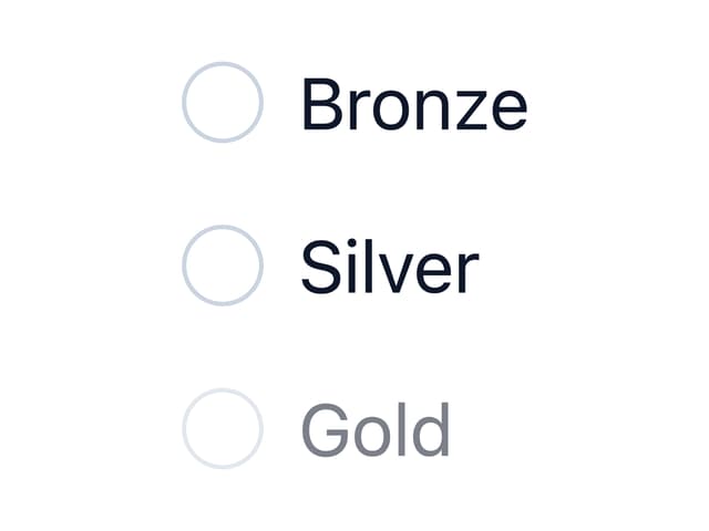
Radio Group

Icon
More in Text
View all
Motion Blur Text
45

Rainbow Text Effect
58

Text Reveal
29
Blur Reveal
73

Short Slide Down
45
Apple Hello Effect
659

Scroll Fill Headline
14

Blur Reveal
364

