
About
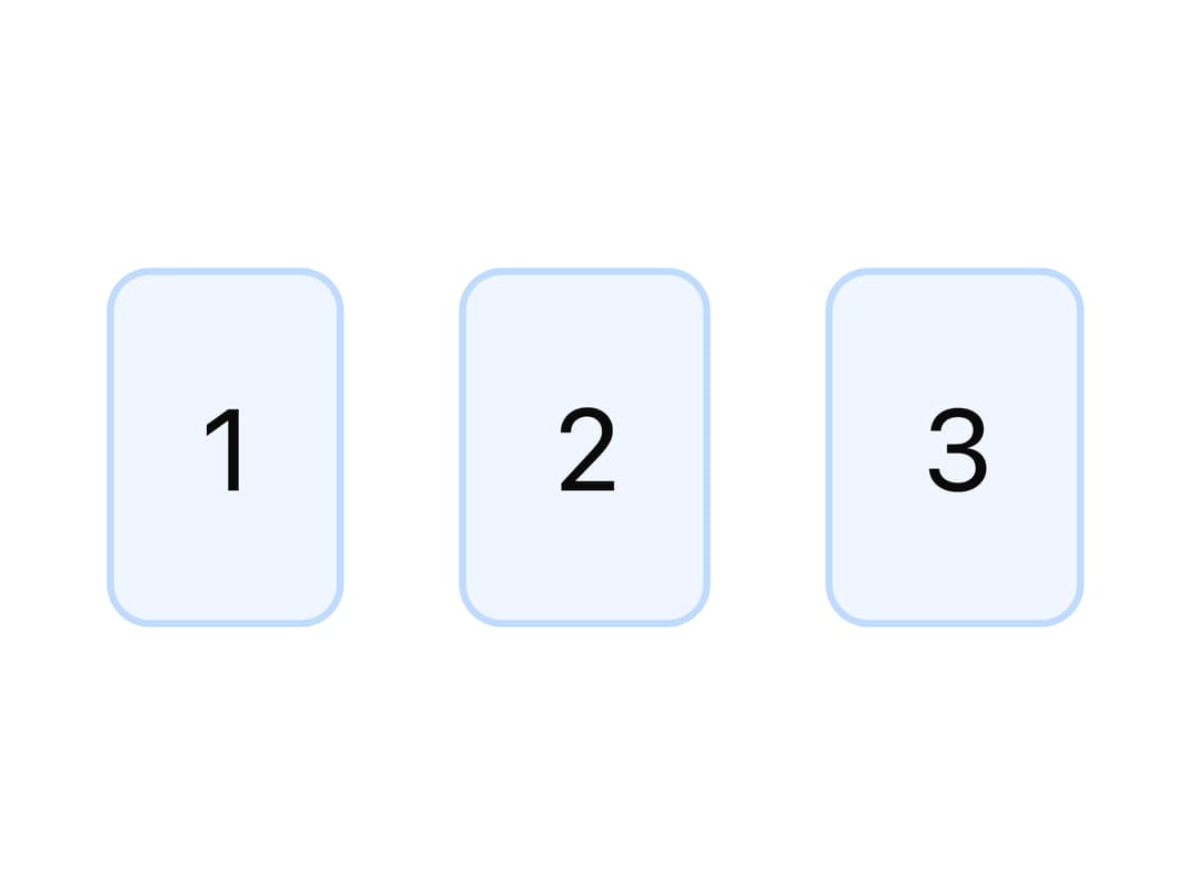
A flexbox layout primitive that arranges children vertically or horizontally with configurable gap, alignment, justification and wrapping.
Built with React and Tailwind. Copy the prompt and paste it into Claude Code, Cursor or Lovable: your agent adds Stack to your project and fits it to your theme.
Code
How Stack is used: the demo's code. The component's own source comes with a free account.
Usage.tsx
import { Stack } from "@/components/ui/stack";

const Box = ({ label }: { label: string }) => (
  <div
    style={{
      padding: 12,
      background: "var(--tatva-color-primary-50)",
      border: "1px solid var(--tatva-color-primary-200)",
      borderRadius: 6,
      color: "var(--tatva-color-neutral-900)",
    }}
  >
    {label}
  </div>
);

export default function StackHorizontalDemo() {
  return (
    <Stack direction="horizontal" gap="4">
      <Box label="1" />
      <Box label="2" />
      <Box label="3" />
    </Stack>
  );
}
More by dixant
View all
Tooltip
1
Select
Typography
Avatar
Pagination
Skeleton
Radio Group

Icon