
About
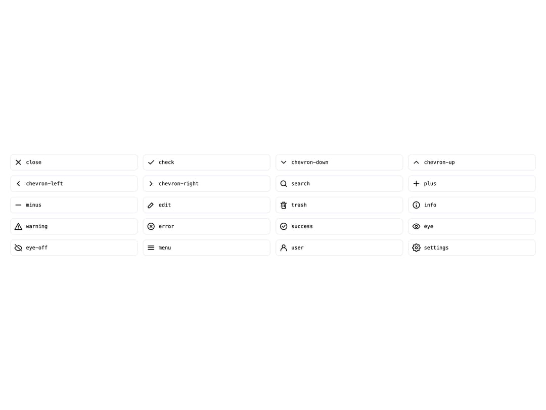
A lightweight SVG icon component that renders any icon from a small built-in outline icon set by name, with configurable size and color.
Built with React and Tailwind. Copy the prompt and paste it into Claude Code, Cursor or Lovable: your agent adds Icon to your project and fits it to your theme.
Code
How Icon is used: the demo's code. The component's own source comes with a free account.
Usage.tsx
import Icon from "@/components/ui/icon";

const ICON_NAMES = [
  "close",
  "check",
  "chevron-down",
  "chevron-up",
  "chevron-left",
  "chevron-right",
  "search",
  "plus",
  "minus",
  "edit",
  "trash",
  "info",
  "warning",
  "error",
  "success",
  "eye",
  "eye-off",
  "menu",
  "user",
  "settings",
] as const;

export default function IconAllDemo() {
  return (
    <div className="grid w-full grid-cols-4 gap-3 p-6">
      {ICON_NAMES.map((name) => (
        <div
          key={name}
          className="flex items-center gap-2 rounded-md border p-2"
          style={{ borderColor: "var(--tatva-color-border)" }}
        >
          <Icon name={name} label={name} />
          <span className="font-mono text-xs">{name}</span>
        </div>
      ))}
    </div>
  );
}
More by dixant
View all
Tooltip
1
Select
Typography
Avatar
Stack
Pagination

Skeleton
Radio Group
More in Galleries
View all

Scattered About
14

Animated Gallery
1.5K
Photo Deck
4

Gallery Component
5
Editorial Collage Hero
507

Elastic Gallery
1.1K

Image Gallery
130
Folded Card
42
