
About
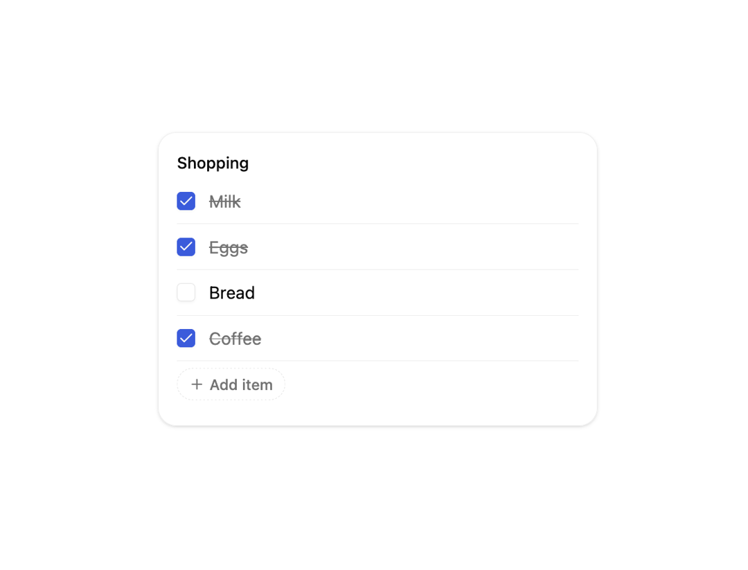
A checklist that animates each item in with a staggered fade/blur and draws a strikethrough across the label when its checkbox is checked.
Built with React and Tailwind. Copy the prompt and paste it into Claude Code, Cursor or Lovable: your agent adds Animated Checklist to your project and fits it to your theme.
Code
How Animated Checklist is used: the demo's code. The component's own source comes with a free account.
Usage.tsx
"use client";

import AnimatedChecklist from "@/components/ui/animated-checklist";

export default function AnimatedChecklistDemo() {
  return (
    <div className="flex min-h-[420px] w-full items-center justify-center bg-background p-8">
      <div className="w-full max-w-sm rounded-2xl border border-border/70 bg-card p-4 shadow-sm">
        <div className="mb-1 flex items-center gap-2 text-sm font-medium text-foreground">
          Shopping
        </div>
        <AnimatedChecklist
          data={{ items: ["Milk", "Eggs", "Bread", "Coffee"], verb: "buy" }}
          interactive
        />
      </div>
    </div>
  );
}
Dependencies
More by Anish Gupta
View all
Countdown Card
Morph Container
Bill Split Card
Habit Tracker Card