
About
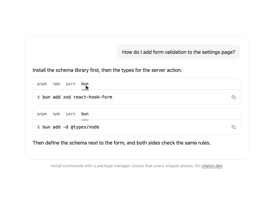
Install commands with package manager tabs that every snippet on the page shares, and a copy button.
Built with React and Tailwind. Copy the prompt and paste it into Claude Code, Cursor or Lovable: your agent adds Snippet to your project and fits it to your theme.
Code
How Snippet is used: the demo's code. The component's own source comes with a free account.
Usage.tsx
"use client"

import * as React from "react"
import { cn } from "@/lib/utils"
import { Snippet, packageManagerTabs } from "@/components/ui/snippet"

interface GhostState {
  x: number
  y: number
  shown: boolean
  down: boolean
}

/**
 * A pointer that walks a demo through its clicks, so a preview shows what each control does.
 * `stage` is the positioned box the pointer moves in; targets are found inside it. Sizes come
 * from layout boxes, so a scaled FitFrame never throws the aim off.
 */
function useGhost(stage: React.RefObject<HTMLElement | null>) {
  const [ghost, setGhost] = React.useState<GhostState>({ x: 0, y: 0, shown: false, down: false })

  const find = React.useCallback(
    (target: string | HTMLElement) =>
      typeof target === "string"
        ? stage.current?.querySelector<HTMLElement>(target) ?? null
        : target,
    [stage],
  )

  const moveTo = React.useCallback(
    (target: string | HTMLElement, dx = 0.5, dy = 0.6) => {
      const root = stage.current
      const el = find(target)
      if (!root || !el) return null
      const rr = root.getBoundingClientRect()
      const scale = root.offsetWidth ? rr.width / root.offsetWidth : 1
      const er = el.getBoundingClientRect()
      const x = (er.left - rr.left + er.width * dx) / scale
      const y = (er.top - rr.top + er.height * dy) / scale
      // A hidden pointer fades in a short way off its first target instead of flying in from
      // wherever it was last.
      setGhost((g) => (g.shown ? { x, y, shown: true, down: false } : { x: x + 70, y: y + 46, shown: false, down: false }))
      window.requestAnimationFrame(() =>
        window.requestAnimationFrame(() => setGhost({ x, y, shown: true, down: false })),
      )
      return el
    },
    [stage, find],
  )

  const press = React.useCallback((down: boolean) => setGhost((g) => ({ ...g, down })), [])
  const hide = React.useCallback(() => setGhost((g) => ({ ...g, shown: false, down: false })), [])

  return { ghost, moveTo, press, hide, find }
}

/**
 * Embedded previews often block the clipboard, so a scripted Copy could show "Copy failed". While
 * `quiet` holds true, writes resolve without touching the clipboard; a visitor's own clicks after
 * the tour stops use the real one.
 */
function useQuietClipboard(quiet: React.RefObject<boolean>) {
  React.useEffect(() => {
    const clip = navigator.clipboard
    if (!clip) {
      Object.defineProperty(navigator, "clipboard", {
        configurable: true,
        value: { writeText: async () => {} },
      })
      return
    }
    const real = clip.writeText.bind(clip)
    clip.writeText = async (text: string) => {
      if (quiet.current) return
      return real(text)
    }
    return () => {
      clip.writeText = real
    }
  }, [quiet])
}

const reducedMotion = () =>
  typeof window !== "undefined" && window.matchMedia("(prefers-reduced-motion: reduce)").matches

const STOP = Symbol("stop")

/**
 * Runs `script` in a loop with a `wait(ms)` that stops cleanly on unmount or once `active` turns
 * false. Reduced motion never starts it.
 */
function useLoop(
  script: (wait: (ms: number) => Promise<void>) => Promise<void>,
  active = true,
) {
  const ref = React.useRef(script)
  ref.current = script
  React.useEffect(() => {
    if (!active || reducedMotion()) return
    let alive = true
    const timers = new Set<number>()
    const wait = (ms: number) =>
      new Promise<void>((resolve, reject) => {
        const id = window.setTimeout(() => {
          timers.delete(id)
          if (alive) resolve()
          else reject(STOP)
        }, ms)
        timers.add(id)
      })
    ;(async () => {
      try {
        while (alive) await ref.current(wait)
      } catch (error) {
        if (error !== STOP) throw error
      }
    })()
    return () => {
      alive = false
      for (const id of timers) window.clearTimeout(id)
    }
  }, [active])
}

/** The demo's own key, so a visitor's real choice on chatcn.dev is never touched. */
const KEY = "chatcn-21st-snippet-demo"

/** Moves to a target, presses and clicks it. Returns the element, or null if it is gone. */
async function tap(
  g: ReturnType<typeof useGhost>,
  target: string | HTMLElement,
  wait: (ms: number) => Promise<void>,
  travel = 700,
) {
  if (!g.moveTo(target)) return null
  await wait(travel)
  g.press(true)
  await wait(130)
  const el = g.find(target)
  el?.click()
  g.press(false)
  return el
}

const FIT_CSS = "html,body{overflow:hidden}[data-fit-small] [data-fit-hide]{display:none!important}"

/**
 * 21st shows a demo in a small frame: about 674 by 421 on a component page, 358 by 224 on a
 * phone and 245 by 139 on a profile card. A demo taller than its frame gets scrollbars, which
 * render white on dark pages. FitFrame fills the frame exactly instead.
 *
 * - "scale": the content shrinks until it fits, centered. For visuals such as orbs.
 * - "crop": the content stays at full size from the top and fades out at the bottom. For text
 *   that streams in, where a changing scale would make the page breathe.
 *
 * `minWidth` lays out a wide demo (a table, a two column panel) at that width and scales it down
 * to the frame, instead of letting it collapse to a narrow layout. The frame centers it, so it
 * shrinks evenly on both sides.
 *
 * Anything marked `data-fit-hide` (state buttons, the chatcn.dev line) drops out in frames
 * shorter than `hideBelow`, so a profile card shows the visual alone.
 */
function FitFrame({
  children,
  mode = "scale",
  hideBelow = 360,
  minWidth,
}: {
  children: React.ReactNode
  mode?: "scale" | "crop"
  hideBelow?: number
  minWidth?: string
}) {
  const content = React.useRef<HTMLDivElement>(null)
  const [cropped, setCropped] = React.useState(false)

  React.useLayoutEffect(() => {
    const el = content.current
    if (!el) return
    const measure = () => {
      const vw = window.innerWidth
      const vh = window.innerHeight
      el.toggleAttribute("data-fit-small", vh < hideBelow)
      // Layout sizes ignore the transform, so measuring never feeds back.
      const w = Math.max(el.offsetWidth, el.scrollWidth)
      const h = Math.max(el.offsetHeight, el.scrollHeight)
      const scale = mode === "scale" ? Math.min(1, vw / w, vh / h) : 1
      el.style.transform = scale < 1 ? `scale(${scale})` : ""
      setCropped(mode === "crop" && h > vh + 1)
    }
    measure()
    const observer = new ResizeObserver(measure)
    observer.observe(el)
    // Content that changes inside a fixed width box (a headline that cycles words) never resizes
    // the box itself, so changes below it measure again on the next frame.
    let frame = 0
    const mutations = new MutationObserver(() => {
      cancelAnimationFrame(frame)
      frame = requestAnimationFrame(measure)
    })
    mutations.observe(el, { subtree: true, childList: true, characterData: true })
    window.addEventListener("resize", measure)
    return () => {
      observer.disconnect()
      mutations.disconnect()
      cancelAnimationFrame(frame)
      window.removeEventListener("resize", measure)
    }
  }, [mode, hideBelow])

  const fade = "linear-gradient(to bottom, #000 calc(100% - 40px), transparent)"
  return (
    <div
      className="flex w-full justify-center overflow-hidden"
      style={{
        height: "100dvh",
        alignItems: mode === "crop" ? "flex-start" : "center",
        maskImage: cropped ? fade : undefined,
        WebkitMaskImage: cropped ? fade : undefined,
      }}
    >
      <style>{FIT_CSS}</style>
      <div
        ref={content}
        className="w-full shrink-0"
        style={{ transformOrigin: mode === "crop" ? "top center" : "center", minWidth }}
      >
        {children}
      </div>
    </div>
  )
}

/* -------------------------------------------------------------------------------------------------
 * Types and context
 * -----------------------------------------------------------------------------------------------*/

type MessageRole = "user" | "assistant" | "system"

type MessageLayout = "auto" | "bubble" | "flat" | "compact"

type MessageState = "streaming" | "done" | "edited" | "error" | "stopped" | "queued"

/* -------------------------------------------------------------------------------------------------
 * Message
 * -----------------------------------------------------------------------------------------------*/

interface MessageProps extends React.ComponentProps<"div"> {
  /** Who wrote it. Named `from` so the ARIA `role` attribute stays free. */
  from: MessageRole
  /**
   * `auto` gives users a subtle bubble and assistants a flat, document-style block. `compact`
   * is the dense log style for agent traces and side panels. Defaults to `auto`.
   */
  layout?: MessageLayout
  /** Lifecycle state. Defaults to `done`. */
  state?: MessageState
  /** Follows a message from the same author: tightens the gap and hides the avatar. */
  grouped?: boolean
  /** The newest message. Keeps its actions visible instead of revealing them on hover. */
  latest?: boolean
  /**
   * Enter animation. Defaults to animating only messages that arrive after the conversation
   * mounted, so restored history appears at once.
   */
  animate?: boolean
  /** Announce the text to screen readers when streaming finishes. Defaults to true. */
  announce?: boolean
}

/** Scroll behavior for imperative calls. `smooth` falls back to instant under reduced motion. */
type ChatcnScrollBehavior = "smooth" | "instant"

/* -------------------------------------------------------------------------------------------------
 * Context
 * -----------------------------------------------------------------------------------------------*/

interface ConversationContextValue {
  scrollRef: (element: HTMLElement | null) => void
  contentRef: (element: HTMLElement | null) => void
  spacerRef: (element: HTMLElement | null) => void
  /** Within the threshold of the bottom. */
  isAtBottom: boolean
  /** Following new content. */
  isSticky: boolean
  /** More than one viewport from the bottom. */
  isFar: boolean
  /** Messages that arrived below while the reader was scrolled up. */
  unread: number
  scrollToBottom: (options?: { behavior?: ChatcnScrollBehavior }) => void
  scrollToTurn: (element: HTMLElement, options?: { behavior?: ChatcnScrollBehavior }) => void
  /** Read text to screen readers through the conversation's polite live region. */
  announce: (text: string) => void
  /** False during the first render, so restored history does not animate in. */
  ready: boolean
}

const ConversationContext = React.createContext<ConversationContextValue | null>(null)

/** Scroll state and controls of the nearest `Conversation`. Returns null outside one. */
function useConversation() {
  return React.useContext(ConversationContext)
}

interface MessageContextValue {
  from: MessageRole
  /** Resolved layout: `auto` becomes `bubble` for users and `flat` for everyone else. */
  layout: Exclude<MessageLayout, "auto">
  state: MessageState
  /** The newest message: its actions stay visible. */
  latest: boolean
}

const MessageContext = React.createContext<MessageContextValue | null>(null)

/**
 * One turn in the conversation. Compose `MessageAvatar`, `MessageContent`, `MessageMeta`,
 * `MessageStatus` and `MessageActions` inside it.
 */
function Message({
  from,
  layout: layoutProp = "auto",
  state = "done",
  grouped = false,
  latest = false,
  animate,
  announce = true,
  className,
  children,
  ...props
}: MessageProps) {
  const conversation = useConversation()
  const layout: MessageContextValue["layout"] =
    layoutProp === "auto" ? (from === "user" ? "bubble" : "flat") : layoutProp
  const [enter] = React.useState(() => animate ?? conversation?.ready ?? false)
  const ref = React.useRef<HTMLDivElement>(null)

  // Screen readers hear the finished reply once, never token by token.
  const previous = React.useRef(state)
  React.useEffect(() => {
    const was = previous.current
    previous.current = state
    if (!announce || was !== "streaming" || state === "streaming") return
    const text = ref.current?.querySelector('[data-slot="message-content"]')?.textContent?.trim()
    if (text) conversation?.announce(text)
  }, [state, announce, conversation])

  const value = React.useMemo(
    () => ({ from, layout, state, latest }),
    [from, layout, state, latest],
  )

  return (
    <MessageContext.Provider value={value}>
      <div
        ref={ref}
        data-slot="message"
        data-role={from}
        data-layout={layout}
        data-message-state={state}
        data-grouped={grouped ? "" : undefined}
        data-latest={latest ? "" : undefined}
        aria-busy={state === "streaming" || undefined}
        className={cn(
          "group/message relative flex min-w-0 flex-col",
          layout === "compact" ? "gap-1" : "gap-2",
          layout === "bubble" ? "items-end" : "items-start",
          from === "system" && layout !== "compact" && "items-center text-center",
          grouped && (layout === "compact" ? "-mt-2" : "-mt-4"),
          // An avatar sits in the start gutter (the end gutter for bubbles).
          layout === "bubble"
            ? "has-[>[data-slot=message-avatar]]:pe-9"
            : "has-[>[data-slot=message-avatar]]:ps-9",
          enter &&
            (from === "user"
              ? "ease-(--chatcn-ease-out-soft) transition-[opacity,translate] duration-200 starting:translate-y-2 starting:opacity-0 motion-reduce:starting:translate-y-0"
              : "ease-(--chatcn-ease-out-soft) transition-opacity duration-150 starting:opacity-0"),
          className,
        )}
        {...props}
      >
        {children}
      </div>
    </MessageContext.Provider>
  )
}

/** Role, layout and state of the nearest `Message`. Returns null outside one. */
function useMessage() {
  return React.useContext(MessageContext)
}

/* -------------------------------------------------------------------------------------------------
 * MessageContent
 * -----------------------------------------------------------------------------------------------*/

/**
 * The text of a message, capped at a 68ch measure. Plain text keeps its line breaks. Markdown
 * renderers drop in as children and inherit the 15/24 prose size.
 */
function MessageContent({ className, children, ...props }: React.ComponentProps<"div">) {
  const ctx = useMessage()
  const layout = ctx?.layout ?? "flat"
  const from = ctx?.from ?? "assistant"
  const state = ctx?.state ?? "done"
  const plain = typeof children === "string"

  return (
    <div
      data-slot="message-content"
      className={cn(
        "text-(color:--chatcn-fg) min-w-0 [overflow-wrap:anywhere]",
        // Bubbles fill their lines: pretty wrapping would leave a wide, half-empty bubble.
        layout !== "bubble" && "text-pretty",
        plain && "whitespace-pre-wrap",
        layout === "bubble" &&
          "text-[0.9375rem]/[1.5rem] tracking-[-0.006em] rounded-(--chatcn-radius-xl) bg-(color:--chatcn-fill) max-w-[80%] px-4 py-2.5 text-start",
        layout === "flat" && "text-[0.9375rem]/[1.5rem] tracking-[-0.006em] w-full max-w-[68ch]",
        layout === "compact" &&
          (from === "user"
            ? "text-[0.875rem]/[1.25rem] tracking-[-0.003em] rounded-(--chatcn-radius-md) bg-(color:--chatcn-fill) max-w-full px-3 py-1.5"
            : "text-[0.875rem]/[1.25rem] tracking-[-0.003em] w-full max-w-[68ch]"),
        from === "system" && "text-[0.8125rem]/[1.25rem] text-(color:--chatcn-fg-muted) max-w-[60ch]",
        // Queued turns are not sent yet: an outline instead of a fill says "pending".
        state === "queued" &&
          from === "user" &&
          "text-(color:--chatcn-fg-muted) border-(color:--chatcn-border-strong) border border-dashed bg-transparent",
        state === "error" && from === "user" && "text-(color:--chatcn-fg-muted)",
        className,
      )}
      {...props}
    >
      {children}
    </div>
  )
}

/** The pointer itself. Put it last inside the stage, which must be `relative`. */
function Ghost({ ghost }: { ghost: GhostState }) {
  return (
    <div
      aria-hidden
      className="pointer-events-none absolute top-0 left-0 z-20"
      style={{
        transform: `translate(${ghost.x}px, ${ghost.y}px)`,
        opacity: ghost.shown ? 1 : 0,
        // Hidden, it jumps; shown, it glides.
        transition: ghost.shown
          ? "transform 620ms cubic-bezier(0.4, 0, 0.2, 1), opacity 220ms ease-out"
          : "opacity 220ms ease-out",
      }}
    >
      <svg
        width="18"
        height="20"
        viewBox="0 0 18 20"
        className="drop-shadow-[0_1px_2px_rgb(0_0_0/0.25)]"
        style={{
          transform: ghost.down ? "scale(0.86)" : "scale(1)",
          transformOrigin: "2px 2px",
          transition: "transform 120ms ease-out",
        }}
      >
        <path
          d="M2 1.5 L2 16 L5.9 12.4 L8.6 18.3 L11.2 17.1 L8.6 11.3 L13.9 11.1 Z"
          className="fill-[oklch(0.2_0_0)] stroke-white dark:fill-white dark:stroke-[oklch(0.2_0_0)]"
          strokeWidth="1.3"
          strokeLinejoin="round"
        />
      </svg>
    </div>
  )
}

/** The line under each 21st demo that points back to the kit. */
function MoreOn({ slug, children }: { slug: string; children: React.ReactNode }) {
  return (
    <p data-fit-hide className="text-[0.75rem]/[1rem] text-(color:--chatcn-fg-faint) text-center text-balance">
      {children}{" "}
      <a
        href={`https://chatcn.dev/docs/components/${slug}`}
        target="_blank"
        rel="noopener"
        className="text-(color:--chatcn-fg-subtle) hover:text-(color:--chatcn-fg) underline underline-offset-2"
      >
        chatcn.dev
      </a>
    </p>
  )
}

/**
 * An assistant answers with two install commands. The pointer picks bun in the first and the
 * second follows, since every snippet on the page shares the choice. Then it copies the command,
 * and on the next pass picks npm. Loops. Click anything to take over.
 */
export default function SnippetPreview() {
  const stage = React.useRef<HTMLDivElement>(null)
  const g = useGhost(stage)
  const [touring, setTouring] = React.useState(true)
  const quiet = React.useRef(true)
  const [round, setRound] = React.useState(0)
  useQuietClipboard(quiet)

  const tab = (label: string) => `[data-slot="snippet"]:first-of-type [data-tab="${label}"]`

  useLoop(async (wait) => {
    for (const pick of ["bun", "npm"]) {
      try {
        window.localStorage.removeItem(KEY)
      } catch {
        // Storage can be blocked in an embed; the snippets still start on their first tab.
      }
      setRound((r) => r + 1)
      await wait(1600)
      await tap(g, tab(pick), wait)
      await wait(1300)
      await tap(g, '[data-slot="snippet"]:first-of-type button[aria-label="Copy command"]', wait)
      await wait(500)
      g.hide()
      await wait(2200)
    }
  }, touring)

  return (
    <FitFrame minWidth="38rem">
      <div className="flex w-full flex-col items-center justify-center gap-3 p-4">
        <div
          ref={stage}
          className="relative w-full max-w-2xl"
          onPointerDown={() => {
            if (!touring) return
            quiet.current = false
            setTouring(false)
            g.hide()
          }}
        >
          <div className="bg-(color:--chatcn-bg) rounded-(--chatcn-radius-xl) shadow-(--chatcn-shadow-border) flex h-[23rem] w-full flex-col gap-5 overflow-hidden px-6 py-6">
            <Message from="user">
              <MessageContent>How do I add form validation to the settings page?</MessageContent>
            </Message>
            <Message from="assistant" animate={false}>
              <MessageContent>
                <div key={round} className="flex flex-col gap-3">
                  <p>Install the schema library first, then the types for the server action:</p>
                  <div className="flex flex-col gap-2.5 [&>[data-slot=snippet]]:shadow-(--chatcn-shadow-border)">
                    <Snippet storageKey={KEY} tabs={packageManagerTabs("zod react-hook-form")} />
                    <Snippet storageKey={KEY} tabs={packageManagerTabs("@types/node", { dev: true })} />
                  </div>
                  <p>Then define the schema next to the form, and both sides check the same rules.</p>
                </div>
              </MessageContent>
            </Message>
          </div>
          <Ghost ghost={g.ghost} />
        </div>
        <MoreOn slug="snippet">Install commands with a package manager choice that every snippet shares. On</MoreOn>
      </div>
    </FitFrame>
  )
}
More by Aadi
View all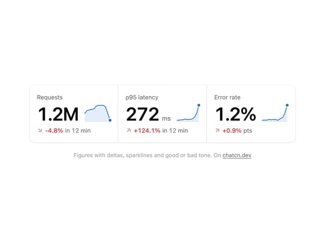
Stat Card
46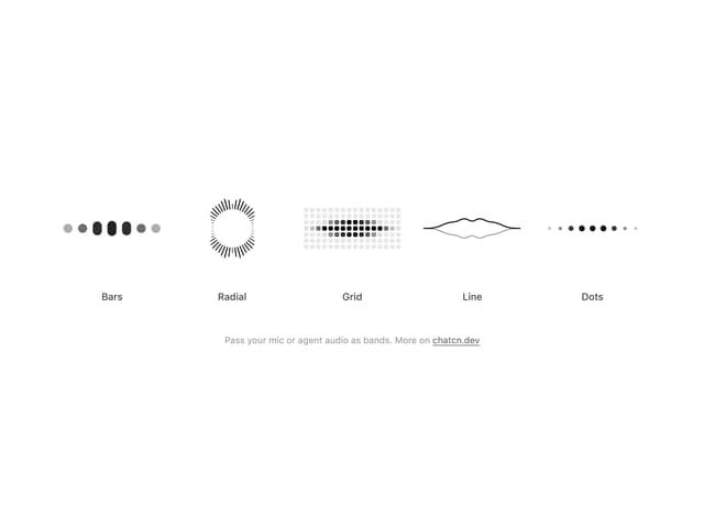
Audio Visualizer
32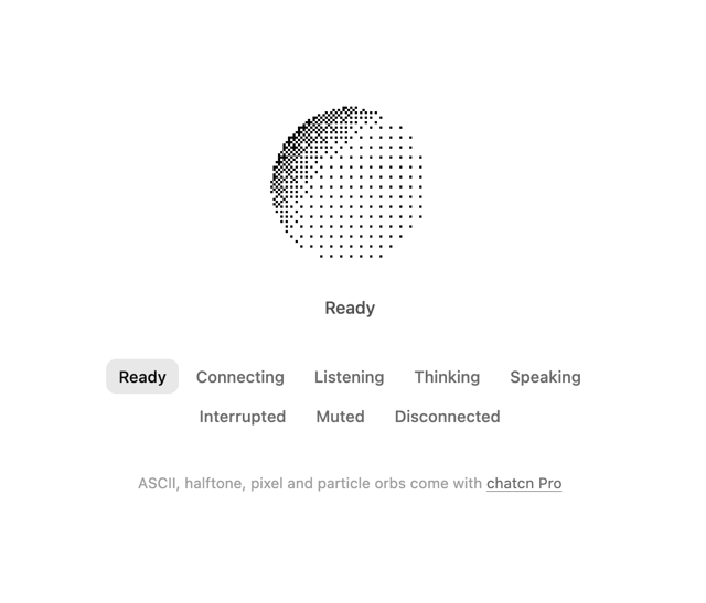
Dither Orb
24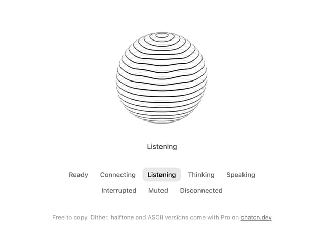
Voice Orb
20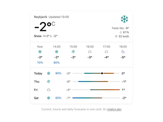
Weather Card
18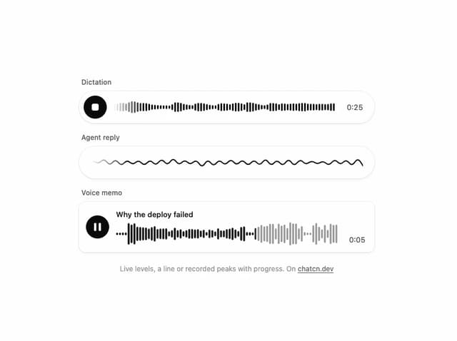
Waveform
15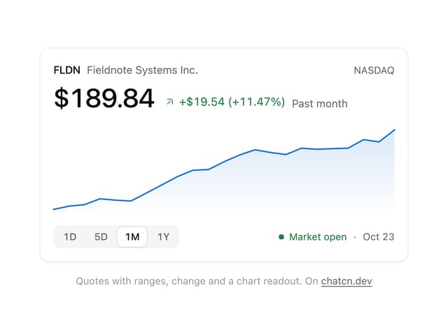
Ticker Card
15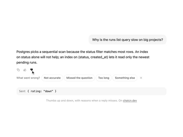
Message Feedback
13
More in AI chats
View all

AI Actions
351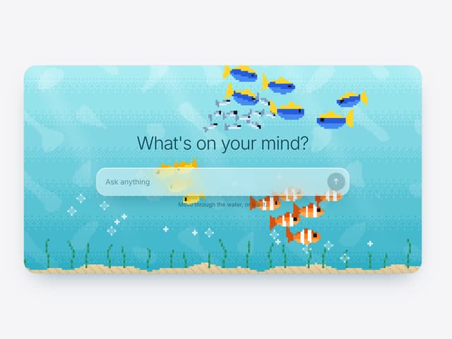

Aquarium Prompt
113
Agent Chat
21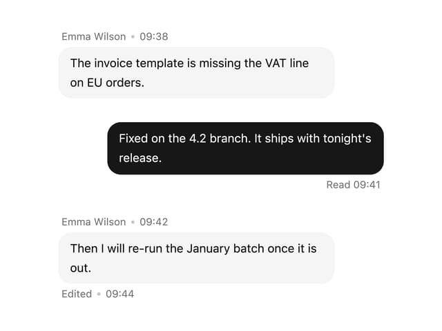

Message With Header And Delivery Status
60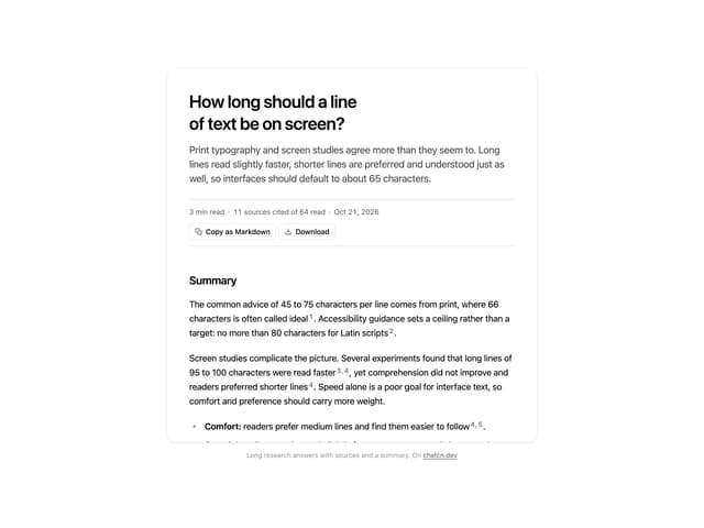
Research Report
7
Tool Web Fetch
4
Color Picker
201
Suggestions
40

