Hero Components for React & Next.js
Level up first impressions with 284 hero components for React and Tailwind CSS, designed to capture attention on your Next.js landing pages.
Browse components


Responsive Hero Banner
2.2K

SaaS Template
2.7K

Hero
1.3K
Centered Hero with Image Fan
1.1K
Editorial Collage Hero
507

Hero Section
445

Aero Hero-3
618
Hero with group of images, text and two buttons
442

Hero 03
375
Underline Hero Section
158

Hero Section 6
953
Agency Hero Section
1K

Minimalist Hero Fashion
318

HeroSectionWithGradient
385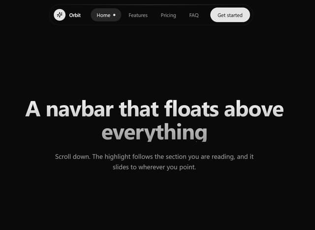

Floating Glassmorphic Navbar with Morphing Pill Indicator
38

Hero Section with Responsive Navigation
69


Keep browsing with a free account
See all 12,000+ components, 414 templates, 1,007 themes and 138 apps, save favourites and copy two prompts a day for free. No card needed
More hero components
- Hero Section by prebuiltui
- Hero Modern by brijr
- Background snippets by Julien Thibeaut
- Background Gradient Glow by meghtrix
- Hero Modern by brijr
- Hero Section with Device Mockups by solaceui
- Hero Golden Spiral by Chánh Đại
- Modern AI SaaS Hero with Interactive Live Preview by themeocean
- Minimalist Hero by Ravi Katiyar
- Featured Project Hero by Waqar H. Syed
- Hero-Section by Nick
- Parallax Scrolling by osmosupply
- PrismaHero by Rahil Vahora
- Oceanic Shimmer by Serafim
- Scroll Morph Hero by Prashant Som
- Hero Section by Ravi Katiyar
- Syntra Hero by Clevision
- Animated Hero Section by Sonu kumar
- Modern Hero section by Sonu kumar
- Scroll media expansion hero by Arunachalam
- Bento Grid Hero by LN
- Woven Light Hero by Dhileep Kumar GM
- Wilderness by Patrick Dunn
- EZPZ Type Tunnel by ezpz
- Background snippets by Julien Thibeaut
- Grid Background by meghtrix
- Gradient Backgrounds by meghtrix
- Radial Glow Background by meghtrix
- Hero Modern by brijr
- WebGL Shader by Ali Imam
- Gradient Background 4 by Julien Thibeaut
- Background Paths by Kokonut UI
- Iris Petal by Serafim
- Glow Horizon by Bashar ahammed
- Feature 1 by Shadcnblocks.com
- Hero by Ravi Katiyar
- Liquid Metal Hero by Caio Bonato
- CTA Section by shadcndesign
- Almoayyed by Gordon Edacheril
- Variable Font Proximity Hero by Cnippet
- Feature Modern by brijr
- Lunar Gravity Card by Alex Reino
- Orchid Petal Sky by Serafim
- Dark Gradient Background by Jatin Yadav
- Sunset Bloom by Serafim
- Minimal Welcome Onboarding by uğur sözen
- Perspective Tunnel Hero by Daiwiik Harihar
- Retrying by Dhileep Kumar GM
- Background snippets by Julien Thibeaut
- Radial Glow Background by meghtrix
- Gradient Backgrounds by meghtrix
- Grid Background by meghtrix
- Hero Modern by brijr
- Modern Animated Hero Section by Sonu kumar
- AnomalousMatterHero by Dhileep Kumar GM
- Feature 2 by Shadcnblocks.com
- call to action by Gujjeti Mokshith
- Dynamic Wave Canvas Background by Le Thanh
- Animated Shader Hero by Ravi Katiyar
- Smooth Scroll Hero by Shamsudheen
- FlickeringGridHero by Kain Xu
- Fractal Bloom Tree by Dhileep Kumar GM
- Lamp by Manu Arora
- Grid Pattern by Dillion Verma
- Hero by ohmfordev
- Liquid Sculpture Hero by Guglielmo Giannattasio
- InteractiveSynapseNetwork by Dhileep Kumar GM
- Endless by Weblisy
- Spline Scene by Serafim
- Animated Video on Scroll by YoucefBnm Bnm
- Dotted Dialog by Serafim
- Horizon Hero Section by scott clayton
- Background snippets by Julien Thibeaut
- Gradient Blur Bg by meghtrix
- Background Gradient Glow by meghtrix
- Gradient Backgrounds by meghtrix
- Iris Bloom by Serafim
- Shader Animation by Ali Imam
- Marine Foam by Serafim
- Dot Matrix by bagherifarzad
- Glassmorphism Trust Hero by Hossain Jahed
- Title Slide by slide-cn
- Animated hero by Tommy Jepsen
- Animated Gallery by YoucefBnm Bnm
- Hero Section by Ravi Katiyar
- Magic Hour by Kedhareswer Naidu
- Volumetric Studio by Alex Reino
- Hero Section by LaviKatiyar
- flow-gradient-heroSection by Hardik Kasheeyanee
- Digital Serenity - Animated Landing Page by Le Thanh
- Bolt Style Chat by Hurera Sheikh
- Real Estate Search Hero by felipemenezes098
- Product Rail Gallery – Fashion Store Hero Section by DHxWhy
- Aether Flow Hero by Dhileep Kumar GM
- Bloim Animation Background by Serge Bunas
- GLSL Hills by Ali Imam
- Background snippets by Julien Thibeaut
- Background Gradient Glow by meghtrix
- Background Components by meghtrix
- Gradient Backgrounds by meghtrix
- Vignette Grid Background by Rushil Dhinoja
- Book A Demo 3 by Ali Imam
- MacBook Neo Hero by Jean Duthil
- Hero Section by Ravi Katiyar
- Hero Scrub by Jean Duthil
- Violet Starlight by Serafim
- Hero by Sam sir
- Classy Hero by Jatin Yadav
- EZPZ Type Steps by ezpz
- Sketch City Hero by Kedhareswer Naidu
- Full-Bleed Gradient Coming Soon by 7Ovr - Oliver
- Tunnel Hero by Umair Waheed
- Hero by reuno-ui
- Floating Icons Hero Section by Ravi Katiyar
- Pixel perfect Hero by Hossain Jahed
- Hero Gallery Scroll Animation by YoucefBnm Bnm
- Luminous Topography by Mehi
- Spatial Product Showcase by Daiwiik Harihar
- Gradient Bar hero section by waiz
- jelly fish by Univolve
- Background snippets by Julien Thibeaut
- Gradient Backgrounds by meghtrix
- Gradient Blur Bg by meghtrix
- Grid Background by meghtrix
- Portfolio Hero by waiz
- Bread and Butter by jash shah
- Interactive Neural Vortex Background by Le Thanh
- Color Carousel by Serafim
- background rowds shop v1 by Gabriel Porcius
- Hero by Ravi Katiyar
- Black Hole Vortex Animation by Le Thanh
- Bright Lagoon by Serafim
- PulseFit hero by Dhileep Kumar GM
- Call to Action by felipemenezes098
- Parallel Waves by Serafim
- Header Section by shadcndesign
- Glass Video Hero by Rahil Vahora
- Vignette Grid Background by Rushil Dhinoja
- Feature Modern by brijr
- Sonic Waveform by Dhileep Kumar GM
- Tilted Grid Hero by Ruixen
- Halide Topo Hero by Shivendra Kumar
- Shader Art by OSAGI
- Stack Feature Section by Ruixen
- Background Components by meghtrix
- Background snippets by Julien Thibeaut
- Background Gradient Glow by meghtrix
- Gradient Blur Bg by meghtrix
- Violet Radiance II by Serafim
- Violet Radiance by Serafim
- Floating Gradient by Moumen Soliman
- Floral Veil by Serafim
About hero components
This collection gathers 603 hero components for React, the block visitors read first on a landing page. You'll find centered headline layouts, split copy-and-image designs, full-bleed background heroes, and animated variants with typing effects or gradient meshes. Some pair a call-to-action button with social proof; others lead with a product screenshot or a waitlist form. If you're searching for hero section templates or a specific hero section design, the variety here covers most marketing intros.
Pick a text-forward hero when your message does the selling, and an image or demo layout when the product is visual. Every component ships full TSX with a live preview, so read the source before committing. Copy the code straight in, run the shadcn CLI with the component's registry URL, or pull it through the Magic MCP from Cursor or Claude Code. These are Tailwind-based and drop into any Next.js or React project.