
About
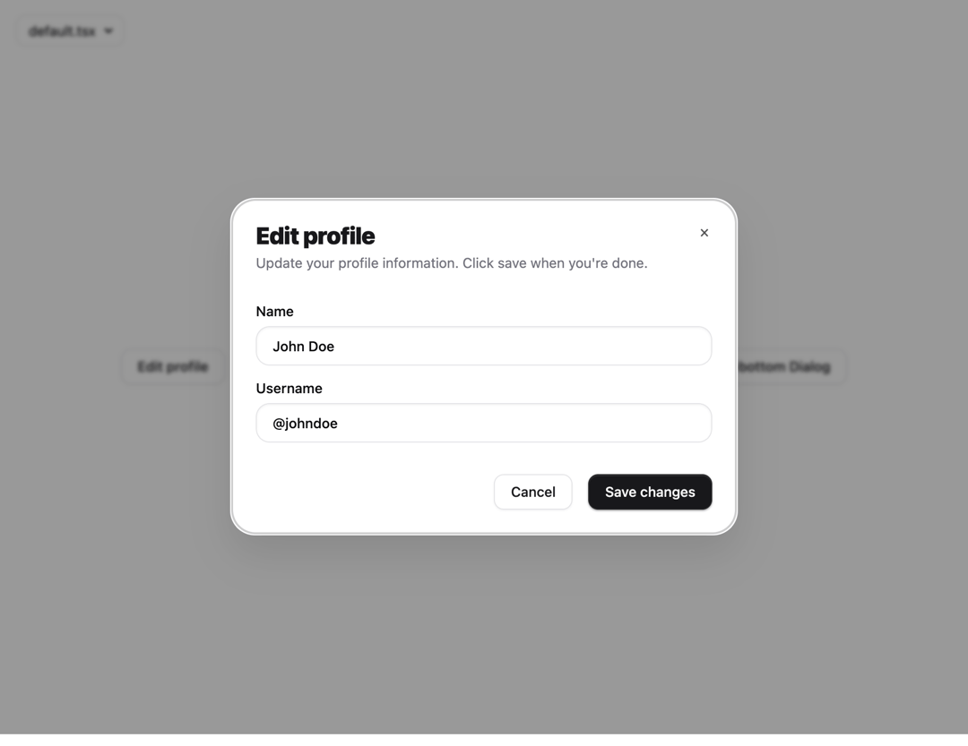
Dialog Modal with Cool animation, can be used as Modal, Dialog or Drawer, support Variants
Built with React and Tailwind. Copy the prompt and paste it into Claude Code, Cursor or Lovable: your agent adds Dialog Modal Drawer to your project and fits it to your theme.
Code
How Dialog Modal Drawer is used: the demo's code. The component's own source comes with a free account.
Usage.tsx
import * as React from "react"
import { cn } from "@/lib/utils"

export interface InputProps extends React.ComponentProps<"input"> {
    error?: boolean
}

/**
 * Orix Premium Input
 * Features a depth-realistic inner shadow and an animated focus ring.
 */
const Input = React.forwardRef<HTMLInputElement, InputProps>(
    ({ className, type, error, ...props }, ref) => {
        return (
            <div className="relative w-full group">
                <input
                    type={type}
                    className={cn(
                        "flex h-10 w-full rounded-xl border bg-white px-4 py-2 text-sm font-medium transition-all duration-200 outline-none",
                        "placeholder:text-zinc-400 dark:placeholder:text-zinc-500",
                        "disabled:cursor-not-allowed disabled:opacity-50",
                        // Light Mode Styles
                        "border-zinc-200 shadow-[0_1px_2px_rgba(0,0,0,0.05)_inset,0_1px_0_rgba(255,255,255,0.8)]",
                        "focus:border-zinc-400 focus:ring-4 focus:ring-zinc-100 focus:shadow-[0_2px_4px_rgba(0,0,0,0.05)_inset]",
                        // Dark Mode Styles
                        "dark:border-zinc-800 dark:bg-zinc-950 dark:text-zinc-50",
                        "dark:shadow-[0_1px_2px_rgba(0,0,0,0.4)_inset,0_1px_0_rgba(255,255,255,0.05)]",
                        "dark:focus:border-zinc-700 dark:focus:ring-zinc-900",
                        // Error State
                        error && "border-red-500! ring-red-100! dark:ring-red-950/30!",
                        className
                    )}
                    ref={ref}
                    {...props}
                />

                {/* Micro-animation border highlight (optional but adds premium feel) */}
                <div className="absolute inset-0 rounded-xl pointer-events-none border border-primary/0 transition-all duration-300 group-focus-within:border-primary/10" />
            </div>
        )
    }
)
Input.displayName = "Input"

export default Input
Dependencies
More in Buttons
View all
Texture Button
108
Button
14

Notification Button
117

HeroUI Button Group
2

Eclipse Button
44
Button Save
50

App Store Button
484

Base Button
1


