
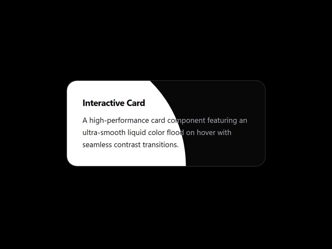
About
A high-performance card component featuring an ultra-slow, cinematic radial color flood on hover with seamless contrast transitions.
Built with React and Tailwind. Copy the prompt and paste it into Claude Code, Cursor or Lovable: your agent adds Color Fill Card to your project and fits it to your theme.
Code
How Color Fill Card is used: the demo's code. The component's own source comes with a free account.
Usage.tsx
import React, { useState, useEffect, useRef } from "react";
import ColorFillCard from "@/components/ui/color-fill-card";

export default function ColorFillCardDemo() {
  const containerRef = useRef<HTMLDivElement>(null);
  const [isDark, setIsDark] = useState(true);

  useEffect(() => {
    const checkDark = () => {
      const el = containerRef.current;
      const hasDarkAncestor = Boolean(
        el?.closest(".dark") ||
          el?.closest('[data-theme="dark"]') ||
          document.documentElement.classList.contains("dark") ||
          document.body.classList.contains("dark")
      );
      setIsDark(hasDarkAncestor);
    };

    checkDark();

    const observer = new MutationObserver(checkDark);
    observer.observe(document.documentElement, {
      attributes: true,
      attributeFilter: ["class", "data-theme"],
      subtree: true,
    });

    return () => observer.disconnect();
  }, []);

  return (
    <div
      ref={containerRef}
      className={`flex min-h-screen w-full items-center justify-center overflow-hidden p-4 sm:p-8 transition-colors duration-500 ${
        isDark ? "bg-black" : "bg-zinc-100"
      }`}
    >
      <ColorFillCard
        title="Interactive Card"
        description="A high-performance card component featuring an ultra-smooth liquid color flood on hover with seamless contrast transitions."
        baseColor={isDark ? "#080808" : "#ffffff"}
        fillColor={isDark ? "#ffffff" : "#09090b"}
        textColor={isDark ? "#ffffff" : "#09090b"}
        fillTextColor={isDark ? "#000000" : "#ffffff"}
        secondaryTextColor={isDark ? "#a1a1aa" : "#71717a"}
        fillSecondaryTextColor={isDark ? "#18181b" : "#e4e4e7"}
        borderColor={
          isDark ? "rgba(255, 255, 255, 0.12)" : "rgba(0, 0, 0, 0.08)"
        }
        origin="bottom-left"
        duration={2400}
        lift={-4}
        className="w-full max-w-[340px]"
      />
    </div>
  );
}
More in Cards
View all

Course Design Cards
1.3K

Statistics Card 7
327
Statistics Card 2
305

Interactive Tech Stack Bento Grid with Hover Effects
625

Card Studio
5
The Item one
4

Weather Card
65

Card
9