
About
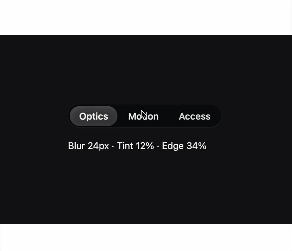
An accessible tabbed content switcher with a sliding glass-pill selection indicator that glides between tabs.
Built with React and Tailwind. Copy the prompt and paste it into Claude Code, Cursor or Lovable: your agent adds Liquid Glass Tabs to your project and fits it to your theme.
Code
How Liquid Glass Tabs is used: the demo's code. The component's own source comes with a free account.
Usage.tsx
import Tabs from "@/components/ui/tabs";

export default function TabsDemo() {
  return (
    <div
      data-ogui-design="liquid"
      className="flex min-h-[20rem] w-full items-center justify-center p-10"
      style={{ background: "#101214", color: "#f7f6f0" }}
    >
      <Tabs
        label="Material inspector"
        defaultValue="optics"
        items={[
          {
            value: "optics",
            label: "Optics",
            content: "Blur 24px · Tint 12% · Edge 34%",
          },
          {
            value: "motion",
            label: "Motion",
            content: "Spring 180ms · Damping 0.82",
          },
          {
            value: "access",
            label: "Access",
            content: "Contrast 7.1:1 · Motion follows OS",
          },
        ]}
      />
    </div>
  );
}
More in Navigation
View all

Liquid Glass Expandable Sidebar
76

Footer with Big Wordmark
40

Sidebar
392

Oversized 404 Numeral
78
Navbar with Theme Toggle
67

NavBar
2

Pagination
109
Tabs like bookmark
82
