

About
A magazine-style team section featuring a three-column staggered photo grid paired with an interactive member list. Photos default to grayscale; hovering a photo or a name entry simultaneously reveals the portrait in full color and highlights the corresponding name row. Includes social link icons (X, LinkedIn) that animate in on row hover.
Built with React and Tailwind. Copy the prompt and paste it into Claude Code, Cursor or Lovable: your agent adds Team Showcase to your project and fits it to your theme.
Code
How Team Showcase is used: the demo's code. The component's own source comes with a free account.
Usage.tsx
import TeamShowcase from "@/components/ui/team-showcase";

export default function TeamShowcaseDemo() {
  return (
    <div className="min-h-screen flex items-center justify-center p-8">
      <TeamShowcase />
    </div>
  );
}
Dependencies
More by Mak VieSAinte
View all

Progress Metric Card
1K
Builders Community Hero
556
Hover Brand Logo
416
Contributors Section
226
Country Accordion
208
More in Galleries
View all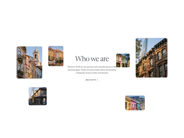

Scattered About
14

Animated Gallery
1.5K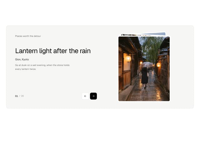
Photo Deck
4

Gallery Component
5
Editorial Collage Hero
507

Elastic Gallery
1.1K

Image Gallery
130
Folded Card
42
