
About
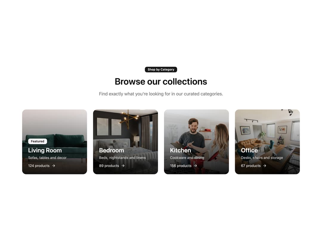
A responsive product category grid with image cards, hover zoom, featured badges, and product counts, ideal for storefront navigation and collection showcases.
Built with React and Tailwind. Copy the prompt and paste it into Claude Code, Cursor or Lovable: your agent adds Shop by Category Grid to your project and fits it to your theme.
Code
How Shop by Category Grid is used: the demo's code. The component's own source comes with a free account.
Usage.tsx
import Ecommerce4, { ecommerce4Demo } from "@/components/ui/ecommerce4";

export default function Ecommerce4Demo() {
  return <Ecommerce4 {...ecommerce4Demo} />;
}
Dependencies
More by uğur sözen
View all

Worth Keeping CTA
259
Comparison Slider with Highlights
211
Before/After Image Slider
135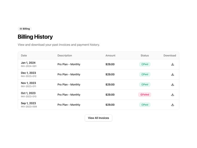
Invoice History Table
102
Recipe Card
44
PIN Keypad Unlock
43
Trigger to Action
36
Shop by Brand Grid
32
More in Cards
View all

Course Design Cards
1.3K

Statistics Card 7
327
Statistics Card 2
305

Interactive Tech Stack Bento Grid with Hover Effects
621

Card Studio
5
The Item one
4

Card
9

Weather Card
65