About
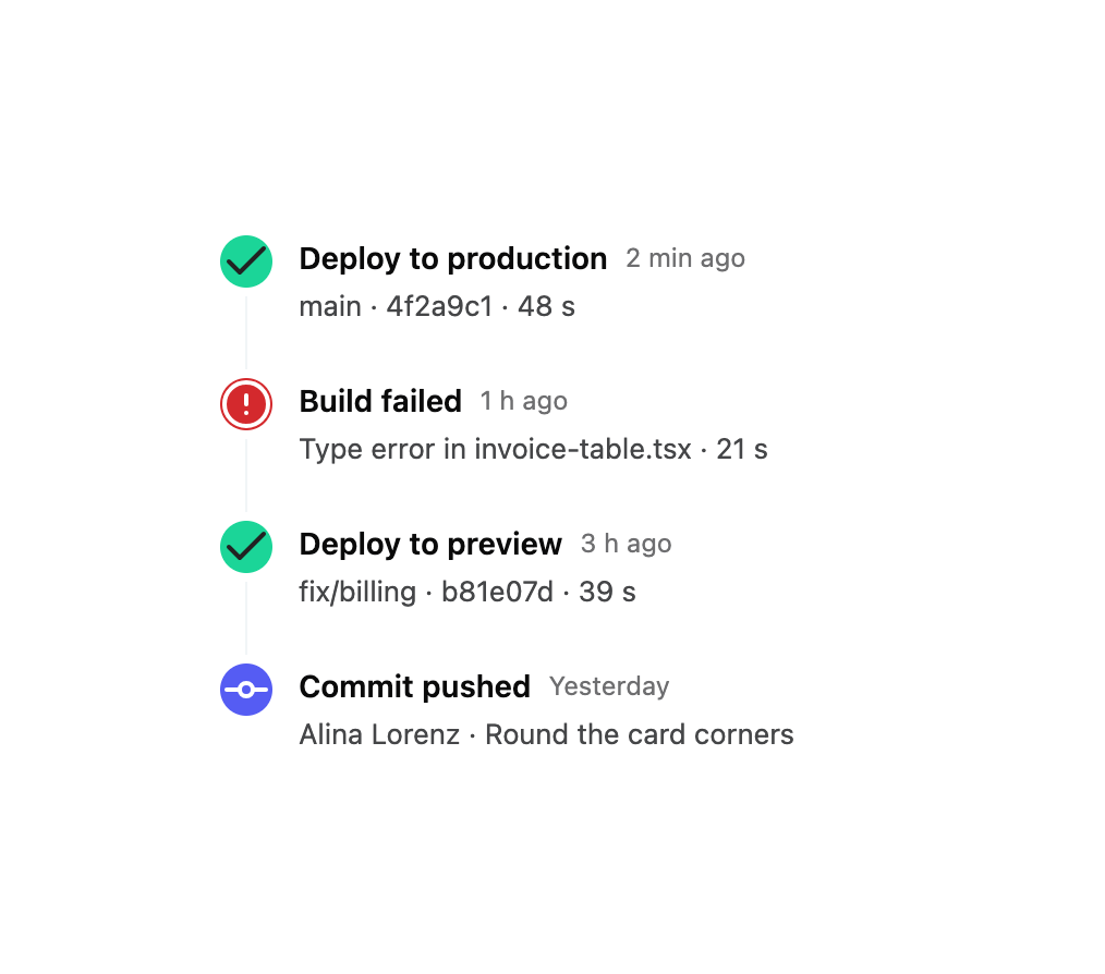
A vertical or horizontal sequence of dated, dot-connected events for activity feeds, changelogs, order tracking and project milestones.
Built with React and Tailwind. Copy the prompt and paste it into Claude Code, Cursor or Lovable: your agent adds Timeline to your project and fits it to your theme.
Code
How Timeline is used: the demo's code. The component's own source comes with a free account.
Usage.tsx
import { Timeline } from "@/components/ui/timeline";
import { Check, CircleAlert, GitCommitHorizontal } from "lucide-react";

export default function DeployLogDemo() {
  return (
    <div className="flex w-full items-center justify-center p-10">
      <Timeline
        className="w-96"
        items={[
          {
            id: "1",
            title: "Deploy to production",
            timestamp: "2 min ago",
            description: "main · 4f2a9c1 · 48 s",
            color: "var(--success)",
            icon: <Check />,
          },
          {
            id: "2",
            title: "Build failed",
            timestamp: "1 h ago",
            description: "Type error in invoice-table.tsx · 21 s",
            color: "var(--destructive)",
            icon: <CircleAlert />,
          },
          {
            id: "3",
            title: "Deploy to preview",
            timestamp: "3 h ago",
            description: "fix/billing · b81e07d · 39 s",
            color: "var(--success)",
            icon: <Check />,
          },
          {
            id: "4",
            title: "Commit pushed",
            timestamp: "Yesterday",
            description: "Alina Lorenz · Round the card corners",
            color: "var(--primary)",
            icon: <GitCommitHorizontal />,
          },
        ]}
      />
    </div>
  );
}
Dependencies
More by wunder-ui
View all

Popover
3
Avatar Stack
Avatar
Empty State