"use client";

import * as React from "react";
import { Switch } from "@/components/ui/switch";

const settings = {
  switchSize: "md",
  showSegmented: true,
  showPower: true,
};

const ROWS = [
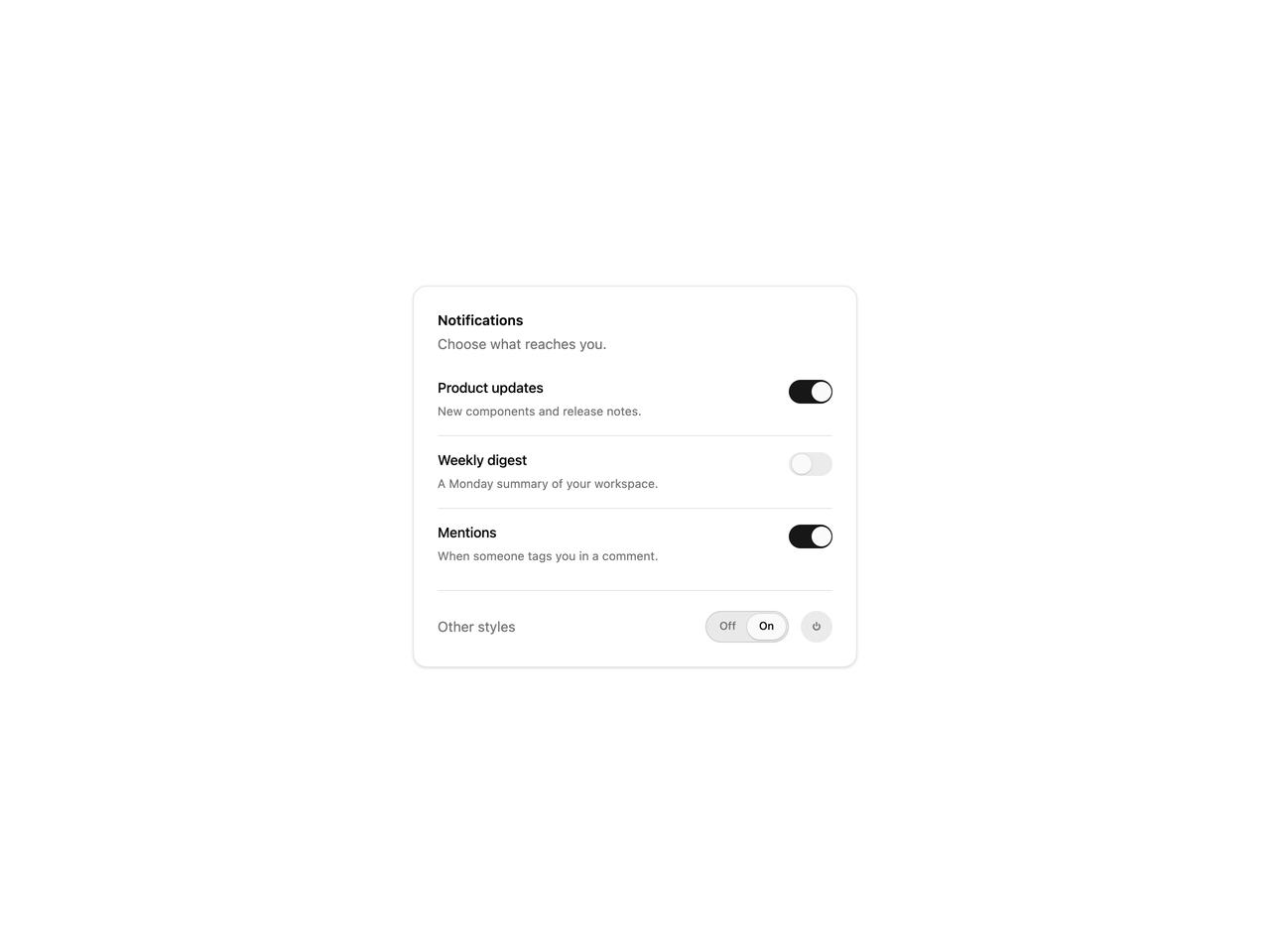
  { label: "Product updates", description: "New components and release notes.", on: true },
  { label: "Weekly digest", description: "A Monday summary of your workspace.", on: false },
  { label: "Mentions", description: "When someone tags you in a comment.", on: true, elevated: true },
];

export default function SwitchDemo(props: Partial<typeof settings>) {
  const s = { ...settings, ...props };
  const size = s.switchSize as "sm" | "md" | "lg";

  return (
    <div className="flex min-h-[420px] w-full items-center justify-center bg-background p-6">
      <div className="w-full max-w-md space-y-6 rounded-xl border border-border bg-card p-6 text-card-foreground shadow-sm">
        <div>
          <h3 className="text-sm font-semibold">Notifications</h3>
          <p className="mt-1 text-sm text-muted-foreground">Choose what reaches you.</p>
        </div>
        <div className="divide-y divide-border">
          {ROWS.map((row) => (
            <div key={row.label} className="py-3.5 first:pt-0 last:pb-0">
              <Switch
                fullWidth
                labelPosition="left"
                switchSize={size}
                variant={row.elevated ? "elevated" : "minimal"}
                defaultChecked={row.on}
                label={row.label}
                description={row.description}
              />
            </div>
          ))}
        </div>

        {(s.showSegmented || s.showPower) && (
          <div className="flex items-center justify-between border-t border-border pt-5">
            <span className="text-sm text-muted-foreground">Other styles</span>
            <div className="flex items-center gap-3">
              {s.showSegmented && (
                <Switch variant="segmented" switchSize={size} defaultChecked aria-label="Auto sync" />
              )}
              {s.showPower && (
                <Switch variant="power" switchSize={size} aria-label="Power" />
              )}
            </div>
          </div>
        )}
      </div>
    </div>
  );
}