
About
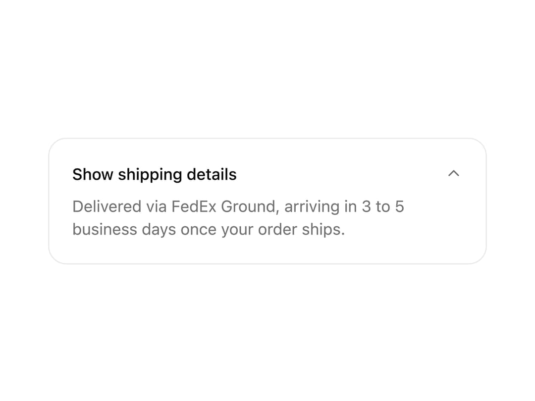
A collapsible section that expands and collapses content with a smooth height animation. Use it for show more text, advanced settings and sidebar groups.
Built with React and Tailwind. Copy the prompt and paste it into Claude Code, Cursor or Lovable: your agent adds Collapsible to your project and fits it to your theme.
Code
How Collapsible is used: the demo's code. The component's own source comes with a free account.
Usage.tsx
"use client";

import * as React from "react";
import { Collapsible, CollapsibleContent, CollapsibleTrigger } from "@/components/ui/collapsible";

export function CollapsiblePreview() {
  return (
    <div className="w-full max-w-sm rounded-2xl border border-zinc-200/80 bg-white p-5 dark:border-white/[0.06] dark:bg-[#0c0c0e]">
      <Collapsible variant="inline" defaultOpen>
        <CollapsibleTrigger>Show shipping details</CollapsibleTrigger>
        <CollapsibleContent>
          <p className="text-sm text-[var(--muted-foreground)]">
            Delivered via FedEx Ground, arriving in 3 to 5 business days once your order ships.
          </p>
        </CollapsibleContent>
      </Collapsible>
    </div>
  );
}

export default function Demo() {
  return <CollapsiblePreview />;
}
Dependencies
More by Wensity Labs
View all

Sidebar
392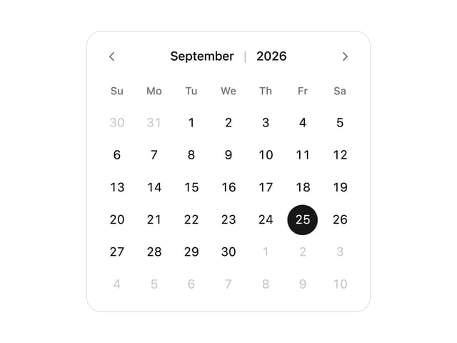
Calendar
287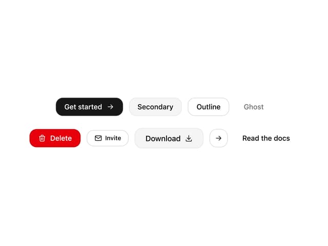
Button
131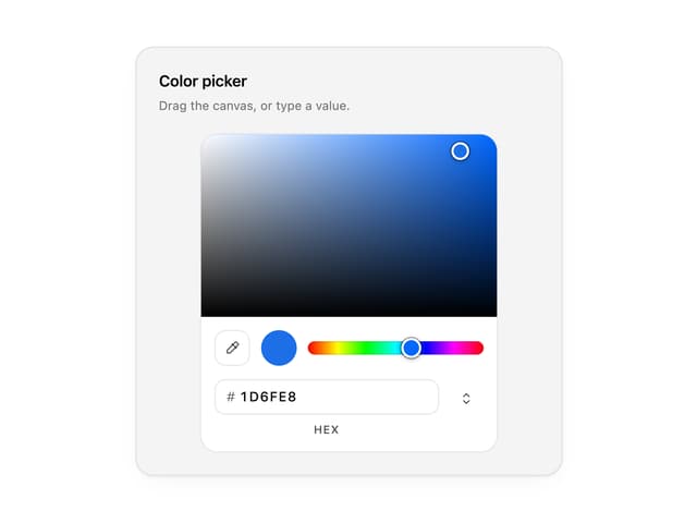
Color Picker
97
Image Comparison Slider
82
AI Prompt Input
80
Text Morphing
60
Carousel
57