
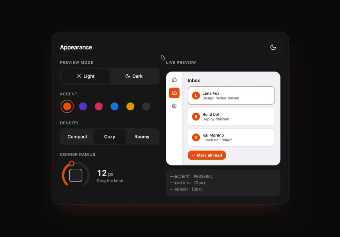
About
Appearance settings: preview mode, accent swatches, density and a corner radius rotary dial. A live mini inbox window re-lays out with layout animations; accent clicks release a color bloom from the swatch. Outputs the generated CSS variables live; built-in light/dark toggle for the panel itself.
Built with React and Tailwind. Copy the prompt and paste it into Claude Code, Cursor or Lovable: your agent adds Appearance Lab to your project and fits it to your theme.
Code
How Appearance Lab is used: the demo's code. The component's own source comes with a free account.
Usage.tsx
import * as React from "react"
import { AppearanceLab } from "@/components/ui/st-appearance-lab"

export default function AppearanceLabDemo() {
  return <AppearanceLab />
}
Dependencies
More by Holo
View all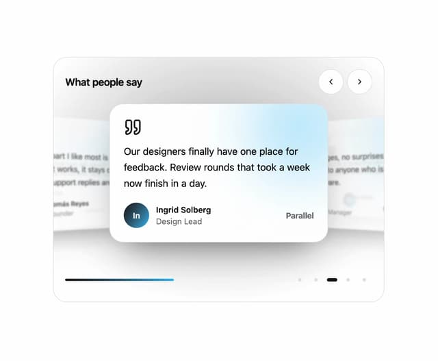

Testimonial Coverflow
68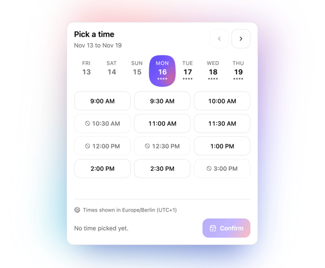
Slot Week Picker
67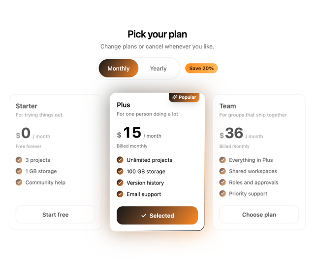
Pricing Plan Tilt
46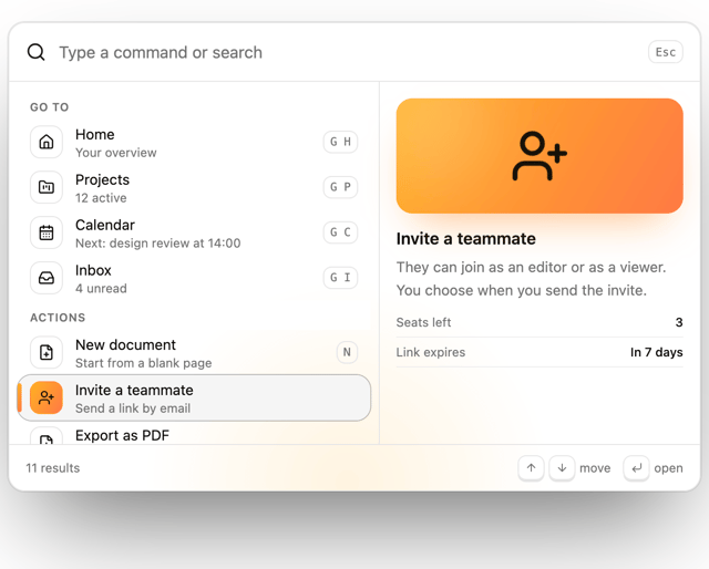
Command Palette
32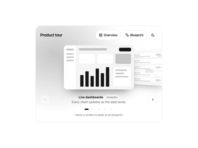
Lens Reel
30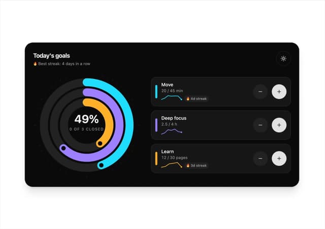
Orbit Goals
20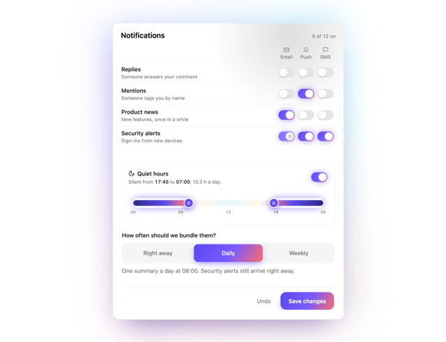
Notification Matrix
18
Path Stepper
16