About
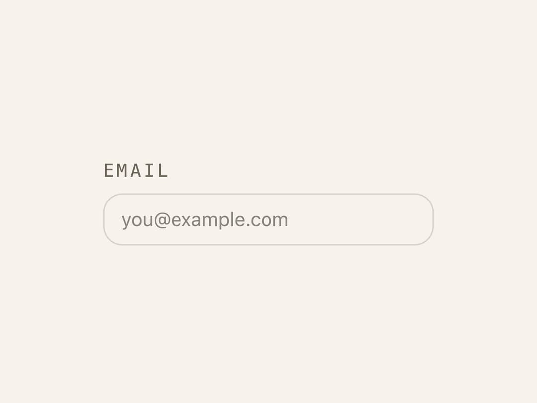
A form label styled in uppercase monospace tracking, built on the Radix UI Label primitive for pairing with inputs, switches, and checkboxes.
Built with React and Tailwind. Copy the prompt and paste it into Claude Code, Cursor or Lovable: your agent adds Glass Label to your project and fits it to your theme.
Code
How Glass Label is used: the demo's code. The component's own source comes with a free account.
Usage.tsx
import { GlassLabel } from "@/components/ui/glass-label";

export default function GlassLabelDemo() {
  return (
    <div className="flex w-full max-w-xs items-center justify-center bg-background p-10">
      <div className="grid w-full gap-1.5">
        <GlassLabel htmlFor="email">Email</GlassLabel>
        <input
          id="email"
          type="email"
          placeholder="[email protected]"
          className="border-border bg-background text-foreground rounded-md border px-3 py-2 text-sm outline-none focus-visible:ring-1 focus-visible:ring-ring"
        />
      </div>
    </div>
  );
}
Dependencies
More by tochny
View all

Glass Pagination
4
Glass Calendar
Glass Context Menu
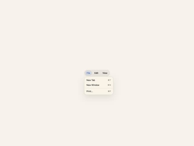
Glass Menubar
Glass Progress
Glass Skeleton
More in Forms
View all

Login 1
64

Premium Auth
571

Contact Card
1.1K

Form
18

Book A Demo 1
91
Authentication Card
52

Card Studio
47

Login Card
35
