

About
An accessible native checkbox input with optional label, helper description text, and an indeterminate "select all" state.
Built with React and Tailwind. Copy the prompt and paste it into Claude Code, Cursor or Lovable: your agent adds Checkbox to your project and fits it to your theme.
Code
How Checkbox is used: the demo's code. The component's own source comes with a free account.
Usage.tsx
import { Checkbox } from "@/components/ui/checkbox";

export default function CheckboxDemo() {
  return (
    <div
      className="flex w-full max-w-sm flex-col gap-4 rounded-lg p-6"
      style={{
        background: "var(--fp-color-bg)",
        color: "var(--fp-color-text)",
      }}
    >
      <Checkbox label="Notify customer by email" />
      <Checkbox label="Notify customer by email" defaultChecked />
      <Checkbox label="Select all orders" indeterminate />
      <Checkbox
        label="Notify customer by email"
        description="We'll send a receipt and tracking link."
      />
      <Checkbox label="Notify customer by email" disabled />
    </div>
  );
}
More by sudharshanpanidev
View all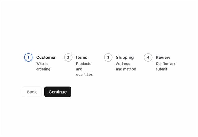
Stepper
4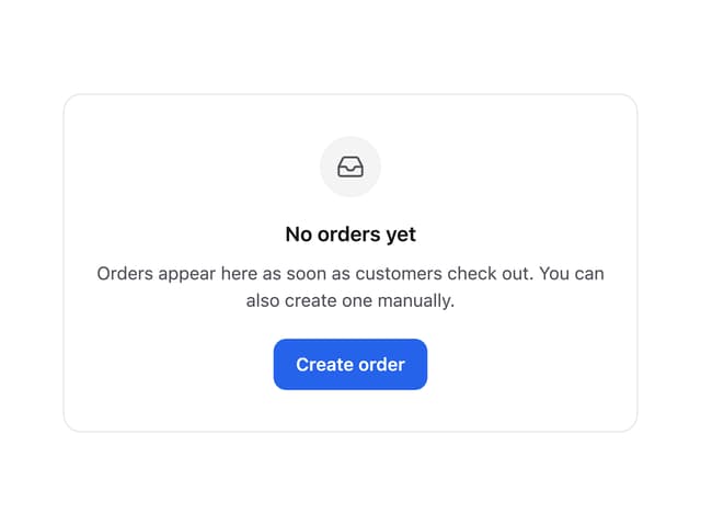
Empty State
3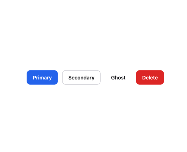
Button
2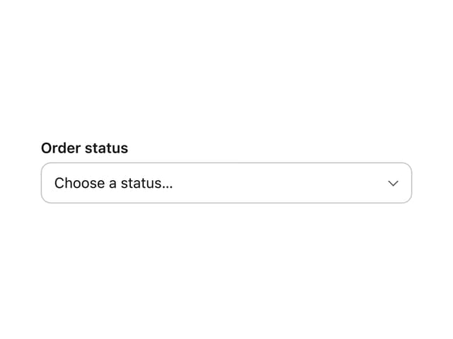
Select
2
Status Badge
More in Forms
View all

Login 1
64

Premium Auth
571

Contact Card
1.1K

Form
18

Book A Demo 1
91
Authentication Card
52

Card Studio
47

Login Card
35
