
About
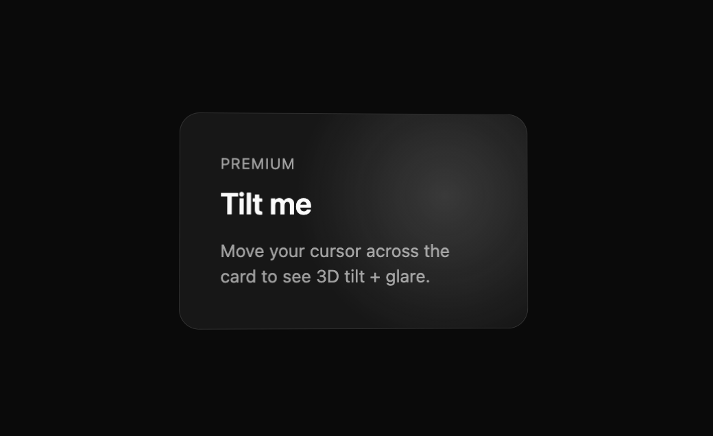
Built with React and Tailwind. Copy the prompt and paste it into Claude Code, Cursor or Lovable: your agent adds BeUI Tilt Card to your project and fits it to your theme.
Code
How BeUI Tilt Card is used: the demo's code. The component's own source comes with a free account.
Usage.tsx
"use client";

import { TiltCard } from "@/components/ui/be-ui-tilt-card";

export default function TiltCardPreview() {
  return (
    <div className="flex items-center justify-center p-6">
      <TiltCard className="w-[280px] border border-border bg-card p-8">
        <div className="text-xs uppercase tracking-wider text-muted-foreground">Premium</div>
        <h3 className="mt-2 text-2xl font-semibold text-foreground">Tilt me</h3>
        <p className="mt-3 text-sm text-muted-foreground">Move your cursor across the card to see 3D tilt + glare.</p>
      </TiltCard>
    </div>
  );
}
Dependencies
More by Saurabh
View all
BeUI Expandable Tabs
373
BeUI File Upload
309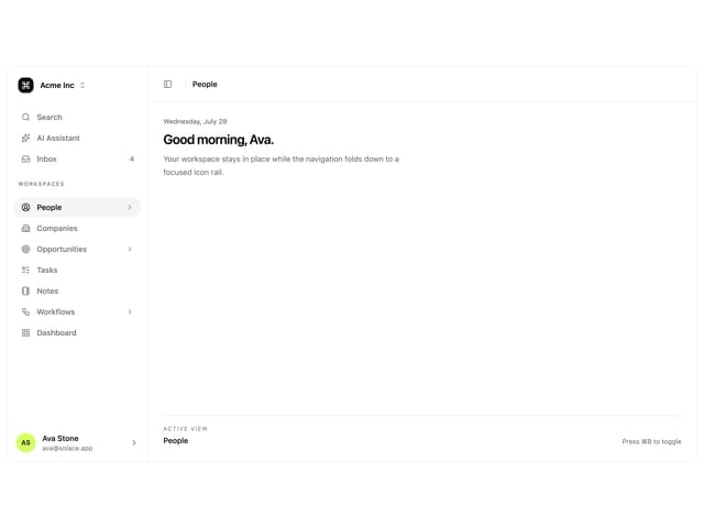
Animated Sidebar
294
BeUI Bouncy Accordion
220
Loader
214
BeUI Create Menu
207
BeUI Expanable Action Bar
206
BeUI 404 / Not Found
179
More in Cards
View all

Course Design Cards
1.3K

Statistics Card 7
327
Statistics Card 2
305

Interactive Tech Stack Bento Grid with Hover Effects
625

Card Studio
5
The Item one
4

Weather Card
65

Card
9