
About
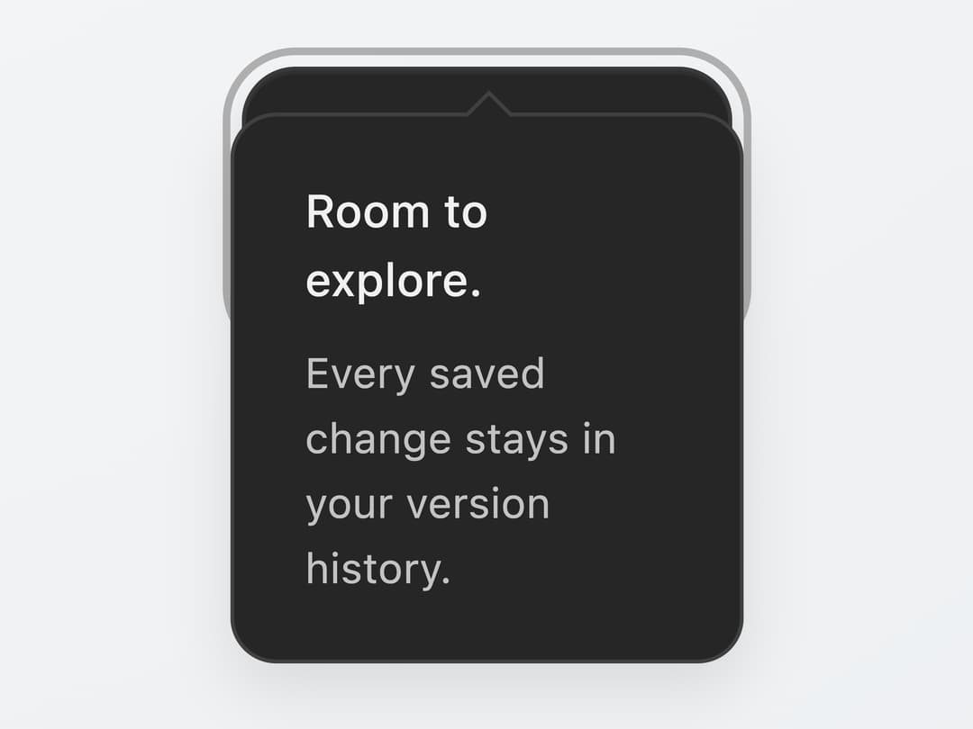
A dark, matte-styled tooltip that opens on hover, keyboard focus or tap, auto-flips above/below its trigger to stay in view, and can be pinned open with a click.
Built with React and Tailwind. Copy the prompt and paste it into Claude Code, Cursor or Lovable: your agent adds Matte Tooltip Overlay to your project and fits it to your theme.
Code
How Matte Tooltip Overlay is used: the demo's code. The component's own source comes with a free account.
Usage.tsx
"use client";

import MatteTooltipOverlay from "@/components/ui/matte-tooltip-overlay";

export default function MatteTooltipOverlayDemo() {
  return (
    <div
      className="flex h-screen w-full items-center justify-center"
      style={{
        background:
          "radial-gradient(ellipse at 25% 0%, #f7f8f9, transparent 95%), linear-gradient(145deg, #eef0f2, #e4e7eb)",
      }}
    >
      <MatteTooltipOverlay />
    </div>
  );
}
More by SL
View all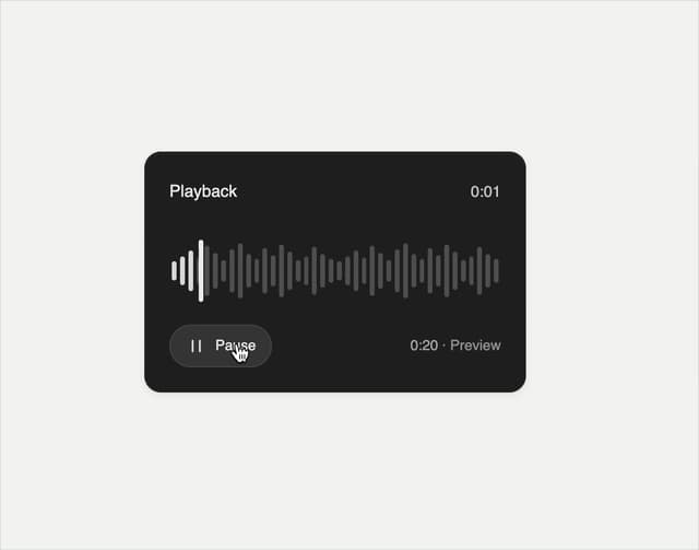

Playback Scrubber
63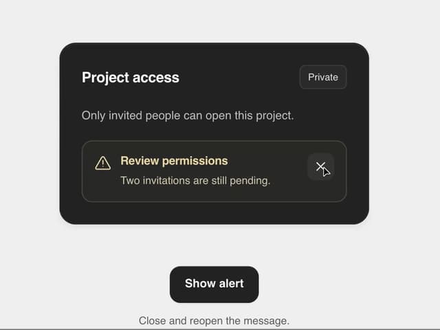
Matte Alert Feedback
46
Notification Stack
36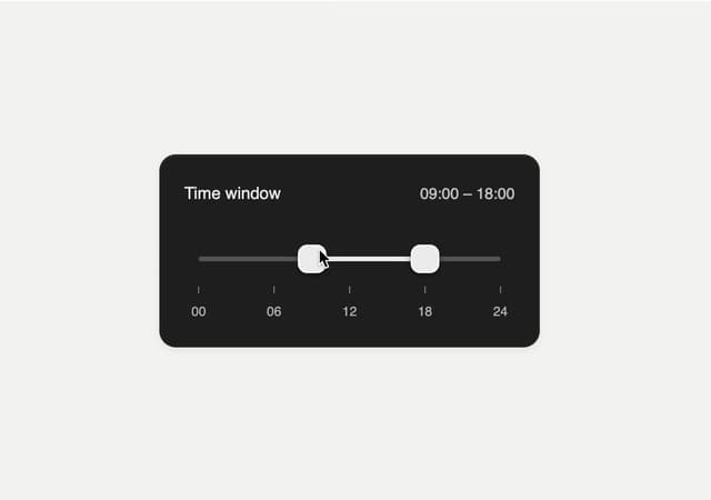
Time Window Slider
28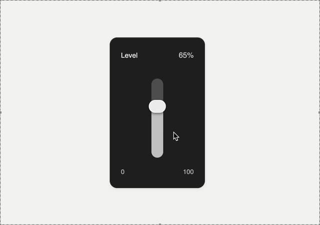
Matte Meter Slider
19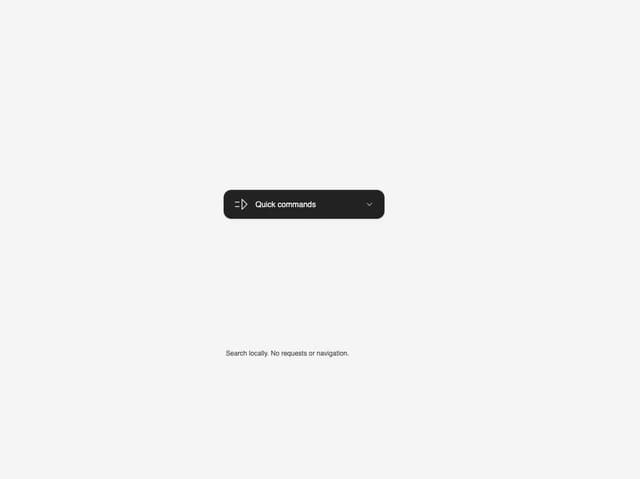
Commands Menu
16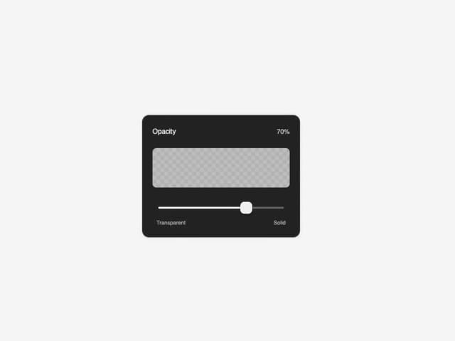
Matte Opacity Slider
13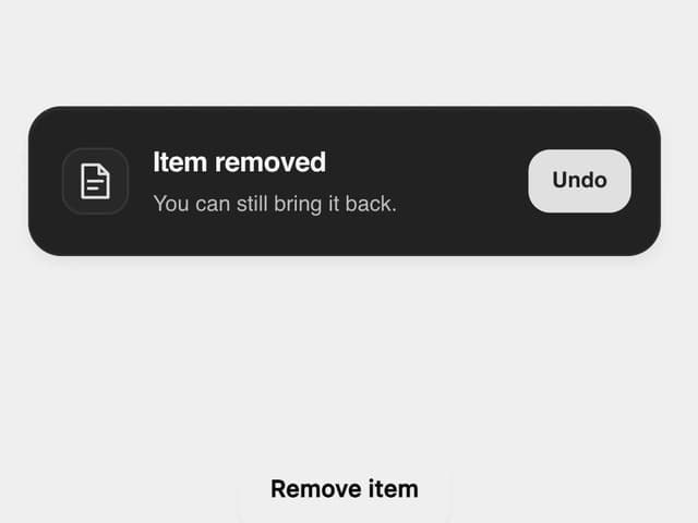
Undo Feedback
10
More in Cards
View all

Course Design Cards
1.3K

Statistics Card 7
327
Statistics Card 2
305

Interactive Tech Stack Bento Grid with Hover Effects
625

Card Studio
5
The Item one
4

Weather Card
65

Card
9