
About
Good error design is clear, useful, and friendly. Designing concise and accurate error messages unblocks users and builds trust by meeting people where they are.
Built with React and Tailwind. Copy the prompt and paste it into Claude Code, Cursor or Lovable: your agent adds Error to your project and fits it to your theme.
Code
How Error is used: the demo's code. The component's own source comes with a free account.
Usage.tsx
import { Error } from "@/components/ui/error";

const Default = () => {
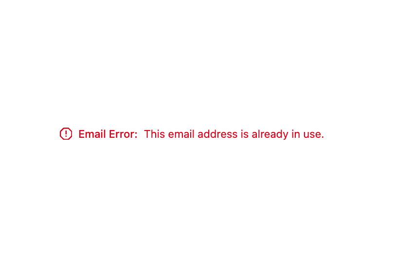
  return <Error>This email address is already in use.</Error>;
};

const CustomLabel = () => {
  return <Error label="Email Error">This email address is already in use.</Error>;
};

const Sizes = () => (
  <div className="flex gap-6">
    <Error size="small">This email is in use.</Error>
    <Error>This email is in use.</Error>
    <Error size="large">This email is in use.</Error>
  </div>
);

const WithAnErrorProperty = () => {
  return <Error
          error={{
            message: "The request failed.",
            action: "Contact Us",
            link: "https://vercel.com/contact"
          }}
        />;
};

export { Default, CustomLabel, Sizes, WithAnErrorProperty };
More by tigran tumasov
View all
Product Hunt Badge
1.9K
Book
180
Calendar
156
Theme Switcher
141
Snippet
125
Table
124
Toggle
97
Feedback
94
More in Forms
View all

Login 1
63

Premium Auth
570

Contact Card
1.1K

Form
18

Book A Demo 1
91
Authentication Card
52

Card Studio
47

Login Card
35
