About
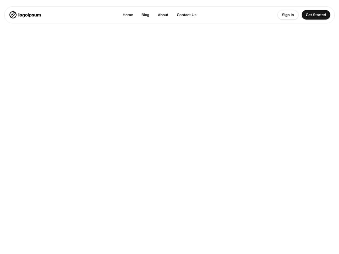
A fixed, rounded pill-shaped navigation bar with a logo, desktop menu links, sign-in/get-started buttons, and a slide-out sheet menu for mobile.
Built with React and Tailwind. Copy the prompt and paste it into Claude Code, Cursor or Lovable: your agent adds Pill Navbar to your project and fits it to your theme.
Code
How Pill Navbar is used: the demo's code. The component's own source comes with a free account.
Usage.tsx
import Navbar from "@/components/ui/navbar-04";

export default function Demo() {
  return (
    <div className="relative h-screen w-full">
      <Navbar />
    </div>
  );
}
More by shadcnui-blocks
View all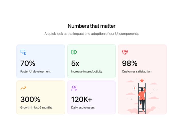
Numbers Stats Grid
287
Logo Cloud 15
273
Testimonials 13
219
Underlined Navigation Menu
107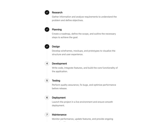
Process Timeline
92
Rich Navigation Menu
92
Empty State with Marquee
90
Members Table Block
88
More in Navigation
View all

Liquid Glass Expandable Sidebar
76

Footer with Big Wordmark
40

Sidebar
392

Oversized 404 Numeral
78
Navbar with Theme Toggle
67

NavBar
2

Pagination
109
Tabs like bookmark
82
