About
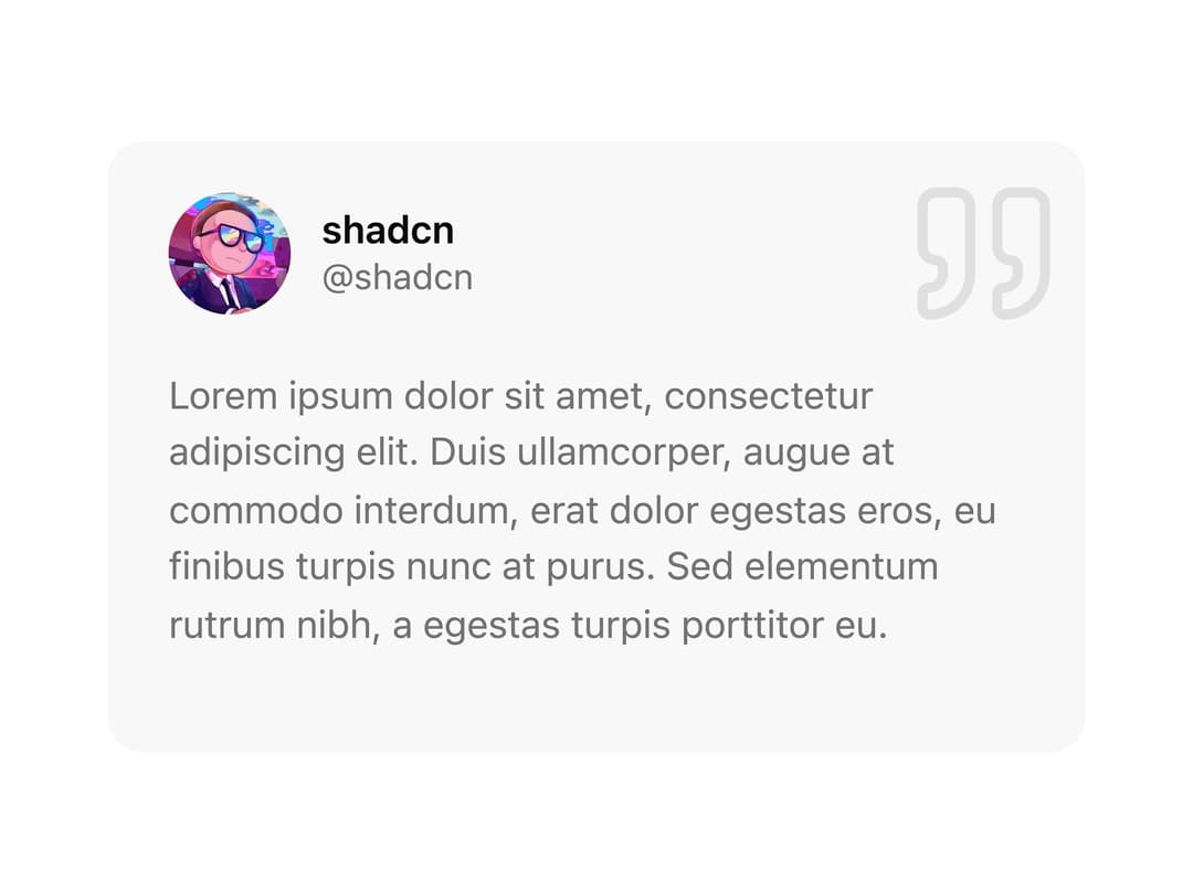
A compact testimonial card that shows a user's avatar, name, handle and a quoted review, with a decorative quote icon watermark.
Built with React and Tailwind. Copy the prompt and paste it into Claude Code, Cursor or Lovable: your agent adds Testimonial Card to your project and fits it to your theme.
Code
How Testimonial Card is used: the demo's code. The component's own source comes with a free account.
Usage.tsx
import TestimonialCard from "@/components/ui/card-08";

export default function TestimonialCardDemo() {
  return (
    <div className="flex min-h-screen w-full items-center justify-center p-8">
      <TestimonialCard />
    </div>
  );
}
Dependencies
More by shadcnui-blocks
View all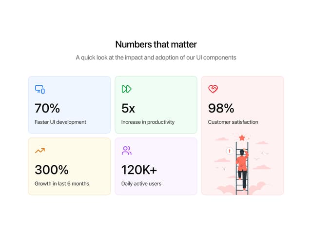
Numbers Stats Grid
287
Logo Cloud 15
273
Testimonials 13
219
Underlined Navigation Menu
107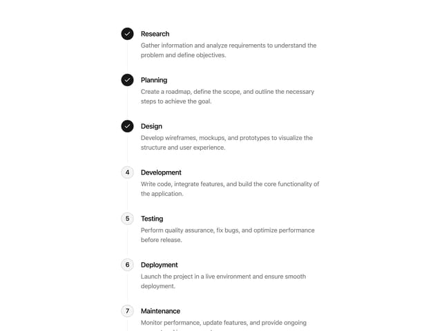
Process Timeline
92
Rich Navigation Menu
92
Empty State with Marquee
90
Members Table Block
88
More in Testimonials
View all

Testimonial
133

Centered Testimonial
33
testimonial
898
Testimonials Section
186
Testimonials Section
255

Card Studio
18
Testimonial 2
40

Voice Testimonial
141

