
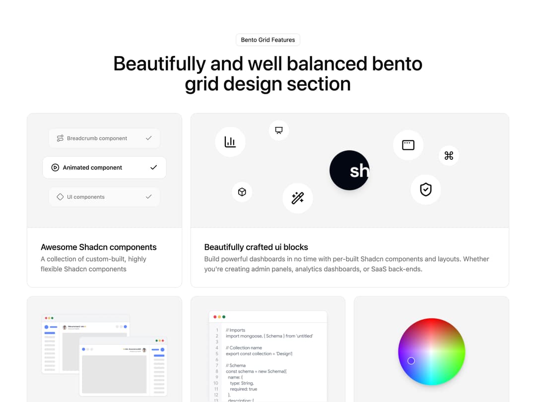
About
A responsive bento-style grid section that showcases product features or testimonials using mixed card sizes, icons, and small animated illustrations.
Built with React and Tailwind. Copy the prompt and paste it into Claude Code, Cursor or Lovable: your agent adds Bento Grid Features to your project and fits it to your theme.
Code
How Bento Grid Features is used: the demo's code. The component's own source comes with a free account.
Usage.tsx
import Bentogrid from "@/components/ui/bento-grid-features";

export default function BentoGridFeaturesDemo() {
  return <Bentogrid />;
}
More by ShadcnSpace
View all
Integration Card
1.9K
Stacked Card Carousel
1.6K
Button witn Icon
1.5K
Orbiting Circles with Globe
1.4K
Agency Hero Section
1K
Testimonials Marquee
669
Range Select Calendar
492
Shine Border
492
More in Features
View all

Grid Feature Cards
1.9K

Feature Sections
55

Features 8
3.2K
Feature with advantages
297

Features Grid
91
Features 1
291

Feature 1
121
Features Card
263

