
About
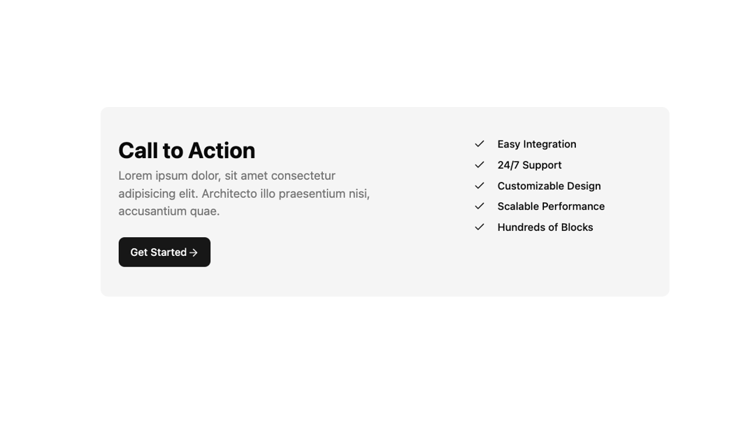
Call to action section with heading, description and button on left. Feature bullet list on right.
Built with React and Tailwind. Copy the prompt and paste it into Claude Code, Cursor or Lovable: your agent adds Cta 4 to your project and fits it to your theme.
Code
How Cta 4 is used: the demo's code. The component's own source comes with a free account.
Usage.tsx
import { Cta4 } from "@/components/ui/cta-4";

const DemoOne = () => {
  return (
    <Cta4
      title="Call to Action"
      description="Lorem ipsum dolor, sit amet consectetur adipisicing elit. Architecto illo praesentium nisi, accusantium quae."
      buttonText="Get Started"
      buttonUrl="https://shadcnblocks.com"
      items={[
        "Easy Integration",
        "24/7 Support",
        "Customizable Design",
        "Scalable Performance",
        "Hundreds of Blocks"
      ]}
    />
  );
};

export { DemoOne };
Dependencies
More by Shadcnblocks.com
View all

Gallery with image cards
3.1K
Hero 195
2.4K
Feature 108
1.4K
Navbar with Dropdowns
888
Footer 7
616
Gallery 6
579
Feature 197
539
About 3
447
More in Buttons
View all
Texture Button
108
Button
14

Notification Button
117

HeroUI Button Group
2

Eclipse Button
44
Button Save
50

App Store Button
484

Base Button
1


