
About
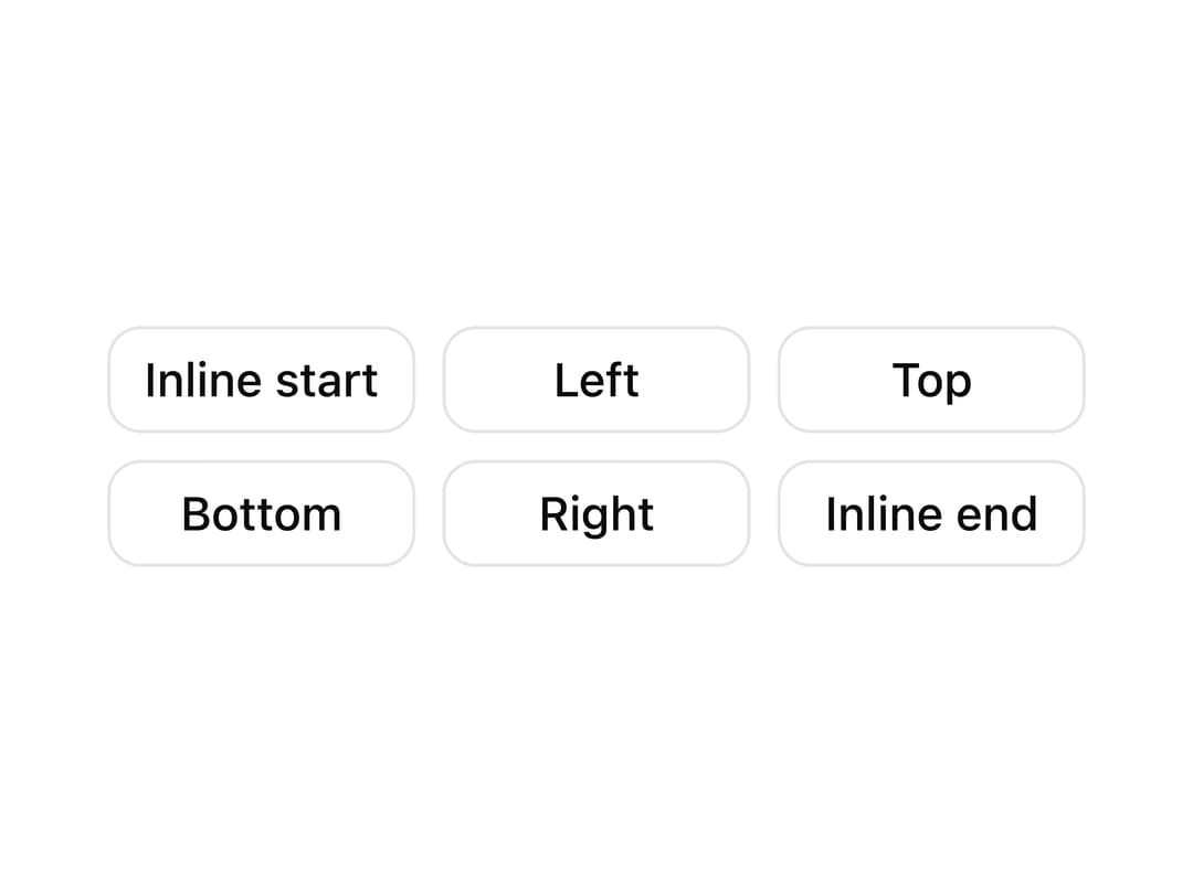
A grid of buttons that each open a tooltip from a different side (top, bottom, left, right, and logical inline start/end) so you can preview tooltip positioning options at once.
Built with React and Tailwind. Copy the prompt and paste it into Claude Code, Cursor or Lovable: your agent adds Tooltip Sides Grid to your project and fits it to your theme.
Code
How Tooltip Sides Grid is used: the demo's code. The component's own source comes with a free account.
Usage.tsx
import CTooltip2 from "@/components/ui/c-tooltip-2";
import { TooltipProvider } from "@/components/ui/c-tooltip-2-utils/tooltip";

export default function CTooltip2Demo() {
  return (
    <TooltipProvider>
      <div className="flex min-h-[320px] w-full items-center justify-center p-10">
        <CTooltip2 />
      </div>
    </TooltipProvider>
  );
}
More by Sean Hello
View all

3D Testimonails
3.7K
Line Charts 9
712
Alert
506
Line Charts 6
412
Area Charts 1
406
Scroll Area
379
Navigation Menu
346
Area Charts 2
330
More in Buttons
View all
Texture Button
108
Button
14

Notification Button
117

HeroUI Button Group
2

Eclipse Button
44
Button Save
50

App Store Button
484
Base Button
1


