
About
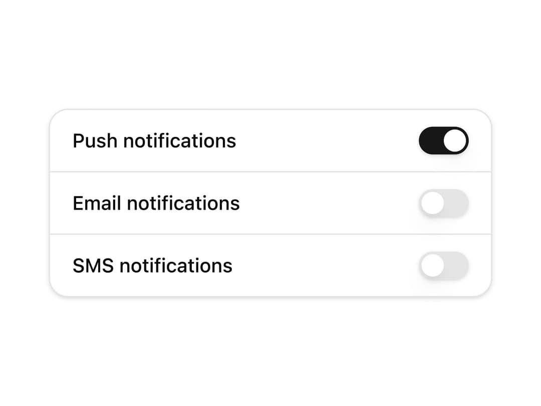
A settings card that groups multiple toggle switches with labels, separated by dividers, for things like notification preferences.
Built with React and Tailwind. Copy the prompt and paste it into Claude Code, Cursor or Lovable: your agent adds Switch List Card to your project and fits it to your theme.
Code
How Switch List Card is used: the demo's code. The component's own source comes with a free account.
Usage.tsx
import Component from "@/components/ui/c-switch-6";

export default function Preview() {
  return <Component />;
}
More by Sean Hello
View all

3D Testimonails
3.7K
Line Charts 9
713
Alert
508
Line Charts 6
412
Area Charts 1
406
Scroll Area
379
Navigation Menu
348
Area Charts 2
330
More in Cards
View all

Course Design Cards
1.3K
Statistics Card 7
327
Statistics Card 2
305

Interactive Tech Stack Bento Grid with Hover Effects
625

Card Studio
5
The Item one
4

Weather Card
65

Card
9