

About
A loading indicator that announces in plain words what is loading (e.g. "Loading your bookings") with a small decorative drawing, including a polite screen-reader announcement and three visual registers (quiet, warm, playful). Ported to React from Susegad UI's sg-loader web component by Sarat Chandra Gnanamgari (Asymmetrica).
Built with React and Tailwind. Copy the prompt and paste it into Claude Code, Cursor or Lovable: your agent adds Status Loader to your project and fits it to your theme.
Code
How Status Loader is used: the demo's code. The component's own source comes with a free account.
Usage.tsx
"use client";
import * as React from "react";
import Loader from "@/components/ui/loader";

const steps = ["Sending your photos", "Making previews", "Saving the album"];

export default function LiveStatusUpdatesDemo() {
  const [i, setI] = React.useState(0);
  return (
    <div className="flex min-h-[220px] w-full flex-col items-center justify-center gap-4 p-10">
      <Loader label={steps[i]} />
      <button
        type="button"
        onClick={() => setI((n) => (n + 1) % steps.length)}
        className="rounded-md border border-border px-3 py-1.5 text-sm"
      >
        Move to the next step
      </button>
    </div>
  );
}
More by sarat-asymmetrica
View all
Tile Band
8
Hand-drawn Radio Group
3
Toggle
2
Kolam & Chai Progress
Hand-Inked Status Badge
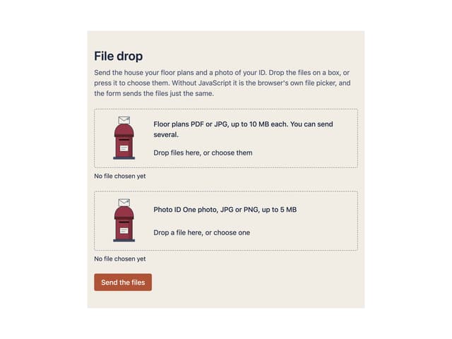
File Drop
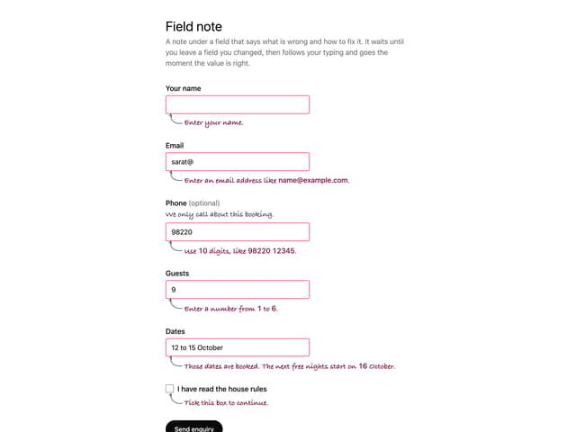
Field Note