

About
Premium Interactive Product Card with light/dark modes, hover effects, and crisp typography.
Built with React and Tailwind. Copy the prompt and paste it into Claude Code, Cursor or Lovable: your agent adds Premium Product Card to your project and fits it to your theme.
Code
How Premium Product Card is used: the demo's code. The component's own source comes with a free account.
Usage.tsx
import PublishedComponent from "@/components/ui/premium-product-card"

export default function Demo() {
  return <PublishedComponent />
}
Dependencies
More by Sajadh Ahmed
View all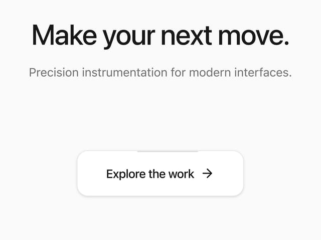

Living Orbit Button
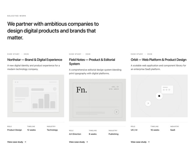
Project Showcase
More in Cards
View all

Course Design Cards
1.3K

Statistics Card 7
327
Statistics Card 2
305

Interactive Tech Stack Bento Grid with Hover Effects
625

Card Studio
5
The Item one
4

Weather Card
65

Card
9