
About
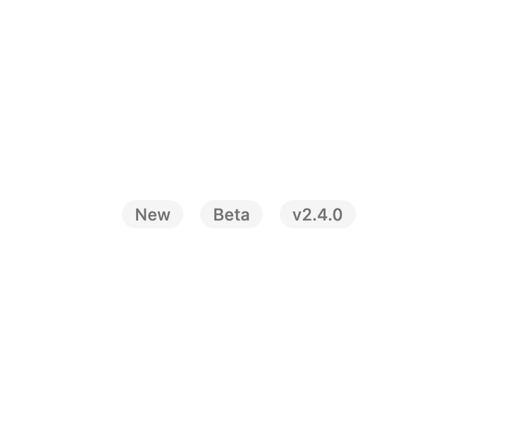
A small polymorphic label used as a status pill, outlined tag, or centered divider between grouped content such as chat messages.
Built with React and Tailwind. Copy the prompt and paste it into Claude Code, Cursor or Lovable: your agent adds Marker to your project and fits it to your theme.
Code
How Marker is used: the demo's code. The component's own source comes with a free account.
Usage.tsx
import Marker from "@/components/ui/marker";

export default function MarkerDemo() {
  return (
    <div className="flex min-h-[200px] w-full flex-wrap items-center justify-center gap-3 bg-background p-6">
      <Marker>New</Marker>
      <Marker>Beta</Marker>
      <Marker>v2.4.0</Marker>
    </div>
  );
}
Dependencies
More by russellbloxwich
View all
Sensitive Input
5
Chart
4
Code Block
4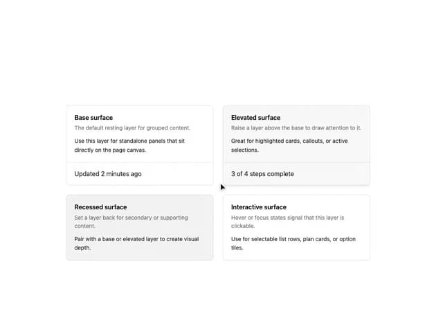
Layer Card
3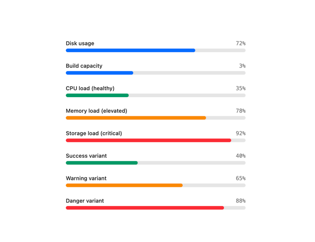
Meter
1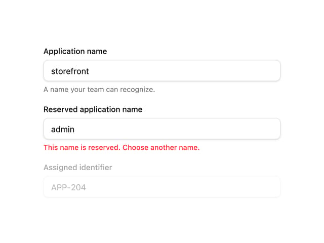
Field
1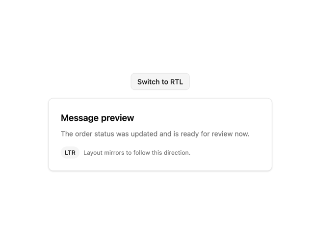
Direction Provider
1
Toast Notifications
1