
About
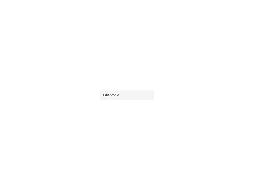
Building block for menus and navigation that renders its main area from children and works with both href and onClick. Supports critical and neutral colors, selected and disabled states, three sizes, startSlot/endSlot composition, built-in icon support and a MenuItem.Aligner utility for aligning with surrounding text.
Built with React and Tailwind. Copy the prompt and paste it into Claude Code, Cursor or Lovable: your agent adds Reshaped Menu item to your project and fits it to your theme.
Code
How Reshaped Menu item is used: the demo's code. The component's own source comes with a free account.
Usage.tsx
import { Reshaped } from "reshaped/bundle";
import MenuItem from "@/components/ui/reshaped-menu-item";

export default function Demo() {
  return (
    <Reshaped theme="slate">
      <div style={{ maxWidth: 320, width: "100%", margin: "0 auto", padding: 24 }}>
        <MenuItem size="large" onClick={() => {}}>
          Edit profile
        </MenuItem>
      </div>
    </Reshaped>
  );
}
Dependencies
More by reshaped
View all
Reshaped Toast
12
Reshaped Calendar
10
Reshaped Progress indicator
8
Reshaped Context menu
8
Reshaped Checkbox
8
Reshaped Autocomplete
8
Reshaped Slider
7
Reshaped Pagination
7
More in Navigation
View all

Liquid Glass Expandable Sidebar
76

Footer with Big Wordmark
40

Sidebar
392

Oversized 404 Numeral
78
Navbar with Theme Toggle
67

NavBar
2

Pagination
109
Tabs like bookmark
82
