
About
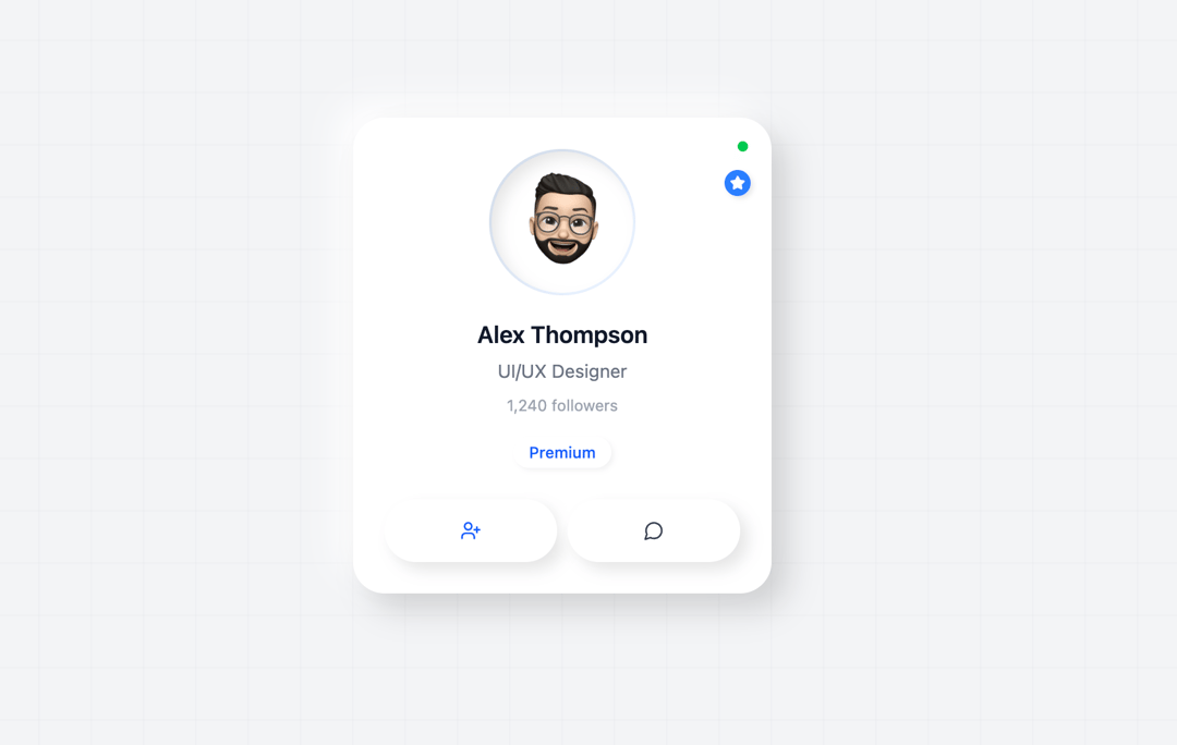
The information card includes the name, designation, followers, a premium user button, and a message button.
Built with React and Tailwind. Copy the prompt and paste it into Claude Code, Cursor or Lovable: your agent adds Info Card to your project and fits it to your theme.
Code
How Info Card is used: the demo's code. The component's own source comes with a free account.
Usage.tsx
import ProfileCardGrid from "@/components/ui/info-card";

export default function DemoOne() {
  return <ProfileCardGrid />;
}
Dependencies
More by Ravi Katiyar
View all

Animated Shader Hero
3.8K
Hero
3.4K
Circular Gallery
2.9K
Minimalist Hero
2.7K
Glass Calendar
2K
Floating Icons Hero Section
2K
Feature Carousel
1.8K
AI Image Generator Hero
1.5K
More in Cards
View all

Course Design Cards
1.3K

Statistics Card 7
327
Statistics Card 2
305

Interactive Tech Stack Bento Grid with Hover Effects
625

Card Studio
5
The Item one
4

Weather Card
65

Card
9