
About
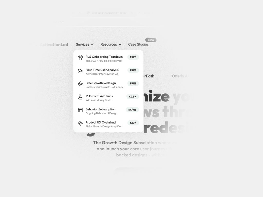
A NavBar Button that answers visitors question of "What's next?" In a single place. The title, description, icon, and badge (which is awesome) give anyone the minimum details to act
Built with React and Tailwind. Copy the prompt and paste it into Claude Code, Cursor or Lovable: your agent adds Navbar Custom Dropdown Button to your project and fits it to your theme.
Code
How Navbar Custom Dropdown Button is used: the demo's code. The component's own source comes with a free account.
Usage.tsx
import { NavButtonDropdown } from "@/components/ui/navbar-custom-dropdown-button";

export default function DemoOne() {
  return (
    <main className="bg-base-100 w-screen h-screen flex items-center px-20 justify-center">

      <NavButtonDropdown />

    </main>
  )
}
Dependencies
More by Radu Popescu
View all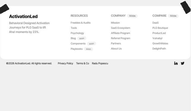

Footer Taped Design
547
Colorful Bento Grid
377
PricingSlider Loops
186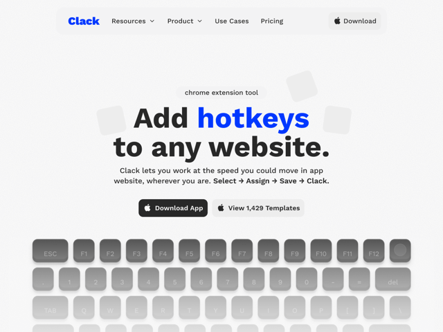
Simple Navigation with Icons
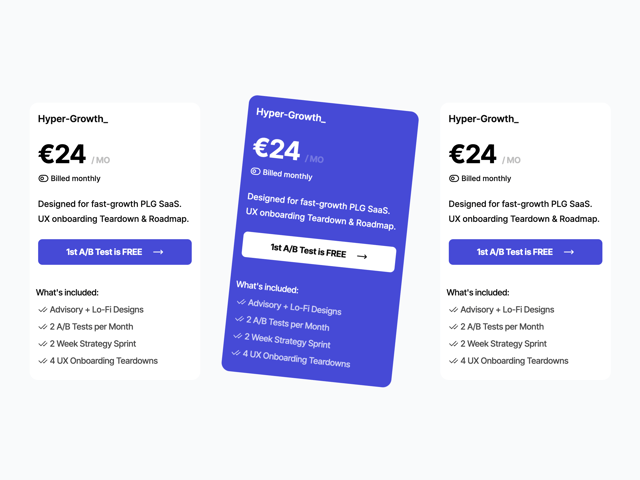
Pricing Plan Card With Toggle
Reviews Badge
Checkout Button
FeatureCard
More in Buttons
View all
Texture Button
108
Button
14

Notification Button
117

HeroUI Button Group
2

Eclipse Button
44
Button Save
50

App Store Button
484

Base Button
1


