
About
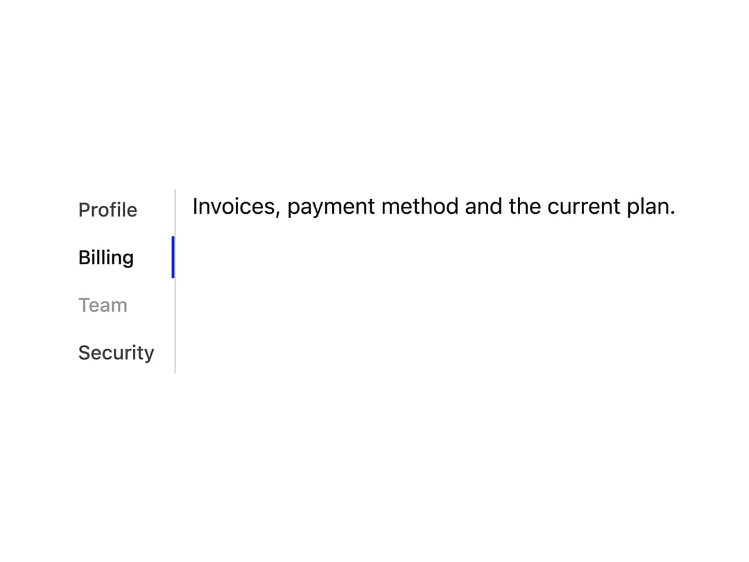
An accessible tabbed interface for switching between related sections of content, following the WAI-ARIA Tabs pattern with keyboard navigation.
Built with React and Tailwind. Copy the prompt and paste it into Claude Code, Cursor or Lovable: your agent adds Tabs to your project and fits it to your theme.
Code
How Tabs is used: the demo's code. The component's own source comes with a free account.
Usage.tsx
import { Tabs } from "@/components/ui/tabs";

export default function TabsVerticalDemo() {
  return (
    <div className="w-full max-w-md">
      <Tabs defaultValue="billing" orientation="vertical">
        <Tabs.List aria-label="Account">
          <Tabs.Tab value="profile">Profile</Tabs.Tab>
          <Tabs.Tab value="billing">Billing</Tabs.Tab>
          <Tabs.Tab value="team" disabled>
            Team
          </Tabs.Tab>
          <Tabs.Tab value="security">Security</Tabs.Tab>
        </Tabs.List>
        <Tabs.Panel value="profile">
          Name, avatar and the languages you speak.
        </Tabs.Panel>
        <Tabs.Panel value="billing">
          Invoices, payment method and the current plan.
        </Tabs.Panel>
        <Tabs.Panel value="team">Members and roles.</Tabs.Panel>
        <Tabs.Panel value="security">
          Sessions, passkeys and two-factor authentication.
        </Tabs.Panel>
      </Tabs>
    </div>
  );
}
More by pearpages
View all
Popover
5
Slider
Switch
More in Navigation
View all

Liquid Glass Expandable Sidebar
76

Footer with Big Wordmark
40

Sidebar
392

Oversized 404 Numeral
78
Navbar with Theme Toggle
67

NavBar
2

Pagination
109
Tabs like bookmark
82
