
About
Enhanced checkbox
Built with React and Tailwind. Copy the prompt and paste it into Claude Code, Cursor or Lovable: your agent adds Checkbox to your project and fits it to your theme.
Code
How Checkbox is used: the demo's code. The component's own source comes with a free account.
Usage.tsx
import { Checkbox } from "@/components/ui/checkbox";
import { Label } from "@/components/ui/label";
import { useId } from "react";

function Component() {
  const id = useId();
  return (
    <div
      className="flex items-center gap-2"
      style={
        { "--primary": "238.7 83.5% 66.7%", "--ring": "238.7 83.5% 66.7%" } as React.CSSProperties
      }
    >
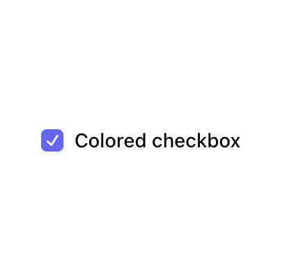
      <Checkbox id={id} defaultChecked />
      <Label htmlFor={id}>Colored checkbox</Label>
    </div>
  );
}

export { Component };
Dependencies
More by Origin UI
View all
Dialog
1.3K
Avatar
1K
useImageUpload
951
usePagination
636
Popover
390
Button
383
Command
346
Calendar [React Day Picker]
271
More in Forms
View all

Login 1
63

Premium Auth
570

Contact Card
1.1K

Form
18

Book A Demo 1
91
Authentication Card
52

Card Studio
47

Login Card
35
