About
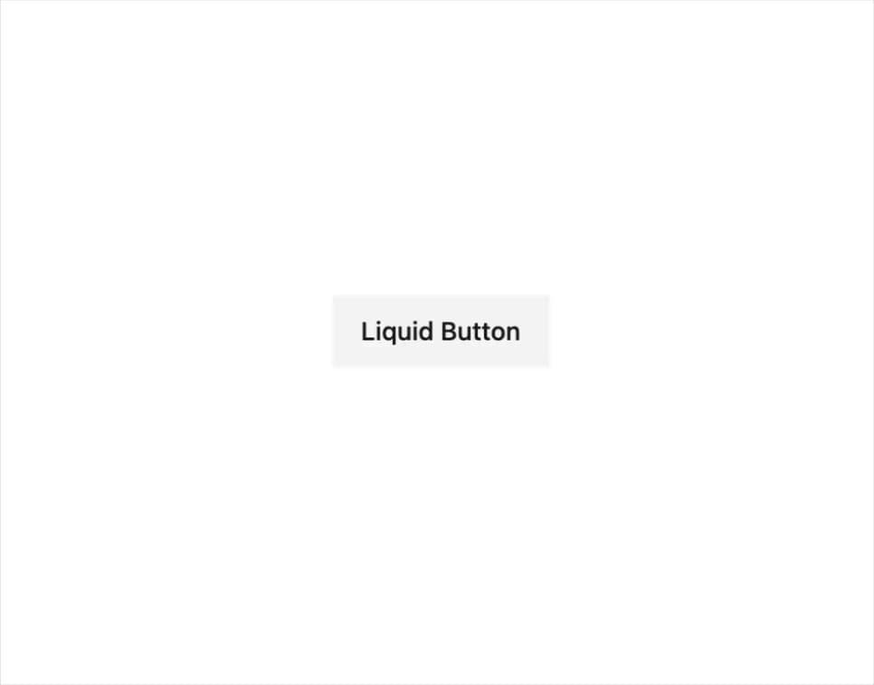
A button whose background liquid-fills from one side to the other on hover, built with Framer Motion CSS variable transitions.
Built with React and Tailwind. Copy the prompt and paste it into Claude Code, Cursor or Lovable: your agent adds Liquid Button to your project and fits it to your theme.
Code
How Liquid Button is used: the demo's code. The component's own source comes with a free account.
Usage.tsx
"use client";

import { LiquidButton } from "@/components/ui/primitives-buttons-liquid";

export default function LiquidButtonDemo() {
  return (
    <div className="flex items-center justify-center p-10">
      <LiquidButton
        delay="0.3s"
        fillHeight="3px"
        hoverScale={1.05}
        tapScale={0.95}
        className="text-sm font-medium px-4 py-2 h-10 overflow-hidden [--liquid-button-color:var(--primary)] [--liquid-button-background-color:var(--accent)] text-primary hover:text-primary-foreground"
      >
        Liquid Button
      </LiquidButton>
    </div>
  );
}
Dependencies
More by odysseyui
View all
AI Orb Avatar
261
Thought Chain
139
Pricing 6
73
Greeting Preloader
46
Typewriter
7
GitHub Stars Button
More in Buttons
View all
Texture Button
108
Button
14

Notification Button
117

HeroUI Button Group
2

Eclipse Button
44
Button Save
50

App Store Button
484

Base Button
1


