
About
WebGL sweep transitions for React. A colour band sweeps across the viewport, revealing the incoming view behind it while retaining the outgoing view ahead. Wrap your app in GlimmProvider and call sweep(navigate) from useGlimm() on any route or state change. Zero runtime dependencies, respects prefers-reduced-motion, falls back gracefully without WebGL. By Noman Ijaz, MIT.
Built with React and Tailwind. Copy the prompt and paste it into Claude Code, Cursor or Lovable: your agent adds Glimm Transition to your project and fits it to your theme.
Code
How Glimm Transition is used: the demo's code. The component's own source comes with a free account.
Usage.tsx
"use client"

import { useState } from "react"
import { Moon, Sun } from "lucide-react"
import GlimmProvider, { useGlimm } from "@/components/ui/glimm-transition"

function Bar({ className = "" }: { className?: string }) {
  return <div className={`rounded-full bg-current opacity-15 ${className}`} />
}

function ThemeDemo() {
  const { sweep } = useGlimm()
  const [dark, setDark] = useState(false)

  return (
    <div
      className={`flex h-screen min-h-[350px] w-full flex-col ${
        dark ? "bg-neutral-900 text-neutral-100" : "bg-neutral-100 text-neutral-900"
      }`}
    >
      <header
        className={`flex h-14 items-center justify-between border-b px-5 ${
          dark ? "border-white/10 bg-neutral-950" : "border-black/10 bg-white"
        }`}
      >
        <Bar className="h-2.5 w-24" />
        <button
          type="button"
          role="switch"
          aria-checked={dark}
          aria-label="Toggle the theme"
          onClick={() => sweep(() => setDark((d) => !d))}
          className={`flex items-center gap-1 rounded-full p-1 ${
            dark ? "bg-white/10" : "bg-black/5"
          }`}
        >
          <span
            className={`grid size-7 place-items-center rounded-full ${
              dark ? "" : "bg-white shadow-sm"
            }`}
          >
            <Sun className="size-4" />
          </span>
          <span
            className={`grid size-7 place-items-center rounded-full ${
              dark ? "bg-neutral-700" : ""
            }`}
          >
            <Moon className="size-4" />
          </span>
        </button>
      </header>
      <main className="flex flex-1 flex-col gap-4 overflow-hidden p-6">
        <Bar className="h-4 w-40" />
        <Bar className="h-2 w-64" />
        <div className="grid flex-1 grid-cols-2 gap-4">
          {[0, 1, 2, 3].map((i) => (
            <div
              key={i}
              className={`flex flex-col gap-2 rounded-xl border p-4 ${
                dark ? "border-white/10 bg-neutral-800" : "border-black/10 bg-white"
              }`}
            >
              <div className="flex-1 rounded-lg bg-current opacity-5" />
              <Bar className="h-2 w-3/4" />
              <Bar className="h-2 w-1/2" />
            </div>
          ))}
        </div>
      </main>
    </div>
  )
}

export default function Default() {
  return (
    <GlimmProvider palette="prism">
      <ThemeDemo />
    </GlimmProvider>
  )
}
Dependencies
More by nomanjack
View all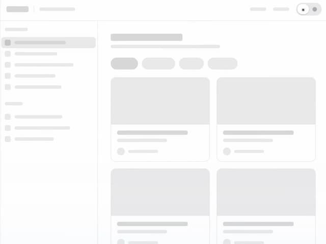

Glimm Theme
66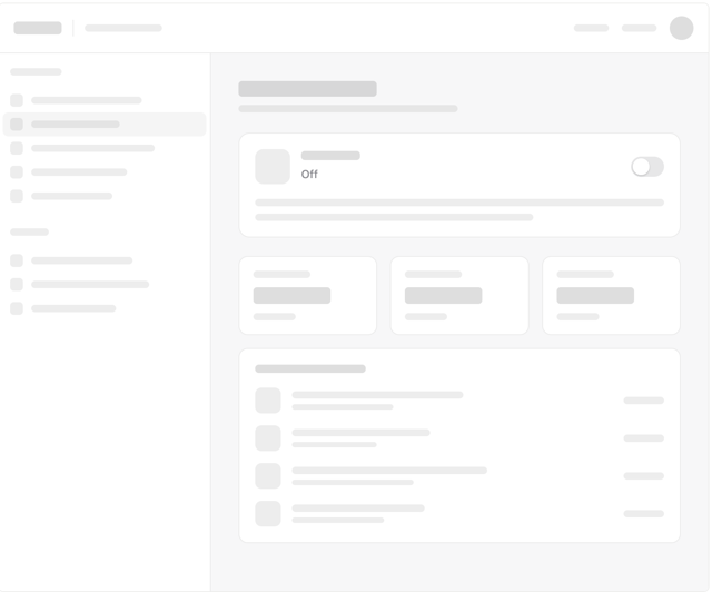
Glimm Autopilot
24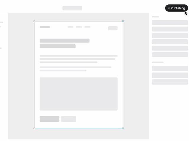
Glimm Publish
21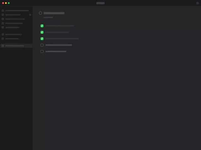
Glimm To-dos
19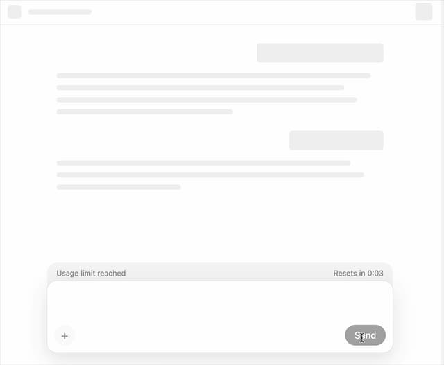
Glimm Usage Reset
12
Glimm HTML-in-Canvas
11
Glimm Invoice Paid
7
Glimm Upgrade to Pro
6
More in Shaders
View all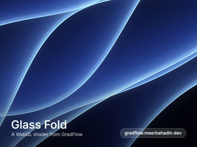
Glass Fold
498

Shader Animation
3.9K
Parallel Waves
13

Phosphor 30
314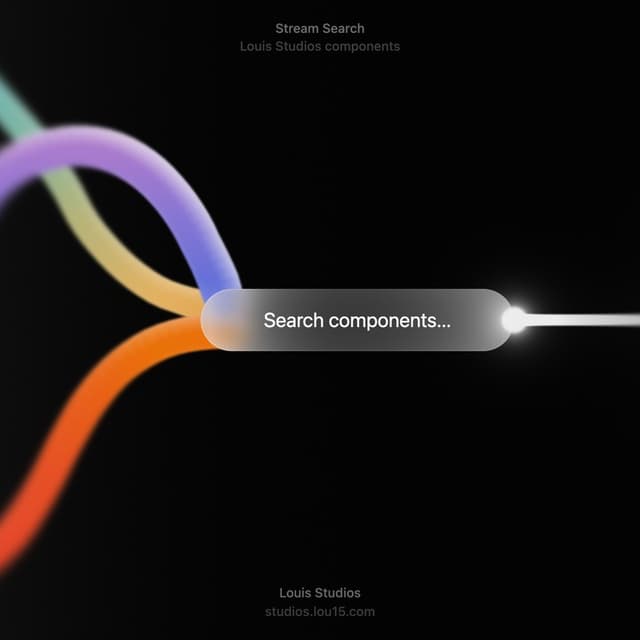

Stream Search
20
Radial Shader
149

Illos Knowledge Sources
55

Paper design shader Background
700

